Customizable & Filterable Gallery In jQuery - tabX
| File Size: | 69.9 KB |
|---|---|
| Views Total: | 1969 |
| Last Update: | |
| Publish Date: | |
| Official Website: | Go to website |
| License: | MIT |
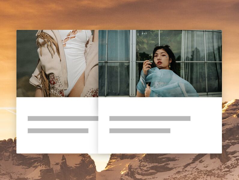
tabX is a lightweight and versatile jQuery plugin that allows you to create responsive, customizable, filterable web galleries with custom filter controls and smooth transitions. Great for photo galleries, portfolio websites, online stores, and more.
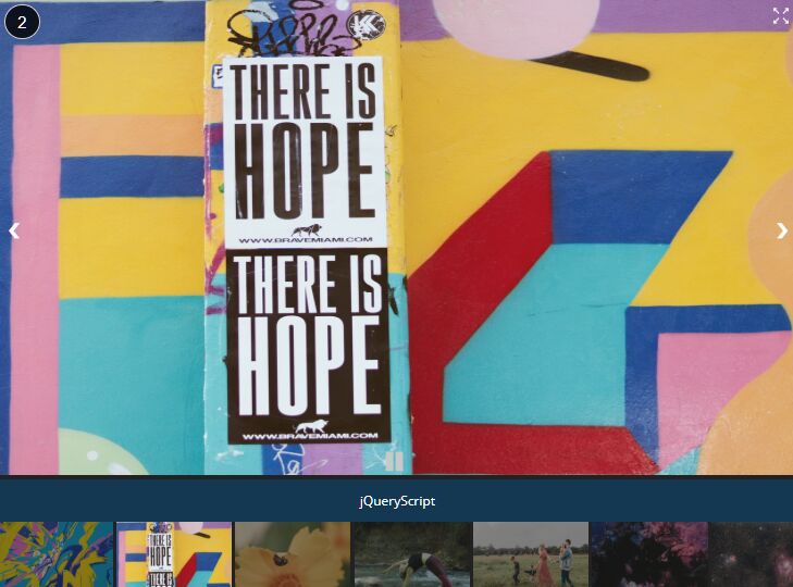
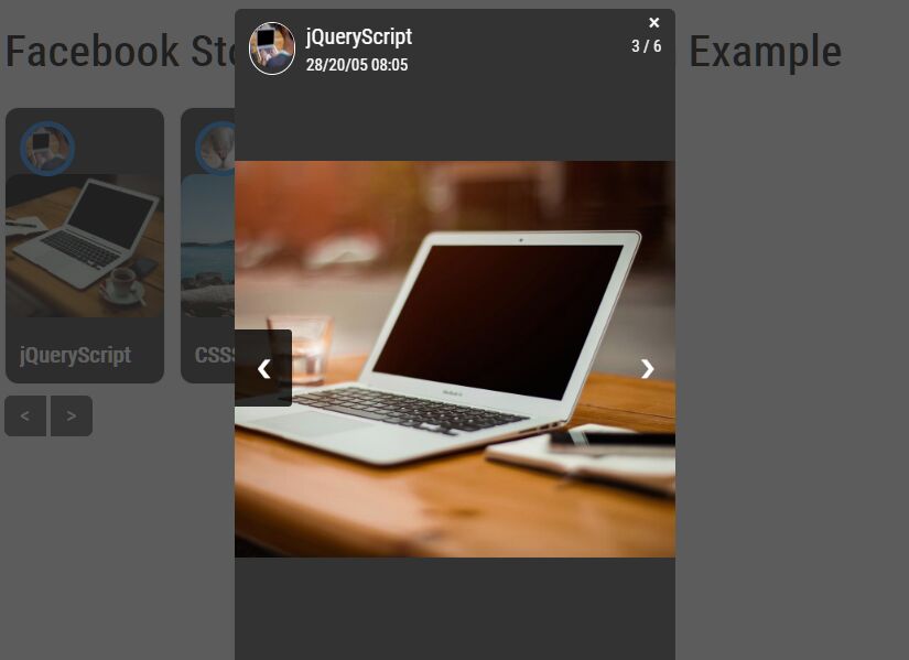
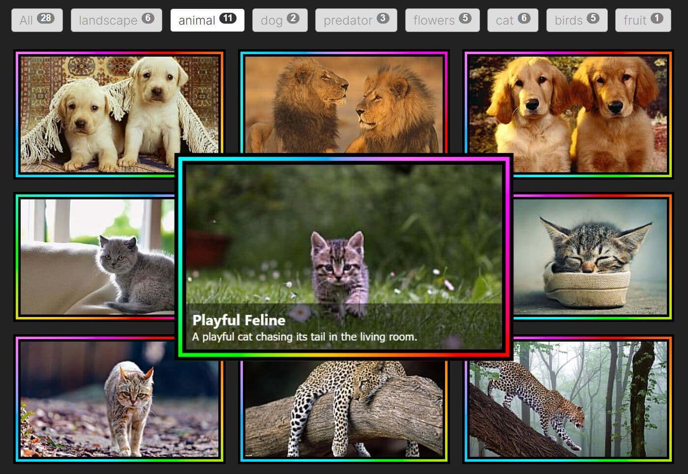
This gallery plugin supports category filtering through tab/button controls, with counters showing item quantities per category. You can place any content within gallery items, from images to text to video elements.
Features:
- 5 pre-built filter controls
- 10+ pre-built gallery item styles
- 12+ pre-built smooth animations
- Easy to implement
How to use it:
1. Load the tabX plugin's JavaScript and CSS files in your document:
<!-- jQuery is required -->
<script src="/path/to/cdn/jquery.min.js"></script>

<!-- jQuery Tabx plugin -->
<link rel="stylesheet" href="/path/to/tabx.css" />
<script src="/path/to/tabx.min.js"></script>
2. Code the HTML structure for your gallery. You'll need a main container element and individual items within it. Each item needs two key attributes: tabx-id and tabx-cats.
- tabx-id: This is a unique identifier for your gallery. Think of it like an ID for the entire gallery container.
- tabx-cats: This attribute defines the categories an item belongs to. You can assign multiple categories by separating them with commas. Remember, use only alphanumeric characters without spaces or special symbols.
<div id="gallery" tabx-id="example">
  <div tabx-cats="javascript">React</div>
  <div tabx-cats="css,javascript">Tailwind</div>
  <div tabx-cats="javascript">jQueryScript</div>
  ...
</div>
3. Use jQuery to initialize the tabX plugin on your gallery container. You can customize the gallery using the following options.
- type: Controls the appearance of your filter controls. You can choose from 'buttons', 'pills', 'tabs', 'switches', or 'radios'.
- animation: Sets the animation effect when filtering. Available options include "fade", "slide", "fall", "noir", "rotatez", "rotatey", "rotatex", "blur", "away", "blast", or "random". Setting it to "none" disables animation.
- animations: If you choose 'random' for the animation option, this array specifies the list of animations to randomly select from.
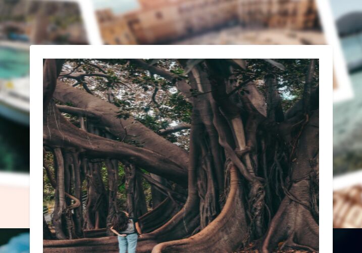
- boxClass: Applies a pre-defined or custom CSS class to your gallery items. Built-in options are 'default', 'photo', 'glass', 'plastic', 'frosty', 'candy', 'double', 'neon', 'stamp', 'chequered'.
- activeCat: Determines which category is initially active when the page loads. Use 'all' to show all items initially.
$('#gallery').tabX({
  type: 'buttons',
  animation: 'none',
  animations: ["fade", "slide", "fall", "noir", "rotatez", "rotatey", "rotatex", "blur", "away", "blast"],
  boxClass: 'default',
  activeCat: 'all',
});
4. By default, tabX creates the filter controls (tabs) within the gallery container. If you need to place the filter controls elsewhere on your page, use the tabx-gid attribute on an element (like a <ul>). The value of tabx-gid must match the tabx-id of your gallery.
<ul tabx-gid="my-gallery"></ul>
<div tabx-id="my-gallery">
  ...
</div>
5. tabX automatically generates filter controls (tabs) for each category. However, if you want to customize the text or add a specific class to a particular category tab, define the navigation container manually and create the list items. Use the tabx-cat-nav attribute with the category name:
<ul tabx-gid="my-gallery">
  <li class="ycustom-class" tabx-cat-nav="javascript">Web Dev</li>
  ...
</ul>
6. You can also define the type and animation options directly in the HTML of your navigation container using the tabx-type and tabx-anim attributes. Note that options set in the JavaScript initialization will override these HTML attributes.
<ul tabx-gid="my-gallery" tabx-type="pills" tabx-anim="slide">
  ...
</ul>
7. To add images to your gallery items, use standard <img> tags. tabX provides predefined classes for styling.
<!-- Image only -->
<div tabx-cats="javascript">
  <a href="https://www.jqueryscript.net">
    <img class="tabx-img" src="/path/to/jqueryscript.svg">
  </a>
</div>

<!-- Image with hover title and description -->
<div tabx-cats="javascript">
  <a href="https://www.jqueryscript.net">
    <img class="tabx-img" src="/path/to/jqueryscript.svg">
  </a>
  <div class="tabx-info">
    <div class="tabx-title">jQuery Script</div>
    <div class="tabx-descr">A jQuery plugin website.</div>
  </div>
</div>
8. You can add your own animation effects by defining CSS animations.
.tabx-custom-hide .tabx-in {
  /* custom animation */
}

.tabx-custom-show .tabx-in {
  /* custom animation */
}
9. Similar to animations, you can create custom box designs using CSS. When you specify a boxClass (e.g., "custom"), tabX adds the class tabx-box-customd to the item container. The basic HTML structure of a gallery item includes automatically generated tabx-in and tabx-ui elements.
<div tabx-cats="javascript" class="tabx tabx-box-custom">
  <div class="tabx-in">
    <div class="tabx-ui">
      <!-- HTML content -->
    </div>
  </div>
</div>
.tabx-box-custom .tabx-in {
  /* custom styles here */
}
10. You can also create your own tab/button styles. When you set the type option (e.g., "tags"), tabX adds the attribute tabx-type="tags" to the navigation <ul> container (the one with the tabx-gid attribute).
<div tabx-cats="javascript" class="tabx tabx-box-custom">
  <div class="tabx-in">
    <div class="tabx-ui">
      <!-- HTML content -->
    </div>
  </div>
</div>
This awesome jQuery plugin is developed by phploaded. For more Advanced Usages, please check the demo page or visit the official website.