Responsive Fullscreen Photo Gallery - jQuery Story-Show-Gallery
| File Size: | 156 KB |
|---|---|
| Views Total: | 26081 |
| Last Update: | |
| Publish Date: | |
| Official Website: | Go to website |
| License: | MIT |

Story-Show-Gallery is a lightweight, flexible, responsive, interactive jQuery Photo Gallery plugin created for desktop, tablet, and mobile.
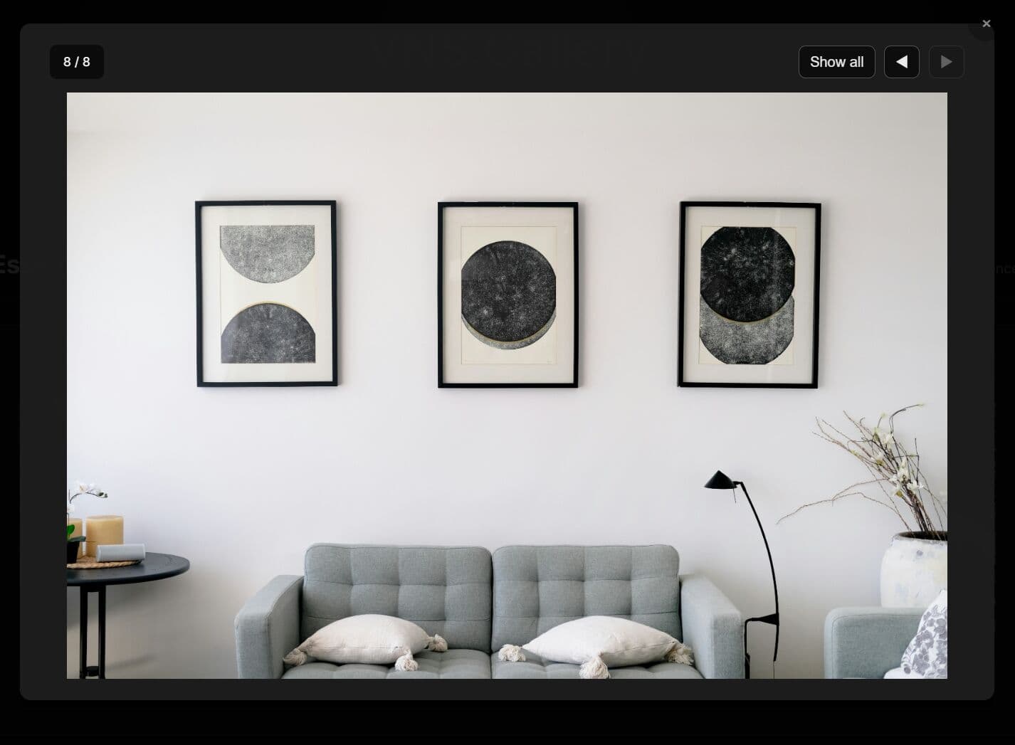
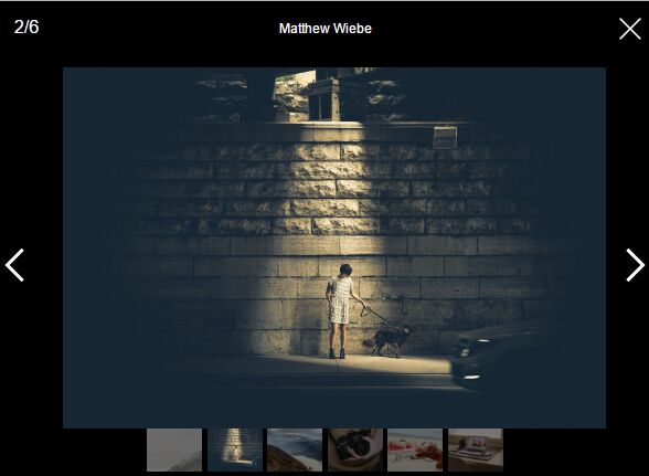
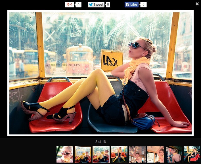
Clicking the thumbnail & link will display all the images in a fullscreen vertical slider where the users are able to navigate through images with mousewheel, arrow keys and touch swipe events.
Licensed under the GNU General Public License v3.0.
How to use it:
1. Insert the latest version of jQuery library and the Simple Scroll Gallery plugin's files into the document.
<script src="/path/to/cdn/jquery.min.js"></script>
<link rel="stylesheet" href="ssg.css" />
<script src="ssg.js"></script>
2. Wrap the images & links into a gallery container.
<section class="gallery">

  <a href='large.jpg'>
    <img src="thumb.jpg" alt="Image 1">
  </a>

  <a href='large.jpg' data-author='photo by…'>
    <img src="thumb.jpg" alt="Image 1">
  </a>

  <a href='large.jpg'>
    <img src="thumb.jpg" alt="Image 1">
  </a>

  <a href='large.jpg'>Link is supported as well</a>

  ...

</section>
3. That's it. To make the gallery fullscreen, just add the CSS class 'fs' to the container element:
<section class="fs gallery">

  <a href='large.jpg'>
    <img src="thumb.jpg" alt="Image 1">
  </a>

  <a href='large.jpg' data-author="Custom Author" data-caption="Custom Caption">
    <img src="thumb.jpg" alt="Image 1">
  </a>

  <a href='large.jpg'>
    <img src="thumb.jpg" alt="Image 1">
  </a>

  <a class="fs" href='large.jpg'>Link is supported as well</a>

  ...

</section>
4. More CSS classes to control the gallery.
- ssg: To create a separate gallery, add this CSS class to the parent container.
- nossg: Ignore images with this CSS class.
- gossg: Set the initial image with this CSS class.
- vipssg: Set the VIP image.
- ssglink: Create a link to the image of the same name that appears on the page.
- ssglight: Light theme.
- ssgdim: Dim theme.
- ssgdark: Dark theme.
- ssgblack: Black theme.
<section class="ssg fs vipssg ssgblack">

  <a href='large.jpg'>
    <img src="thumb.jpg" alt="Image 1">
  </a>

  <a href='large.jpg'>
    <img src="thumb.jpg" alt="Image 1">
  </a>

  <a href='large.jpg'>
    <img src="thumb.jpg" alt="Image 1">
  </a>

  <a class="fs" href='large.jpg'>Link is supported as well</a>

  ...

</section>
5. You can also launch the gallery manually by calling a function:
SSG.run();
6. And then pass the optional settings as displayed below:
SSG.run({

  // init image ID
  initImgID: 3,

  // specify the initial image by its file name
  initImgName: ['story-show-gallery-logo.jpg',1],

  // no close icon, no ESC key
  noExit: true,

  // fullscreen mode
  fs: true,

  // ask if a user wants to switch into fullscreen mode
  fsa: false,

  // pass options here
  cfg: {}

});
7. The plugin also allows you to define images displayed in the gallery via JavaScript:
SSG.run({
  imgs: [
    {
      href: '1.jpg',
      alt: 'Img caption 1'
    },
    {
      href: '2.jpg',
      alt: 'Img caption 2'
    },{
      href: '3.jpg',
      alt: 'Img caption 3'
    }
  ],
  imgsPos:'start',
  initImgID: 12
});
8. Override the default configurations at the beginning of the ssg.js.
// duration of scroll animation in miliseconds. Set to 0 for no scroll animation.
SSG.cfg.scrollDuration = 500;

// Force SSG to always display in fullscreen - true/false
SSG.cfg.alwaysFullscreen = false;

// Force SSG to never display in fullscreen - true/false. There is an exception for smartphones and tablets
SSG.cfg.neverFullscreen = false;

// When a mobile phone is in portrait mode, start SSG in fullscreen mode. But only if FS is demanded - fs class or fs:true.
SSG.cfg.mobilePortraitFS = false;

// Visual theme of the gallery - four possible values: dim, light, black, dark (default)
SSG.cfg.theme = 'dark'

// unobtrusive cross cursor
SSG.cfg.crossCursor = false;

// URL of the HTML file to load behind the gallery (usually a signpost to other galleries).
// HTML file has to be loaded over http(s) due to a browser's CORS policy. Set to null if you don't want it.
SSG.cfg.fileToLoad = null;

// display social share icon and menu
SSG.cfg.socialShare = true;

// hide image captions, it doesn't impact global caption or exif
SSG.cfg.hideImgCaptions = false;

// Enlarge image above its original resolution. But only if the image is smaller than two third of screen. It doesn't work on mobiles and tablets.
SSG.cfg.enlargeImg = false;

// EXIF info (or just the EXIF icon) appears as a part of the caption with link to full EXIF listing
// 4 possible values: 'none' (no exif, default), 'standard', 'trim' (reduced lens info to save space), 'icon'
SSG.cfg.captionExif = 'none';

// log image views into Google Analytics - true/false. SSG supports only ga.js tracking code.
SSG.cfg.logIntoGA = true;

// Protect photos from being copied via right click menu - true/false
SSG.cfg.rightClickProtection = true;

// Caption location depends on a photo size vs. screen size and SSG.cfg.preferedCaptionLocation.
// Negative number => more likely side caption. Positive number => more likely caption below the photo.
// If the number will be too large (eg: 300 or -300 ) a caption will be only in one location.
SSG.cfg.preferedCaptionLocation = 3;

// Side caption for smaller, landscape oriented photos, where is enough space below them as well as on their side.
SSG.cfg.sideCaptionforSmallerLandscapeImg = false;  // false means caption below, true side caption

// an author signature (or some text), which will appear in every caption. The data-author attribute overrides it.
SSG.cfg.globalAuthorCaption = "";

// Show first 3 images of a separate gallery together - e.g. third image clicked - image order will be 3,1,2,4,5,6...
SSG.cfg.showFirst3ImgsTogether = true;

// Locking the scale of mobile viewport at 1. Set it to true if the gallery has scaling problem on your website.
SSG.cfg.scaleLock1 = false;

// observe DOM for changes, so SSG will know about image hyperlinks that are added into page after page render
SSG.cfg.observeDOM = false;

// image border width in pixels
SSG.cfg.imgBorderWidthX = 1;
SSG.cfg.imgBorderWidthY = 1;
// image border color in CSS format (eg: #366988 or black)
SSG.cfg.imgBorderColor = "";
// image outline color in CSS format - imgBorderWidthX and imgBorderWidthY should be the same, otherwise outline won't fit
SSG.cfg.imgOutlineColor = "";
// Light effect on image border - it looks good mainly on thicker borders
SSG.cfg.imgBorderLightFx = false;
// radius is in vh unit, but above 33 is in percent of image size, so it is possible to achieve circle/ellipse (50)
SSG.cfg.imgBorderRadius = 0;
// display shadow around the image (border) as it is defined in the theme
SSG.cfg.imgBorderShadow = true;

// Watermark - logo configuration. Enter watermark text or image URL to display it
SSG.cfg.watermarkWidth = 147; // image watermark width in pixels, it is downsized on smaller screens.
SSG.cfg.watermarkImage = '';  // watermark image URL e.g. 'https://www.flor.cz/img/florcz.png'
SSG.cfg.watermarkText = '';  //  watermark text, use <br> tag for word wrap
SSG.cfg.watermarkFontColor = ""; // custom font color, it will deactivate dark text-shadow from theme
SSG.cfg.watermarkFontSize = 20; // font size in pixels, it is downsized on smaller screens.
SSG.cfg.watermarkOffsetX = 1.8; // watermark horizontal offset from left border in percents of photo, for align to right use value near 100
SSG.cfg.watermarkOffsetY = 0.6; // vertical offset from bottom border in percents of photo, for align to top use value near 100
// Watermark can be also positioned inside image border, use negative values to do so. Negative values are in pixels - as border width
SSG.cfg.watermarkOpacity = 0.42; // opacity

// Here you can translate SSG into other language. Leave tags <> and "" as they are.
SSG.cfg.hint1 = "Browse through Story Show Gallery by:";
SSG.cfg.hint2 = "a mouse wheel <strong>⊚</strong> or arrow keys <strong>↓→↑←</strong>";
SSG.cfg.hint3 = "or <strong>TAP</strong> on the bottom (top) of the screen";
SSG.cfg.hintTouch = "<strong>TAP</strong> on the bottom (top) of the screen<br> or <strong>swipe</strong> to left (right) <br> to browse through Story Show Gallery.";
SSG.cfg.hintFS = 'For a better experience <br><a><abbr>⎚</abbr> go full screen</a>';
SSG.cfg.toTheTop = "Scroll to top";
SSG.cfg.exitLink = "Exit the Gallery";

// share link dialog
SSG.cfg.imageLink = "The link to selected image:";
SSG.cfg.copyButton  = "⎘ Copy the link to clipboard";
SSG.cfg.linkPaste = "…and you can paste it anywhere via ctrl+v";

// in the portrait mode the gallery suggest to turn phone into landscape mode
SSG.cfg.showLandscapeHint = true;
SSG.cfg.landscapeHint = 'photos look better in landscape mode <span>
Changelog:
v3.3.13 (2024-09-16)
- Better utilisation of the smartphone screen. The caption shrinks to allow the wide image to be displayed more prominently.
- The hideCursorTimer setting, which hides the cursor after a defined period of inactivity. Can be disabled.
- The captions can also be aligned to the right.
v3.3.12 (2024-07-30)
- slighlty sharpen enlarged images, SSG.run bugfix
v3.3.11 (2024-06-24)
- fix scrollbars in Firefox, right exif wrapping, system menu for mobile sharing
v3.3.10 (2024-05-15)
- maintain scrollbars on page with priority scrollbars
v3.3.9 (2024-05-13)
- repair scrollbars, text parting via ins tag, modules directory with TS type for SSG params
v3.3.8 (2023-10-09)
- two columns and left aligned long captions, better swiping, css fixes
v3.3.7 (2023-10-09)
- Bugfix
v3.3.6 (2023-09-23)
- iPhone, Pixel problems solved, long captions support
v3.3.5 (2023-09-06)
- iPhone bugfix, fill EXIF blanks for manual lens
v3.3.4 (2023-08-04)
- bugfix
v3.3.3 (2023-08-03)
- ssglink, initImgName, optimizations
v3.3.2 (2023-05-24)
- bugfix
v3.3.1 (2023-05-09)
- masonry mode for thumbnails
v3.3.0 (2023-04-24)
- CSS layout for thumbnails
v3.2.10 (2023-03-26)
- swiping support in portrait mode
v3.2.8 (2023-02-17)
- disable edge visual search in the gallery
v3.2.8 (2023-02-16)
- CSS tuning
v3.2.6 (2023-02-06)
- bg opacity, fontSize, CSS tuning
v3.2.5 (2023-01-15)
- fixed timing
v3.2.3 (2023-01-10)
- force landsape optimalization, CSS update
v3.2.2 (2022-12-30)
- forced landscape mode option
- bugfix
v3.1.9 (2022-07-30)
- observer optimalization
This awesome jQuery plugin is developed by Roman-Flossler. For more Advanced Usages, please check the demo page or visit the official website.