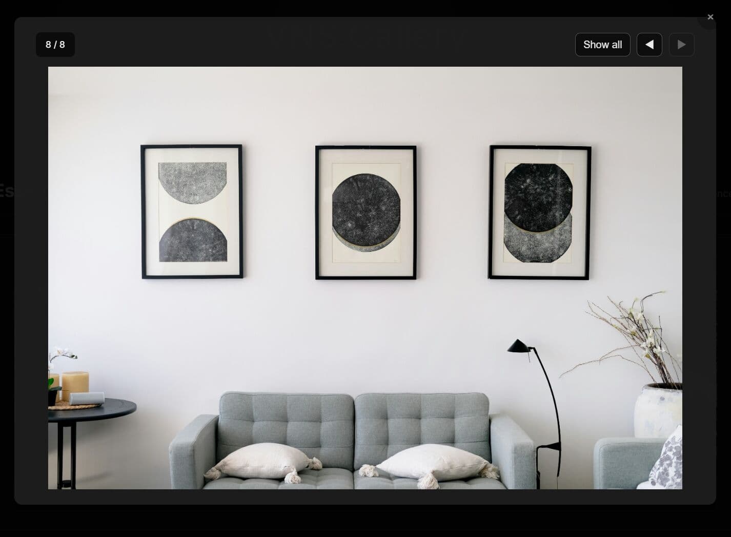
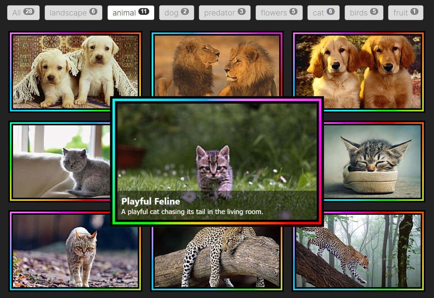
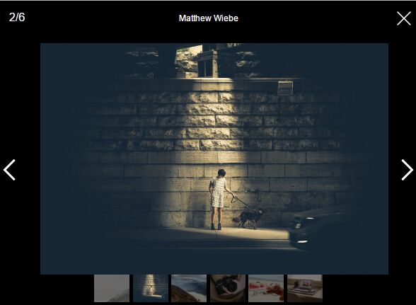
Responsive Image Grid with jQuery and Bootstrap
| File Size: | 2.2 MB |
|---|---|
| Views Total: | 12578 |
| Last Update: | |
| Publish Date: | |
| Official Website: | Go to website |
| License: | MIT |

A small jQuery plugin that arranges a group of images with different height into a neat, clean, responsive, multi-column image grid with a subtle hover zoom effect. Based on Bootstrap grid system.
How to use it:
1. Load the necessary jQuery library and Bootstrap's stylesheet in the html page.
<script src="/path/to/jquery.min.js"></script>
<link rel="stylesheet" href="/path/to/bootstrap.min.css">
2. Load the jQuery image grid plugin's JavaScript and stylesheet in the page.
<link rel="stylesheet" href="css/gallery.css">
<script src="js/image-grid.js"></script>
3. Add your images with captions to the grid like this:
<div class="galleryContainer">
  <div class="container">
    <div data-move="0" class="col-md-4 col-lg-4 col-sm-6 imageContainer">
      <a href="#" class="galleryImage" >
        <img src="images/1.jpg">
      </a>
      <div class="caption">
        Image Caption here
      </div>
    </div>
    <div data-move="0" class="col-md-4 col-lg-4 col-sm-6 imageContainer">
      <a href="#" class="galleryImage" >
        <img src="images/2.jpg">
      </a>
      <div class="caption">
        Image Caption here
      </div>
    </div>
    <div data-move="0" class="col-md-4 col-lg-4 col-sm-6 imageContainer">
      <a href="#" class="galleryImage" >
        <img src="images/3.jpg">
      </a>
      <div class="caption">
        Image Caption here
      </div>
    </div>
  </div>
</div>
4. Initialize the plugin with default options.
$(document).ready(function(){
var options = {
    'bootstrap-class' : 'col-md-4 col-lg-4 col-sm-6 col-xs-12',
    'parent-selector' : '.galleryContainer'
}

initGallery(options);

});
This awesome jQuery plugin is developed by alimfazeli. For more Advanced Usages, please check the demo page or visit the official website.