Simple Modal Window with Blurred Background Using jQuery and CSS3
| File Size: | 3.53 KB |
|---|---|
| Views Total: | 14123 |
| Last Update: | |
| Publish Date: | |
| Official Website: | Go to website |
| License: | MIT |
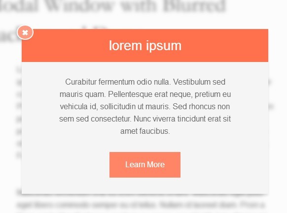
A tiny jQuery script to create a modal dialog box with blurred background transition effect based on CSS3 animation and keyframes.
See also:
How to use it:
1. Wrap your main content in a container with required CSS ID and classes.
<div id="overlay" class="cover blur-in">
  <div class="content">
    Your content goes here
  </div>
</div>
2. Create the content for the modal window.
<div class="pop-up">
<a href="#" class="close-button">✖</a>
Your modal content goes here.
</div>
3. The CSS to style the modal window.
.cover {
  height: 100%;
  width: 100%;
  position: absolute;
  z-index: 1;
}

.content {
  width: 650px;
  margin: 0 auto;
  padding-top: 100px;
}

.pop-up {
  position: fixed;
  margin: 5% auto;
  left: 0;
  right: 0;
  z-index: 2;
}

.box {
  background-color: whitesmoke;
  text-align: center;
  margin-left: auto;
  margin-right: auto;
  margin-top: 10%;
  position: relative;
  -webkit-box-shadow: 0px 4px 6px 0px rgba(0,0,0,0.1);
  -moz-box-shadow: 0px 4px 6px 0px rgba(0,0,0,0.1);
  box-shadow: 0px 4px 6px 0px rgba(0,0,0,0.1);
}

.close-button {
  transition: all 0.5s ease;
  position: absolute;
  background-color: #FF9980;
  padding: 1.5px 7px;
  left: 0;
  margin-left: -10px;
  margin-top: -9px;
  border-radius: 50%;
  border: 2px solid #fff;
  color: white;
  -webkit-box-shadow: -4px -2px 6px 0px rgba(0,0,0,0.1);
  -moz-box-shadow: -4px -2px 6px 0px rgba(0,0,0,0.1);
  box-shadow: -3px 1px 6px 0px rgba(0,0,0,0.1);
}

.close-button:hover {
  background-color: tomato;
  color: #fff;
}
4. The CSS3 rules to create blur animations.
.blur-in {
  -webkit-animation: blur 2s forwards;
  -moz-animation: blur 2s forwards;
  -o-animation: blur 2s forwards;
  animation: blur 2s forwards;
}

.blur-out {
  -webkit-animation: blur-out 2s forwards;
  -moz-animation: blur-out 2s forwards;
  -o-animation: blur-out 2s forwards;
  animation: blur-out 2s forwards;
}

@-webkit-keyframes
blur { 0% {
 -webkit-filter: blur(0px);
 -moz-filter: blur(0px);
 -o-filter: blur(0px);
 -ms-filter: blur(0px);
 filter: blur(0px);
}
 100% {
 -webkit-filter: blur(4px);
 -moz-filter: blur(4px);
 -o-filter: blur(4px);
 -ms-filter: blur(4px);
 filter: blur(4px);
}
}

@-moz-keyframes
blur { 0% {
 -webkit-filter: blur(0px);
 -moz-filter: blur(0px);
 -o-filter: blur(0px);
 -ms-filter: blur(0px);
 filter: blur(0px);
}
 100% {
 -webkit-filter: blur(4px);
 -moz-filter: blur(4px);
 -o-filter: blur(4px);
 -ms-filter: blur(4px);
 filter: blur(4px);
}
}

@-o-keyframes
blur { 0% {
 -webkit-filter: blur(0px);
 -moz-filter: blur(0px);
 -o-filter: blur(0px);
 -ms-filter: blur(0px);
 filter: blur(0px);
}
 100% {
 -webkit-filter: blur(4px);
 -moz-filter: blur(4px);
 -o-filter: blur(4px);
 -ms-filter: blur(4px);
 filter: blur(4px);
}
}

@keyframes
blur { 0% {
 -webkit-filter: blur(0px);
 -moz-filter: blur(0px);
 -o-filter: blur(0px);
 -ms-filter: blur(0px);
 filter: blur(0px);
}
 100% {
 -webkit-filter: blur(4px);
 -moz-filter: blur(4px);
 -o-filter: blur(4px);
 -ms-filter: blur(4px);
 filter: blur(4px);
}
}

@-webkit-keyframes
blur-out { 0% {
 -webkit-filter: blur(4px);
 -moz-filter: blur(4px);
 -o-filter: blur(4px);
 -ms-filter: blur(4px);
 filter: blur(4px);
}
 100% {
 -webkit-filter: blur(0px);
 -moz-filter: blur(0px);
 -o-filter: blur(0px);
 -ms-filter: blur(0px);
 filter: blur(0px);
}
}

@-moz-keyframes
blur-out { 0% {
 -webkit-filter: blur(4px);
 -moz-filter: blur(4px);
 -o-filter: blur(4px);
 -ms-filter: blur(4px);
 filter: blur(4px);
}
 100% {
 -webkit-filter: blur(0px);
 -moz-filter: blur(0px);
 -o-filter: blur(0px);
 -ms-filter: blur(0px);
 filter: blur(0px);
}
}

@-o-keyframes
blur-out { 0% {
 -webkit-filter: blur(4px);
 -moz-filter: blur(4px);
 -o-filter: blur(4px);
 -ms-filter: blur(4px);
 filter: blur(4px);
}
 100% {
 -webkit-filter: blur(0px);
 -moz-filter: blur(0px);
 -o-filter: blur(0px);
 -ms-filter: blur(0px);
 filter: blur(0px);
}
}

@keyframes
blur-out { 0% {
 -webkit-filter: blur(4px);
 -moz-filter: blur(4px);
 -o-filter: blur(4px);
 -ms-filter: blur(4px);
 filter: blur(4px);
}
 100% {
 -webkit-filter: blur(0px);
 -moz-filter: blur(0px);
 -o-filter: blur(0px);
 -ms-filter: blur(0px);
 filter: blur(0px);
}
}
5. Include the necessary jQuery library on the web page.
<script src="//code.jquery.com/jquery-1.11.1.min.js"></script>
6. The Javascript to popup the modal window on page load and blur the background.
$(function() {
  $('.pop-up').hide();
  $('.pop-up').fadeIn(1000);

  $('.close-button').click(function (e) {

  $('.pop-up').fadeOut(700);
  $('#overlay').removeClass('blur-in');
  $('#overlay').addClass('blur-out');
  e.stopPropagation();

  });
});
This awesome jQuery plugin is developed by jaeming. For more Advanced Usages, please check the demo page or visit the official website.