3D Flipping Sidebar Navigation With jQuery And CSS3
| File Size: | 5.39 KB |
|---|---|
| Views Total: | 5811 |
| Last Update: | |
| Publish Date: | |
| Official Website: | Go to website |
| License: | MIT |
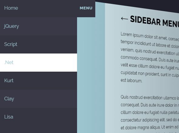
A fancy 3D site navigation concept that reveals a sidebar off-canvas menu by flipping the main content just like a 3D cube. Built using HTML, CSS/CSS3 and JavaScript(jQuery).
How to use it:
1. Create a nav list for the sidebar navigation.
<nav class="menu-activea">
  <h1>Menu</h1>
  <ul>
    <li>Home</li>
    <li>Blog</li>
    <li>Contact</li>
    <li>About</li>
  </ul>
</nav>
2. Create your own main content as these:
<main>
  <section>
    Main Content Here
  </section>
</main>
3. The main CSS/CSS3 styles.
nav, main {
  transition: -webkit-transform 150ms ease-out;
  transition: transform 150ms ease-out;
  transition: transform 150ms ease-out, -webkit-transform 150ms ease-out;
}

nav {
  z-index: 100;
  position: absolute;
  top: 0;
  left: 0;
  bottom: 0;
  width: 16em;
  background-color: #353441;
  -webkit-transform: translateX(-16em);
  transform: translateX(-16em);
}

nav.menu-active {
  -webkit-transform: translateX(0);
  transform: translateX(0);
}

nav.menu-hover {
  -webkit-transform: translateX(-15em);
  transform: translateX(-15em);
}

nav h1 {
  z-index: 100;
  display: block;
  position: absolute;
  top: 0;
  right: -60px;
  height: 60px;
  width: 60px;
  line-height: 60px;
  font-size: .8em;
  font-weight: 800;
  letter-spacing: 1px;
  color: #9DC6D1;
  text-transform: uppercase;
  text-align: center;
  background-color: #353441;
  cursor: pointer;
}

nav h1:hover {
  color: #353441;
  background: #fff;
}

nav ul {
  margin: 0;
  padding: 0;
}

nav li {
  display: inline-block;
  padding: 0 1em;
  width: 100%;
  height: 60px;
  color: #9DC6D1;
  line-height: 60px;
  background-color: #353441;
}

nav li:nth-of-type(2n) { background-color: #3a3947; }

nav li:hover { background: #fff; }

main {
  z-index: 0;
  position: absolute;
  top: 0;
  left: 0;
  bottom: 0;
  right: 0;
  display: flex;
  align-items: center;
  overflow: hidden;
  background-color: #9DC6D1;
  -webkit-transform-origin: 0% 50%;
  transform-origin: 0% 50%;
}

main:after {
  content: '';
  display: block;
  position: absolute;
  z-index: 1;
  top: 0;
  left: 0;
  bottom: 0;
  right: 0;
  background: linear-gradient(to right, rgba(0, 0, 0, 0), rgba(33, 33, 45, 0.5));
  visibility: hidden;
  opacity: 0;
  transition: opacity 150ms ease-out, visibility 0s 150ms;
}

main.menu-active {
  border-radius: .001px;
  -webkit-transform: translateX(16em) rotateY(15deg);
  transform: translateX(16em) rotateY(15deg);
}

main.menu-active:after {
  visibility: visible;
  opacity: 1;
  transition: opacity 150ms ease-out, visibility 0s;
}

main.menu-hover {
  border-radius: .001px;
  -webkit-transform: translateX(1em) rotateY(1deg);
  transform: translateX(1em) rotateY(1deg);
}

main section {
  position: absolute;
  top: 0;
  left: 0;
  bottom: 0;
  right: 0;
  margin: auto;
  padding: 1em 4em;
  max-width: 680px;
  overflow: auto;
  background-color: rgba(255, 255, 255, 0.5);
}
4. Load the needed JQuery library at the end of the document.
<script src="https://code.jquery.com/jquery-3.3.1.min.js"
        integrity="sha384-tsQFqpEReu7ZLhBV2VZlAu7zcOV+rXbYlF2cqB8txI/8aZajjp4Bqd+V6D5IgvKT"
        crossorigin="anonymous">
</script>
5. The main JavaScript to toggle CSS classes based on the current menu status.
(function() {

  var nav = $('nav'),
    menu = $('nav h1'),
    main = $('main'),
    open = false,
    hover = false;

  menu.on('click', function() {
    open = !open ? true : false;
    nav.toggleClass('menu-active');
    main.toggleClass('menu-active');
    nav.removeClass('menu-hover');
    main.removeClass('menu-hover');
    console.log(open);
  });
  menu.hover(
    function() {
      if (!open) {
        nav.addClass('menu-hover');
        main.addClass('menu-hover');
      }
    }, function() {
      nav.removeClass('menu-hover');
      main.removeClass('menu-hover');
    }
  );

})();
This awesome jQuery plugin is developed by J Scott Smith. For more Advanced Usages, please check the demo page or visit the official website.


