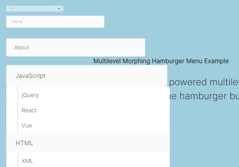
Animated Circle Menu with jQuery and CSS3
| File Size: | 1.89 KB |
|---|---|
| Views Total: | 52394 |
| Last Update: | |
| Publish Date: | |
| Official Website: | Go to website |
| License: | MIT |
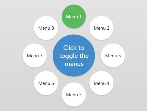
A jQuery plugin that makes uses of CSS3 transitions and transforms to create an animated circle menu around the toggle button.
See also:
- jQuery Plugin For Path-like Wheel Menu Button - Wheel Menu
- jQuery Plugin For Animated Circular Popup Gallery Plugin - popcircle
- Customizable Circle Menu Plugin with jQuery
- Create A Path-Like Circle Menu with jQuery and CSS3 - Path Buttons
- Simple Configurable Path Menu with jQuery & CSS3 - Pie Menu
How to use it:
1. Create a toggle button to open the circle menu.
<button>Click to toggle the menu</button>
2. Create a circle menu using Html unordered list.
<ul>
  <li>
    <input id="c1" type="checkbox">
    <label for="c1">Menu1</label>
  </li>
  <li>
    <input id="c2" type="checkbox">
    <label for="c2">Menu2</label>
  </li>
  <li>
    <input id="c3" type="checkbox">
    <label for="c3">Menu3</label>
  </li>
  <li>
    <input id="c4" type="checkbox">
    <label for="c4">Menu4</label>
  </li>
  <li>
    <input id="c5" type="checkbox">
    <label for="c5">Menu5</label>
  </li>
  <li>
    <input id="c6" type="checkbox">
    <label for="c6">Menu6</label>
  </li>
  <li>
    <input id="c7" type="checkbox">
    <label for="c7">Menu7</label>
  </li>
  <li>
    <input id="c8" type="checkbox">
    <label for="c8">Menu8</label>
  </li>
</ul>
3. And the wrap them into a wrapper element.
<div class="selector">

...

</div>
4. The CSS/CSS3 styles for the circle menu.
.selector,
.selector button {
  font-family: 'Oswald', sans-serif;
  font-weight: 300;
}

.selector button {
  position: relative;
  width: 100%;
  height: 100%;
  padding: 10px;
  background: #428bca;
  border-radius: 50%;
  border: 0;
  color: white;
  font-size: 20px;
  cursor: pointer;
  box-shadow: 0 3px 3px rgba(0, 0, 0, 0.1);
  transition: all .1s;
}

.selector button:hover { background: #3071a9; }

.selector button:focus { outline: none; }

.selector {
  position: absolute;
  left: 50%;
  top: 50%;
  width: 140px;
  height: 140px;
  margin-top: -70px;
  margin-left: -70px;
}

.selector ul {
  position: absolute;
  list-style: none;
  padding: 0;
  margin: 0;
  top: -20px;
  right: -20px;
  bottom: -20px;
  left: -20px;
}

.selector li {
  position: absolute;
  width: 0;
  height: 100%;
  margin: 0 50%;
  -webkit-transform: rotate(-360deg);
  transition: all 0.8s ease-in-out;
}

.selector li input { display: none; }

.selector li input + label {
  position: absolute;
  left: 50%;
  bottom: 100%;
  width: 0;
  height: 0;
  line-height: 1px;
  margin-left: 0;
  background: #fff;
  border-radius: 50%;
  text-align: center;
  font-size: 1px;
  overflow: hidden;
  cursor: pointer;
  box-shadow: none;
  transition: all 0.8s ease-in-out, color 0.1s, background 0.1s;
}

.selector li input + label:hover { background: #f0f0f0; }

.selector li input:checked + label {
  background: #5cb85c;
  color: white;
}

.selector li input:checked + label:hover { background: #449d44; }

.selector.open li input + label {
  width: 80px;
  height: 80px;
  line-height: 80px;
  margin-left: -40px;
  box-shadow: 0 3px 3px rgba(0, 0, 0, 0.1);
  font-size: 14px;
}
5. Include the latest version of jQuery javascript library from google CDN.
<script src="//ajax.googleapis.com/ajax/libs/jquery/1.11.1/jquery.min.js">
6. The Javascript to enable the circle menu with the rotation animation.
var nbOptions = 8; // number of menus
var angleStart = -360; // start angle

// jquery rotate animation
function rotate(li,d) {
  $({d:angleStart}).animate({d:d}, {
   step: function(now) {
    $(li)
      .css({ transform: 'rotate('+now+'deg)' })
      .find('label')
       .css({ transform: 'rotate('+(-now)+'deg)' });
   }, duration: 0
  });
}

// show / hide the options
function toggleOptions(s) {
  $(s).toggleClass('open');
  var li = $(s).find('li');
  var deg = $(s).hasClass('half') ? 180/(li.length-1) : 360/li.length;
  for(var i=0; i<li.length; i++) {
   var d = $(s).hasClass('half') ? (i*deg)-90 : i*deg;
   $(s).hasClass('open') ? rotate(li[i],d) : rotate(li[i],angleStart);
  }
}

$('.selector button').click(function(e) {
  toggleOptions($(this).parent());
});

setTimeout(function() { toggleOptions('.selector'); }, 100);
This awesome jQuery plugin is developed by MarcMalignan. For more Advanced Usages, please check the demo page or visit the official website.