jQuery Plugin For Path-like Wheel Menu Button - Wheel Menu
| File Size: | 14.6KB |
|---|---|
| Views Total: | 11476 |
| Last Update: | |
| Publish Date: | |
| Official Website: | Go to website |
| License: | MIT |
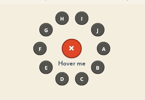
Wheel Menu is a simple and fancy jQuery plugin that allows to popup a path-like wheel menu with smooth animations when hovering over (or clicking) the menu button.
How to use it:
1. Load the latest jQuery javascript library and jQuery wheel menu plugin on your web page
<script src="http://ajax.googleapis.com/ajax/libs/jquery/1.10.2/jquery.min.js"></script>
<script type="text/javascript" src="jquery.wheelmenu.js"></script>
2. Create the html for the wheel menu. Using data-angel attribute to define the angel. You can also define it in javascript
<ul id="wheel"  data-angle="all">
<li class="item"><a href="#home">A</a></li>
<li class="item"><a href="#home">B</a></li>
<li class="item"><a href="#home">C</a></li>
<li class="item"><a href="#home">D</a></li>
<li class="item"><a href="#home">E</a></li>
<li class="item"><a href="#home">F</a></li>
<li class="item"><a href="#home">G</a></li>
<li class="item"><a href="#home">H</a></li>
<li class="item"><a href="#home">I</a></li>
<li class="item"><a href="#home">J</a></li>
</ul>
3. The CSS
.wheel-button, .wheel-button:visited {
line-height: 35px;
font-weight: bold;
font-size: 36px;
background: #df4727;
padding: 10px 11px;
text-align: center;
border-radius: 50px;
width: 35px;
height: 35px;
color: white;
display: block;
margin: 70px auto 20px;
border: 3px solid #92311e;
box-shadow: 0 1px 2px rgba(0,0,0,0.25);
-moz-box-shadow: 0 1px 2px rgba(0,0,0,0.25);
-webkit-box-shadow: 0 1px 2px rgba(0,0,0,0.25);
}
.wheel-button:hover {
color: white;
}
.wheel-button.ne {
border-color: white;
background: #1ABC9C;
color: #34FFFF;
position: absolute;
bottom: 10px;
left: 10px;
}
.wheel-button.nw {
border-color: white;
background-color: #E67E22;
color: #FFFC44;
position: absolute;
bottom: 10px;
right: 10px;
}
.wheel-button span, .wheel span {
position: relative;
-moz-transition: all 1s ease;
-webkit-transition: all 1s ease;
-o-transition: all 1s ease;
transition: all 1s ease;
display: block;
}
.wheel-button.active span {
transform: rotate(135deg);
-ms-transform: rotate(135deg); /* IE 9 */
-webkit-transform: rotate(135deg); /* Safari and Chrome */
}
.wheel li a, .wheel li a:visited {
background: rgba(0,0,0,0.65);
border-radius: 50px;
font-weight: bold;
padding: 10px;
text-align: center;
width: 20px;
height: 20px;
border: 1px solid black;
box-shadow: 0 1px 2px rgba(0,0,0,0.25), inset 0 1px 1px rgba(255,255,255,0.5);
-moz-box-shadow: 0 1px 2px rgba(0,0,0,0.25), inset 0 1px 1px rgba(255,255,255,0.5);
-webkit-box-shadow: 0 1px 2px rgba(0,0,0,0.25), inset 0 1px 1px rgba(255,255,255,0.5);
color: white;
-moz-transition: all 0.25s ease;
-webkit-transition: all 0.25s ease;
-o-transition: all 0.25s ease;
transition: all 0.25s ease;
}
.wheel li a:hover {
background: rgba(0,0,0,0.8);
}

/* Required Stylesheets */
.wheel-button {
position: relative;
}
.wheel {
margin: 0;
padding: 0;
list-style: none;
width: 200px; /* this will determine the diameter of the circle  */
height: 200px; /* this will determine the diameter of the circle  */
visibility: hidden;
position: relative;
display: none;
}
.wheel li {
overflow: hidden;
float: left;
}
.wheel li a {
display: block;
}
4. Call the plugin with options
<script>
$(document).ready(function(){
$(".wheel-button").wheelmenu({
trigger: "hover", // hover or click
animation: "fly", // fade or fly
angle: [0,360],
animationSpeed: "fast" // slow, medium, fast or instant
});
);
</script>
This awesome jQuery plugin is developed by peachananr. For more Advanced Usages, please check the demo page or visit the official website.