CSS3 & jQuery Based Off-canvas Navigation with Fullscreen Overlay
| File Size: | 3.21 KB |
|---|---|
| Views Total: | 10478 |
| Last Update: | |
| Publish Date: | |
| Official Website: | Go to website |
| License: | MIT |
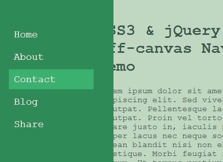
A fixed side off-canvas navigation that transforms into a transparent overlay covering the main content when toggled, powered by CSS3 transforms & transitions and a little jQuery magic.
How to use it:
1. Create an empty element for the vertical off-canvas navigation.
<div id="toggle"> </div>
2. Create a menu for the naivigation using Html unordered list.
<div class="menu closed">
  <ul>
    <li>Home</li>
    <li>About</li>
    <li>Contact</li>
    <li>Blog</li>
    <li>Share</li>
  </ul>
</div>
3. Create main content for your web page as shown below.
<div id="wrapper">
  <div class="content">
    <div class="text">
      Your content goes here
    </div>
  </div>
</div>
4. The core CSS/CSS3 rules to create the off-canvas navigation.
.menu {
  width: 250px;
  height: 100%;
  position: fixed;
  background-color: seagreen;
  -webkit-transition: all 1s;
  transition: all 1s;
  left: 0;
  z-index: 50;
  overflow-y: auto;
  padding-bottom: 100px;
}

.menu.closed { left: -250px; }

#toggle {
  background-color: seagreen;
  height: 100%;
  min-height: 100%;
  width: 50px;
  position: fixed;
  top: 0;
  bottom: 0;
  left: 0px;
  z-index: 25;
  -webkit-transition: all .7s ease;
  transition: all .7s ease;
}

#toggle:hover { cursor: pointer; }

#toggle.closed {
  left: 0px;
  top: 0;
  bottom: 0;
  right: 0;
  width: 100%;
  height: 100%;
  opacity: .3;
}

.content {
  width: 100%;
  height: 100%;
  margin-left: 0px;
  -webkit-transition: all .4s;
  transition: all .4s;
}

.content.closed .text {
  -webkit-transform: translateX(80px);
  -ms-transform: translateX(80px);
  transform: translateX(80px);
}

.text {
  width: 60%;
  margin: auto;
  -webkit-transition: all .4s ease;
  transition: all .4s ease;
  margin-top: 80px;
  margin-bottom: 80px;
}

.menu ul {
  list-style-type: none;
  padding: 0;
  margin: 85px 0 0 40px;
  padding-right: 40px;
}

.menu ul li {
  color: floralwhite;
  font-size: 20px;
  margin: 0 0 5px 0;
  display: block;
  height: 40px;
  line-height: 40px;
  padding-left: 10px;
  -webkit-transition: all .3s;
  transition: all .3s;
}

.menu ul li:hover {
  background-color: #3bb16f;
  cursor: pointer;
}

#wrapper {
  height: 100%;
  min-height: 100%;
  position: fixed;
  overflow-y: auto;
  top: 0;
  left: 0;
  right: 0;
  bottom: 0;
}

#wrapper.closed { position: fixed; }

 *::-moz-selection {
 background-color: #1b5233;
 color: floralwhite;
}

*::selection {
  background-color: #1b5233;
  color: floralwhite;
}
5. Include the necessary jQuery Javascript library at the bottom of your webpage.
<script src="//code.jquery.com/jquery-2.1.1.min.js"></script>
6. The Javascript to toggle CSS classes when the navigation toggled & closed.
$( "#toggle" ).click(function() {
  $(".menu").toggleClass("closed");
  $(this).toggleClass("closed");
  $(".content").toggleClass("closed");
  $("#wrapper").toggleClass("closed")
});
This awesome jQuery plugin is developed by rlacorne. For more Advanced Usages, please check the demo page or visit the official website.