Create An Apple-Like Navigation Menu with jQuery and CSS3
| File Size: | 90.5 KB |
|---|---|
| Views Total: | 4972 |
| Last Update: | |
| Publish Date: | |
| Official Website: | Go to website |
| License: | MIT |
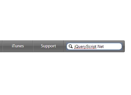
A horizontal navigation bar with sliding search input that duplicates the Apple.com's navigation menu, built on top of Javascript(jQuery), CSS3 and Html5.
How to use it:
1. Include the latest version of jQuery library in the html document.
<script src="http://ajax.googleapis.com/ajax/libs/jquery/1.11.1/jquery.min.js"></script>
2. Create the Html for the Apple-like navigation menu.
<header>
<nav>
<ul class="menu">
<li><a href="#"><span class="icon-house"></span></a></li>
<li><a href="#">Store</a></li>
<li><a href="#">Mac</a></li>
<li><a href="#">iPod</a></li>
<li><a href="#">iPhone</a></li>
<li><a href="#">iPad</a></li>
<li><a href="#">iTunes</a></li>
<li><a href="#">Support</a></li>
</ul>
<div class="search_bar"> <a href="#" class="icon-search"></a>
<input type="text" id="bar">
</div>
</nav>
</header>
3. The required CSS styles.
@font-face {
font-family: "Myriad Pro";
src: url(fonts/myriadpro/myriadpro.eot),  url(fonts/myriadpro/myriadpro.ttf),  url(fonts/myriadpro/myriadpro.woff);
}
* {
margin: 0;
padding: 0;
}
ul, ol {
list-style: none;
}
header {
width: 100%;
}
nav {
width: 1000px;
margin: 20px auto;
overflow: hidden;
border-radius: 4px;
border-bottom: 1px solid #555555;
background: #8b8b8b; /* Old browsers */
background: -moz-linear-gradient(top, #8b8b8b 0%, #6a6a6a 50%, #5e5e5e 51%, #717171 100%); /* FF3.6+ */
background: -webkit-gradient(linear, left top, left bottom, color-stop(0%, #8b8b8b), color-stop(50%, #6a6a6a), color-stop(51%, #5e5e5e), color-stop(100%, #717171)); /* Chrome,Safari4+ */
background: -webkit-linear-gradient(top, #8b8b8b 0%, #6a6a6a 50%, #5e5e5e 51%, #717171 100%); /* Chrome10+,Safari5.1+ */
background: -o-linear-gradient(top, #8b8b8b 0%, #6a6a6a 50%, #5e5e5e 51%, #717171 100%); /* Opera 11.10+ */
background: -ms-linear-gradient(top, #8b8b8b 0%, #6a6a6a 50%, #5e5e5e 51%, #717171 100%); /* IE10+ */
background: linear-gradient(to bottom, #8b8b8b 0%, #6a6a6a 50%, #5e5e5e 51%, #717171 100%); /* W3C */
 filter: progid:DXImageTransform.Microsoft.gradient( startColorstr='#8b8b8b', endColorstr='#717171', GradientType=0 ); /* IE6-9 */
}
.menu {
width: 85%;
display: table;
table-layout: fixed;
float: left;
transition: all .5s ease;
}
.menu li {
display: table-cell;
overflow: hidden;
width: 100%;
border-right: 1px solid #5c5c5c;
border-left: 1px solid rgba(255,255,255,.2);
}
.menu li:first-child {
border-left: none;
}
.menu li:first-child:hover {
border-left: none;
}
.menu li a {
color: #fff;
display: block;
font-family: "Myriad Pro";
font-size: 14px;
padding: 10px 0;
text-align: center;
text-decoration: none;
text-shadow: 1px 1px 0px rgba(0,0,0,.3);
}
.menu li:hover {
background: rgba(0,0,0,.3);
border-right: 1px solid transparent;
border-left: 1px solid transparent;
border-bottom: none;
}
.menu li:active {
background: rgba(0,0,0,.3);
box-shadow: inset 0px 3px 2px rgba(0,0,0,1);
}
.search_bar {
width: 15%;
float: left;
padding: 7px 10px;
box-sizing: border-box;
position: relative;
transition: all .5s ease;
}
.search_bar input {
width: 100%;
height: auto;
border-radius: 50px;
border: none;
border-bottom: 1px solid #858585;
padding: 0px 10px 0px 25px;
box-sizing: border-box;
height: 22px;
box-shadow: inset 0px 1px 3px rgba(0,0,0,.7);
background: #7e7e7e; /* Old browsers */
background: -moz-linear-gradient(top, #7e7e7e 0%, #797979 50%, #6e6e6e 51%, #767676 100%); /* FF3.6+ */
background: -webkit-gradient(linear, left top, left bottom, color-stop(0%, #7e7e7e), color-stop(50%, #797979), color-stop(51%, #6e6e6e), color-stop(100%, #767676)); /* Chrome,Safari4+ */
background: -webkit-linear-gradient(top, #7e7e7e 0%, #797979 50%, #6e6e6e 51%, #767676 100%); /* Chrome10+,Safari5.1+ */
background: -o-linear-gradient(top, #7e7e7e 0%, #797979 50%, #6e6e6e 51%, #767676 100%); /* Opera 11.10+ */
background: -ms-linear-gradient(top, #7e7e7e 0%, #797979 50%, #6e6e6e 51%, #767676 100%); /* IE10+ */
background: linear-gradient(to bottom, #7e7e7e 0%, #797979 50%, #6e6e6e 51%, #767676 100%); /* W3C */
 filter: progid:DXImageTransform.Microsoft.gradient( startColorstr='#7e7e7e', endColorstr='#767676', GradientType=0 ); /* IE6-9 */
}
.search_bar input:focus {
background: #fff;
box-shadow: none;
}
.icon-house {
display: block;
position: relative;
top: 2px;
}
.icon-search {
position: absolute;
bottom: 10px;
left: 15px;
color: #fff;
text-decoration: none;
}
5. The javascript.
var menu = $('.menu');
var barra_busqueda = $('.search_bar');
var bar = $('#bar');
var icono = $('.icon-search');

barra_busqueda.focusin(function(){
	barra_busqueda.css('width', '20%');
	menu.css('width', '80%');
	icono.css('color', '#000');
	bar.css('color', '#000');
});

barra_busqueda.focusout(function(){
	barra_busqueda.css('width', '15%');
	menu.css('width', '85%');
	icono.css('color', '#fff');
	bar.css('color', '#fff');
});
This awesome jQuery plugin is developed by falconmasters. For more Advanced Usages, please check the demo page or visit the official website.


