Facebook App-Style jQuery Side Mobile Menu Plugin
| File Size: | 4.13KB |
|---|---|
| Views Total: | 9726 |
| Last Update: | |
| Publish Date: | |
| Official Website: | Go to website |
| License: | MIT |
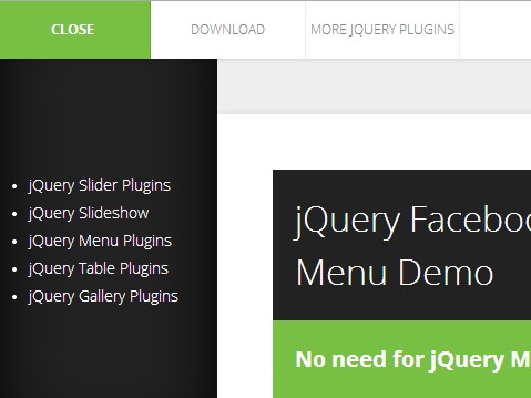
An ultra-light (~2kb unminified) jQuery menu plugin that make it easily to create responsive Facebook & Path App-style side menus on your mobile & desktop website. The side menu slides out from the left side of your web page and pushes the main content to the right.
See also:
Basic Usage:
1. Include the jQuery javascript library and jQuery facebook-style slide mobile menu on the web page.
<script src="http://ajax.googleapis.com/ajax/libs/jquery/1.10.2/jquery.min.js"></script>
<script type="text/javascript" src="js/slide-menu.js"></script>
2. Add the following HTML snippet to the <body> section of your webpage.
<!-- Mobile Header -->
<div class="mobile-header">
<ul class="clearfloat">
<li class="m-menu"> <a><span class="menu-open">Menu</span><span class="menu-close">Close</span></a> </li>
</ul>
</div>

<div id="container-outer">

<!-- Mobile Menu START -->
<div class="mobile-menu"> Menu content to go here </div>

<!-- Main Content -->
<div id="container">
<div id="container-inner">
Main content to go here
</div>
</div>
<div class="mobile-menu-bg"></div>
</div>
3. Add the following styles to your CSS file.
/* Layout */
#container-outer, #container {
width: 100%;
overflow: hidden;
display: block;
position: relative;
}
#container-inner {
max-width: 880px;
overflow: hidden;
display: block;
padding: 50px;
margin: 50px auto;
-webkit-box-shadow: 0px 0px 10px 0px rgba(0, 0, 0, 0.1);
box-shadow: 0px 0px 10px 0px rgba(0, 0, 0, 0.1);
background: #ffffff;
}
/* Mobile Menu */
.mobile-header {
line-height: 100%;
width: 100%;
display: block;
position: relative;
z-index: 30;
background: #ffffff;
z-index: 9999;
-webkit-box-shadow: 0px 0px 5px 0px rgba(0, 0, 0, 0.2);
box-shadow: 0px 0px 5px 0px rgba(0, 0, 0, 0.2);
}
.mobile-header ul {
margin: 0px;
padding: 0px;
z-index: 30;
list-style: none;
}
.mobile-header ul li {
float: left;
list-style: none;
margin: 0px;
padding: 0px;
position: relative;
z-index: 30;
width: 25%;
}
.mobile-header ul li a {
margin: 0px;
padding: 20px 0px;
width: auto;
display: block;
background: none;
text-align: center;
font-size: 12px;
line-height: 12px;
color: #888888;
cursor: pointer;
border-right: 1px solid #eeeeee;
font-family: 'Open Sans', sans-serif;
font-weight: 300;
text-transform: uppercase;
}
.mobile-header ul li.m-menu a {
font-weight: 700;
}
.mobile-header ul li a:hover, .mobile-header ul li.active, .mobile-header ul li.active a {
color: #ffffff;
background: #77c043;
}
.mobile-header ul li a:hover, .mobile-header ul li.active a {
border-right: 1px solid #63A832;
}
.mobile-header ul li a span.menu-open, .mobile-header ul li.active a span.menu-close {
display: inline;
}
.mobile-header ul li.active a span.menu-open, .mobile-header ul li a span.menu-close {
display: none;
}
/* Mobile Menu */
.mobile-menu {
/* background: #222222; */
margin: 0px;
padding: 30px;
width: 140px;
text-transform: none;
font-size: 12px;
position: absolute;
top: 72px;
bottom: 0px;
left: -200px; /* Hides Brief Menu Popup As JavaScript Loads */
z-index: 9998;
display: block;
height: 100%;
overflow: hidden;
color: #ffffff;
}
.mobile-menu.active {
height: auto;
overflow: visible;
}
.mobile-menu-bg {
background: #222222;
margin: 0px;
position: fixed;
width: 200px;
top: 0px;
bottom: 0px;
left: -200px; /* Hides Brief Menu Popup As JavaScript Loads */
z-index: 9997;
display: block;
height: 100%;
-webkit-box-shadow: inset 0px 0px 100px 0px rgba(0, 0, 0, 1);
box-shadow: inset 0px 0px 100px 0px rgba(0, 0, 0, 1);
}
.mobile-menu.active, .mobile-menu-bg.active {
display: block;
}
/* Floats */
.clearfloat:after {
content: "";
display: table;
clear: both;
}
This awesome jQuery plugin is developed by MartinKrestan. For more Advanced Usages, please check the demo page or visit the official website.


