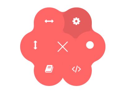
Fancy Ink Drop Menu With jQuery, CSS3 And SVG Fileters
| File Size: | 4.08 KB |
|---|---|
| Views Total: | 1986 |
| Last Update: | |
| Publish Date: | |
| Official Website: | Go to website |
| License: | MIT |
A jQuery & CSS3 based ink drop navigation menu for mobile that uses SVG filters for the gooey effect. Inspired by Łukasz Frankiewicz's Ink Drop Menu.
How to use it:
1. Create SVG based icons for the gooey menu.
<svg xmlns="http://www.w3.org/2000/svg" version="1.1" style="display: none;">
  <defs>
    <filter id="goo">
        <feGaussianBlur in="SourceGraphic" stdDeviation="6" result="blur" />
        <feColorMatrix in="blur" mode="matrix" values="1 0 0 0 0  0 1 0 0 0  0 0 1 0 0  0 0 0 17 -7" result="goo" />
        <feBlend in="SourceGraphic" in2="goo" />
    </filter>
    <symbol id="icon-camera" viewBox="0 0 24 24">
        <title>camera</title>
        <path class="path1" d="M7.125 14.25c0 2.692 2.183 4.875 4.875 4.875s4.875-2.183 4.875-4.875-2.183-4.875-4.875-4.875-4.875 2.183-4.875 4.875zM22.5 6h-5.25c-0.375-1.5-0.75-3-2.25-3h-6c-1.5 0-1.875 1.5-2.25 3h-5.25c-0.825 0-1.5 0.675-1.5 1.5v13.5c0 0.825 0.675 1.5 1.5 1.5h21c0.825 0 1.5-0.675 1.5-1.5v-13.5c0-0.825-0.675-1.5-1.5-1.5zM12 20.906c-3.676 0-6.656-2.98-6.656-6.656s2.98-6.656 6.656-6.656c3.676 0 6.656 2.98 6.656 6.656s-2.98 6.656-6.656 6.656zM22.5 10.5h-3v-1.5h3v1.5z"></path>
    </symbol>
    <symbol id="icon-bubble" viewBox="0 0 24 24">
        <title>bubble</title>
        <path class="path1" d="M12 1.5c6.627 0 12 4.365 12 9.75s-5.373 9.75-12 9.75c-0.636 0-1.261-0.041-1.871-0.118-2.578 2.578-5.654 3.040-8.629 3.108v-0.631c1.606-0.787 3-2.22 3-3.859 0-0.229-0.018-0.453-0.051-0.673-2.714-1.787-4.449-4.518-4.449-7.577 0-5.385 5.373-9.75 12-9.75z"></path>
    </symbol>
    <symbol id="icon-users" viewBox="0 0 24 24">
        <title>users</title>
        <path class="path1" d="M17.226 18.876c-0.444-0.070-0.454-1.281-0.454-1.281s1.305-1.281 1.59-3.004c0.765 0 1.238-1.831 0.473-2.476 0.032-0.678 0.984-5.324-3.834-5.324s-3.866 4.646-3.834 5.324c-0.765 0.644-0.293 2.476 0.473 2.476 0.284 1.723 1.59 3.004 1.59 3.004s-0.010 1.211-0.454 1.281c-1.431 0.226-6.774 2.562-6.774 5.124h18c0-2.562-5.343-4.898-6.774-5.124zM8.064 19.285c1.033-0.636 2.288-1.226 3.317-1.58-0.369-0.526-0.78-1.241-1.039-2.087-0.361-0.295-0.655-0.716-0.844-1.233s-0.261-1.098-0.202-1.633c0.042-0.384 0.152-0.742 0.32-1.057-0.102-1.092-0.174-3.235 1.229-4.798 0.544-0.606 1.232-1.042 2.055-1.305-0.147-1.518-0.918-3.299-3.901-3.299-4.818 0-3.866 4.646-3.834 5.324-0.765 0.644-0.293 2.476 0.473 2.476 0.284 1.723 1.59 3.004 1.59 3.004s-0.010 1.211-0.454 1.281c-1.431 0.226-6.774 2.562-6.774 5.124h7.725c0.11-0.072 0.223-0.144 0.339-0.215z"></path>
    </symbol>
    <symbol id="icon-heart" viewBox="0 0 24 24">
        <title>heart</title>
        <path class="path1" d="M24 8.394c0 2.024-0.872 3.844-2.261 5.106h0.011l-7.5 7.5c-0.75 0.75-1.5 1.5-2.25 1.5s-1.5-0.75-2.25-1.5l-7.489-7.5c-1.389-1.261-2.261-3.082-2.261-5.106 0-3.808 3.087-6.894 6.894-6.894 2.024 0 3.844 0.872 5.106 2.261 1.261-1.389 3.082-2.261 5.106-2.261 3.808 0 6.894 3.087 6.894 6.894z"></path>
    </symbol>
  </defs>
</svg>
2. The main html to create the gooey menu.
<div class="container">
<div class="header">
<div class="menu-button">
<div class="menu-button__bar"></div>
<div class="menu-button__bar"></div>
<div class="menu-button__bar"></div>
</div>
<div class="title">
<div class="title__default">
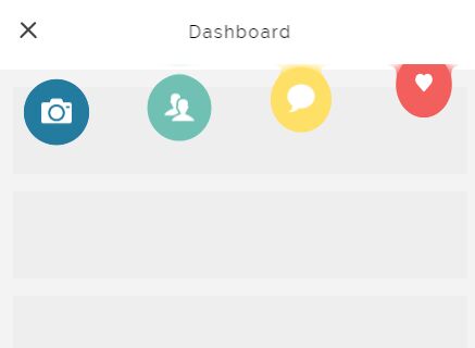
Dashboard
</div>
<div class="title__selected"></div>
</div>
<div class="gooey-wrapper">
<div class="header__bg"></div>
<div class="blender"></div>
<ul class="menu">
<li class="menu__item menu__item--blue" data-color="blue" data-name="Photos">
<a href="" class="menu__link">
<svg class="icon icon-camera"><use xlink:href="#icon-camera"></use></svg>
</a>
</li>
<li class="menu__item menu__item--green" data-color="green" data-name="Users">
<a href="" class="menu__link">
<svg class="icon icon-users"><use xlink:href="#icon-users"></use></svg>
</a>
</li>
<li class="menu__item menu__item--yellow" data-color="yellow" data-name="Messages">
<a href="" class="menu__link">
<svg class="icon icon-bubble"><use xlink:href="#icon-bubble"></use></svg>
</a>
</li>
<li class="menu__item menu__item--red" data-color="red" data-name="Likes">
<a href="" class="menu__link">
<svg class="icon icon-heart"><use xlink:href="#icon-heart"></use></svg>
</a>
</li>
</ul>
</div>
</div>
</div>
3. Add the following CSS/CSS3 snippets into your style section of existing CSS file.
[class^="icon-"], [class*=" icon-"] {
 display: inline-block;
 width: 1em;
 height: 1em;
 fill: currentColor;
}

.container {
  background: #f3f3f3;
  height: 80vh;
  width: 400px;
  overflow: hidden;
}

.title {
  z-index: 6;
  position: relative;
  width: 100%;
 letter-spacing: .1rem;
  text-align: center;
  height: 19px;
}

.title__default, .title__selected {
  position: absolute;
  left: 50%;
}

.title__default {
  transform: translate3d(-50%, 0, 0);
  transition: transform .2s ease, opacity .2s ease;
}

.title__selected {
  color: #fff;
  opacity: 0;
  transform: translate3d(-50%, 5px, 0);
  transition: transform .2s ease, opacity .2s ease;
}

.menu-button {
  z-index: 7;
  position: absolute;
  width: 20px;
  height: 20px;
  top: 52%;
  left: 1.5rem;
  transform: translate(0, -50%);
  cursor: pointer;
  transition: transform .3s ease;
}

.menu-button__bar {
  margin-bottom: 4px;
  height: 2px;
  background: #444444;
  border-radius: 40px;
  transition: transform .4s ease, opacity .4s ease, background .4s ease;
  transform-origin: 0 0;
}

.header {
  position: relative;
  height: 70px;
  background: #fff;
  display: flex;
  flex-wrap: wrap;
  justify-content: center;
  align-items: center;
}

.header__bg {
  z-index: 4;
  position: absolute;
  top: 0;
  left: 0;
  width: 100%;
  height: 70px;
  transform: scale(0, 1);
  opacity: 0;
  transition: transform .4s ease, opacity .2s .4s;
  transform-origin: 0 0;
}

.header__bg--blue { background: linear-gradient(to right, #247BA0, #247BA0 90%, #fff); }

.header__bg--green { background: linear-gradient(to right, #70C1B3, #70C1B3 90%, #fff); }

.header__bg--yellow { background: linear-gradient(to right, #FFE066, #FFE066 90%, #fff); }

.header__bg--red { background: linear-gradient(to right, #F25F5C, #F25F5C 90%, #fff); }

.header.open .menu-button__bar:nth-child(1) { transform: translate(0, 0) rotate(45deg); }

.header.open .menu-button__bar:nth-child(2) {
  transform: translate(10px, 0);
  opacity: 0;
}

.header.open .menu-button__bar:nth-child(3) { transform: translate(-2px, 2px) rotate(-45deg); }

.header.open .menu__item {
  transform: translate3d(0, 80px, 0) scale(1, 1);
  transition: transform .8s ease, opacity .3s;
}

.header.open .menu__item:hover:after {
  opacity: 1;
  transform: translate3d(0, 16px, 0);
}

.header.open .menu__item:nth-of-type(1) { transition-delay: 100ms; }

.header.open .menu__item:nth-of-type(1) .icon {
  transform: scale(1, 1);
  transition-delay: 325ms;
}

.header.open .menu__item:nth-of-type(2) { transition-delay: 200ms; }

.header.open .menu__item:nth-of-type(2) .icon {
  transform: scale(1, 1);
  transition-delay: 450ms;
}

.header.open .menu__item:nth-of-type(3) { transition-delay: 300ms; }

.header.open .menu__item:nth-of-type(3) .icon {
  transform: scale(1, 1);
  transition-delay: 575ms;
}

.header.open .menu__item:nth-of-type(4) { transition-delay: 400ms; }

.header.open .menu__item:nth-of-type(4) .icon {
  transform: scale(1, 1);
  transition-delay: 700ms;
}

.header.open .menu__item:nth-of-type(5) { transition-delay: 500ms; }

.header.open .menu__item:nth-of-type(5) .icon {
  transform: scale(1, 1);
  transition-delay: 825ms;
}

.header.selected .menu-button { transform: translate(-12px, -12px) rotate(180deg); }

.header.selected .menu-button__bar { background: #fff; }

.header.selected .menu-button__bar:nth-child(1) { transform: translate(0, -2px) rotate(45deg) scale(0.6, 1); }

.header.selected .menu-button__bar:nth-child(2) {
  transform: translate(10px, 0);
  opacity: 0;
}

.header.selected .menu-button__bar:nth-child(3) { transform: translate(-2px, 2px) rotate(-45deg) scale(0.6, 1); }

.header.selected .menu__item.active {
  transition: transform .8s ease, opacity .3s;
  transform: translate3d(0, -20px, 0) scale(1, 1);
}

.header.selected .menu__item:not(.active) {
  transition: transform .8s ease, opacity .3s;
  transform: scale(0.1, 0.1);
  opacity: 0;
  transition-delay: 0s;
}

.header.selected .gooey-wrapper { filter: none; }

.header.selected .title__default {
  opacity: 0;
  transform: translate3d(-50%, -10px, 0);
}

.header.selected .title__selected {
  opacity: 1;
  transform: translate3d(-50%, 0, 0);
  transition: transform .2s .1s ease, opacity .2s .1s ease;
}

.header.selected .header__bg {
  transform: scale(1.3, 1);
  opacity: 1;
  transition: transform .6s ease, opacity .3s .1s ease;
}

.header.selected .header__bg--blue {
  transform-origin: 10% 50%;
  background: linear-gradient(to right, #fff, #247BA0 20%, #247BA0 90%, #fff);
  background-position: -80px 0;
  background-size: 115% 100%;
}

.header.selected .header__bg--green {
  transform-origin: 40% 50%;
  background: linear-gradient(to right, #fff, #70C1B3 10%, #70C1B3 90%, #fff);
}

.header.selected .header__bg--yellow {
  transform-origin: 60% 50%;
  background: linear-gradient(to right, #fff, #FFE066 10%, #FFE066 90%, #fff);
}

.header.selected .header__bg--red {
  transform-origin: 90% 50%;
  background: linear-gradient(to right, #fff, #F25F5C 10%, #F25F5C 80%, #fff);
  background-size: 130% 100%;
}

.gooey-wrapper {
  position: absolute;
  top: 0;
  left: 0;
  -webkit-filter: url("#goo");
  filter: url("#goo");
  height: 130px;
  width: 100%;
}

.blender {
  z-index: 3;
  background: #fff;
  position: absolute;
  top: 0;
  left: 0;
  width: 100%;
  height: 65px;
}

.menu {
  position: relative;
  z-index: 2;
  list-style-type: none;
  margin: 0;
  padding: 0;
  display: flex;
  justify-content: space-around;
}

.menu__item {
  border-radius: 50%;
  transform: translate3d(0, -70px, 0) scale(0.1, 1);
  transform-origin: 50% 50%;
  transition: transform .8s ease, opacity .3s;
}

.menu__item:after {
  content: attr(data-name);
  position: absolute;
  bottom: 0;
  left: 0;
  width: 100%;
  text-align: center;
  opacity: 0;
  font-size: 10px;
  text-transform: uppercase;
  transform: translate3d(0, 10px, 0);
  transition: transform .2s ease, opacity .2s ease;
}

.menu__item--blue { background: #247BA0; }

.menu__item--green { background: #70C1B3; }

.menu__item--yellow { background: #FFE066; }

.menu__item--red { background: #F25F5C; }

.menu__link {
  display: block;
  width: 60px;
  height: 60px;
  text-align: center;
  color: #fff;
}

.menu .icon {
 margin-top: .9rem;
  height: 28px;
  width: 28px;
  transition: transform .3s ease;
  transform: scale(0, 0);
}
4. Link to the needed jQuery library.
<script src="//code.jquery.com/jquery-3.0.0.min.js"></script>
5. The jQuery script to toggle the CSS styles.
$(function() {

  var header = $('.header'),
    headerBg = $('.header__bg'),
    menuButton = $('.menu-button'),
    menuItems = $('.menu__item'),
    titleSelected = $('.title__selected');

  menuButton.on('click', function() {
    $(this).toggleClass('close');
    header.toggleClass('open');
    header.removeClass('selected');
    menuItems.removeClass('active');
    if (header.hasClass('open')) {
      headerBg.removeClass(function(index, css) {
        return (css.match(/(^|\s)header__bg--\S+/g) || []).join(' ');
      })
    }
  });

  $('.menu__item').on('click', function(evt) {
    evt.preventDefault();
    evt.stopPropagation();
    $(this).addClass('active');
    header.addClass('selected');
    headerBg.addClass('header__bg--' + $(this).data('color'));
    titleSelected.html($(this).data('name'));
  });
});
This awesome jQuery plugin is developed by ispal. For more Advanced Usages, please check the demo page or visit the official website.