Fixed Morphing App Navigation - Droplet Menu
| File Size: | 2.87 KB |
|---|---|
| Views Total: | 2470 |
| Last Update: | |
| Publish Date: | |
| Official Website: | Go to website |
| License: | MIT |
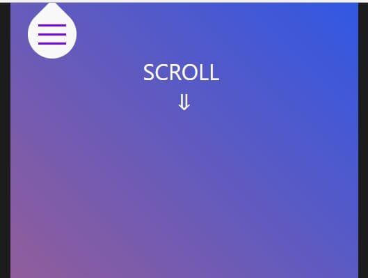
A fixed morphing app navigation written in jQuery/CSS3 that makes the hamburger menu toggle always be fixed on scroll, with a fancy droplet animation.
The Droplet Menu morphs the hamburger menu toggle into a full page navigation menu on click.
How to use it:
1. Create the droplet toggle button.
<nav>
  <div id="drop">
    <div>
      <span></span>
      <span></span>
      <span></span>
    </div>
  </div>
</nav>
2. Create the app navigation.
<ul>
  <li>Home</li>
  <li>Portfolio</li>
  <li>Jobs</li>
  <li>Contact</li>
  <li>About</li>
</ul>
3. The main CSS/CSS3 styles.
#drop, nav { background-color: #f8f8f8 }

nav {
  width: 90%;
  height: 90px;
  padding: 0 5%;
  position: relative;
  justify-content: flex-start;
  align-items: center
}

nav~ul {
  position: absolute;
  flex-direction: column;
  justify-content: center;
  align-items: center;
  left: 1%;
  right: 1%;
  opacity: 0;
  visibility: hidden;
  z-index: 2;
  list-style: none;
  transition: 0s
}

nav~ul>li {
  color: #70f;
  padding: 10px;
  cursor: pointer;
  font-size: 30px
}

nav~ul>li:hover { filter: brightness(200%) }

nav.open~ul {
  transition: .75s ease-in-out;
  visibility: visible;
  opacity: 1
}

#drop {
  cursor: pointer;
  position: fixed;
  width: 70px;
  height: 70px;
  border-radius: 0 50% 50%;
  transform: rotate(45deg);
  transition: border-radius .5s
}

nav.open>#drop {
  transition: .5s ease-in-out;
  box-shadow: 0 0 0 1000px #f8f8f8, inset 0 0 0 20px #f8f8f8;
  position: relative
}

#drop.active {
  border-radius: 50%;
  animation: drop .3s forwards
}

#drop>div {
  transform: rotate(-45deg);
  height: 100%;
  width: 100%;
  flex-direction: column;
  justify-content: center;
  align-items: center
}

#drop span {
  display: block;
  background-color: #70f;
  width: 40px;
  height: 3px;
  margin: 5px 0;
  transition: .5s
}

#drop span.open:nth-child(1) { transform: rotate(45deg) translate(5px, 5px) }

#drop span.open:nth-child(2) { transform: rotate(-45deg) translate(5px, -5px) }

#drop span.open:nth-child(3) { opacity: 0 }

@keyframes
drop { 0% {
transform:translateY(0) rotate(45deg)
}
50% {
transform:translateY(30px) rotate(45deg)
}
100% {
transform:translateY(10px) rotate(45deg)
}
}
4. Load the latest jQuery library at the end of the document.
<script src="https://code.jquery.com/jquery-3.3.1.slim.min.js"
        integrity="sha384-q8i/X+965DzO0rT7abK41JStQIAqVgRVzpbzo5smXKp4YfRvH+8abtTE1Pi6jizo"
        crossorigin="anonymous">
</script>
5. Activate the droplet animation on scroll.
$(window).scroll(function() {
  var scroll = $(window).scrollTop();
  if (scroll > 100) $('#drop').addClass('active');
  else if (scroll < 80) $('#drop').removeClass('active');
});
6. Activate the morphint navigation.
$('#drop, nav ~ ul li').click(function() {
  $('nav, #drop span').toggleClass('open');
  $('body').toggleClass('hidden');
  $(window).scrollTop(0);
});
This awesome jQuery plugin is developed by nodediggity. For more Advanced Usages, please check the demo page or visit the official website.