Responsive Dropdown Navigation Bar In jQuery - flxMenu
| File Size: | 37.6 KB |
|---|---|
| Views Total: | 5833 |
| Last Update: | |
| Publish Date: | |
| Official Website: | Go to website |
| License: | MIT |
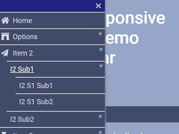
This is a responsive, flexible, multi-level dropdown (off-canvas) navigation menu plugin built in with jQuery.
When the viewport's width is less than 600px the navbar will turn into a toggle button. If you push the button a popup menu will slide in from the right/left/top.
When the bar has focus, you can use the "Arrow" keys to navigate through the menu. The [ESC]-button will close the popup menu.
More Examples:
How to use it:
1. Include the main stylesheet and a theme CSS in the header of the webpage.
<!-- Core -->
<link href="flxMenu.css" rel="stylesheet">
<!-- Dark Theme -->
<link href="flxMenu_ThemeDark.css" rel="stylesheet">
<!-- Light Theme -->
<link href="flxMenu_ThemeBright.css" rel="stylesheet">
2. Create the multi-level dropdown navigation from a nested HTML list.
<div id="NavBar">
  <div id="Trigger" >
  </div>
  <ul id="menu">
    <li><a href="javascript:">Home</a></li>
    <li><a href="javascript:">Category</a>
      <ul>
        <li><a href="javascript:">Category 1</a></li>
        <li><a href="javascript:">Category 2</a></li>
      </ul>
    </li>
    <li><a href="javascript:">Item 3</a>
      <ul>
        <li><a href="javascript:">Item 3-1</a>
        <ul>
          <li><a href="javascript:">Item 3-1-1</a></li>
          <li><a href="javascript:">Item 3-1-2</a></li>
        </ul>
        </li>
        <li><a href="javascript:">Item 3-2</a>
        <ul>
          <li><a href="javascript:">Item 3-2-1</a></li>
          <li><a href="javascript:">Item 3-2-2</a></li>
        </ul>
        </li>

      </ul>
    </li>
    <li><a href="javascript:">Contact</a>
      <ul>
        <li><a href="javascript:">Contact</a></li>
        <li><a href="javascript:">About</a></li>
      </ul>
    </li>
  </ul>
</div>
3. Include jQuery library and the main JavaScript jquery.flxMenu.min.js at the bottom of the page.
<script src="https://code.jquery.com/jquery-3.3.1.min.js"
        integrity="sha384-tsQFqpEReu7ZLhBV2VZlAu7zcOV+rXbYlF2cqB8txI/8aZajjp4Bqd+V6D5IgvKT"
        crossorigin="anonymous"></script>
<script src="jquery.flxMenu.min.js"></script>
4. Call the function on the top container and specify the trigger element.
$(document).ready(function(){
  $("#menu").flxMenu( $("#Trigger"), {
    // options here
  });
});
5. All possible options which can be passed as the second parameter to the flxMenu function.
$(document).ready(function(){
  $("#menu").flxMenu( $("#Trigger"), {

    // time in ms to open submenu
    duration: 300,

    // orientation of the navigation bar in desktop mode
    // "horizontal" or "vertical"
    orientation: "horizontal",

    // in desktop mode submenu will not show up on hover but on clicking the main item.
    smShowByClick: false,

    // popup menu slides in from top, left or right hand side
    puSlideInFrom: "top",

    // popup menu closes when item is selected.
    puCloseOnSelect: false,

    // when popup menu opens, any submenu which contains the active item will be opened.
    puShowActiveItem: false,

    // popup menu aligned to trigger DIV
    puAligned: false,

    // is fullscreen?
    puFullRange: true,

    // class which identifies submenu tags (UL or DIV)
    smFilterClass: false,

    // special handling for different frameworks
    framework: false,

    // debug mode
    debug: false,

    fnChanged: function (toButton, $newFrame, $oldFrame) {___flxMenuDebug(true, 'Moved bar from {1} to {0}', $newFrame[0].id, $oldFrame[0].id);},
    fnInit: function(menuFrame, buttonFrame){},
    fnSubmenuClosing: function($submenu){ ___flxMenuDebug(true, 'closing submenu of <{0} id="{1}">', $submenu[0].nodeName, $submenu.attr("id")); },
    fnPopupShowing: function(showup){ ___flxMenuDebug(true, 'Popup showing {0} ', showup);}

  });
});
Changelog:
2018-09-14
- JS & CSS update
This awesome jQuery plugin is developed by LTS-Tools. For more Advanced Usages, please check the demo page or visit the official website.


