Fullscreen Hamburger Toggle Menu With jQuery And CSS3
| File Size: | 6.56 KB |
|---|---|
| Views Total: | 5371 |
| Last Update: | |
| Publish Date: | |
| Official Website: | Go to website |
| License: | MIT |
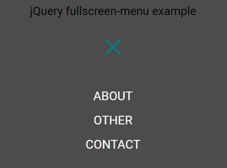
A cross-platform side navigation written in jQuery and CSS/CSS3 that allows to show a fullscreen overlay menu with an animated hamburger toggle icon.
How to use it:
1. The html for the hamburger toggle icon.
<div id="nav-icon">

  <span></span>
  <span></span>
  <span></span>

</div>
2. Style & animate the toggle icon.
#nav-icon {
  position: relative;
  margin: 0 auto;
  width: 45px;
  height: 40px;
  z-index: 10;
  /* Bring icon ontop of overlay */
  cursor: pointer;
  -webkit-transform: rotate(0deg);
  transform: rotate(0deg);
  -webkit-transition: .5s ease-in-out;
  transition: .5s ease-in-out;
}

#nav-icon span {
  position: absolute;
  display: block;
  width: 100%;
  height: 4px;
  background: teal;
  border-radius: 9px;
  opacity: 1;
  left: 0;
  -webkit-transform: rotate(0deg);
  transform: rotate(0deg);
  -webkit-transition: .25s ease-in-out;
  transition: .25s ease-in-out;
}

#nav-icon span:nth-child(1) {
  top: 0px;
}

#nav-icon span:nth-child(2) {
  top: 18px;
}

#nav-icon span:nth-child(3) {
  top: 36px;
}

#nav-icon.animate-icon span:nth-child(1) {
  top: 18px;
  -webkit-transform: rotate(135deg);
  transform: rotate(135deg);
}

#nav-icon.animate-icon span:nth-child(2) {
  opacity: 0;
  left: -60px;
}

#nav-icon.animate-icon span:nth-child(3) {
  top: 18px;
  -webkit-transform: rotate(-135deg);
  transform: rotate(-135deg);
}
3. Create the fullscreen overlay menu:
<div id="overlay">

  <div>

    <ul>
      <li><a href="#">Home</a></li>
      <li><a href="#">Abou</a></li>
      <li><a href="#">Contact</a></li>
    </ul>

  </div>

</div>
4. The primary CSS/CSS3 styles for the fullscreen overlay menu.
#overlay {
  display: -webkit-box;
  display: -ms-flexbox;
  display: flex;
  /* Overlay positioning */
  display: none;
  position: absolute;
  left: 0;
  top: 0;
  width: 100%;
  /* Want a left- or right sided navigation instead? Just play around with the width! */
  height: 100%;
  background: rgba(0, 0, 0, 0.7);
}

#overlay div {
  display: -webkit-box;
  display: -ms-flexbox;
  display: flex;
  width: 100%;
  height: 100vh;
  -webkit-box-pack: center;
  -ms-flex-pack: center;
  justify-content: center;
  -webkit-box-align: center;
  -ms-flex-align: center;
  align-items: center;
}

#overlay ul {
  list-style: none;
  margin: 0;
  padding: 0;
  color: white;
  text-align: center;
}
5. The fullscreen overlay menu requires the latest version of jQuery library loaded in the document.
<script src="//code.jquery.com/jquery-3.1.1.min.js"></script>
6. The JavaScript to toggle the hamburger-icon animation and add the fullscreen-menu overlay when clicked.
$(document).ready(function(){
  $('#nav-icon').click(function(){
    $(this).toggleClass('animate-icon');
    $('#overlay').fadeToggle();
  });
});
7. The JavaScript to close the fullscreen overlay menu and reset hamburger-icon.
$(document).ready(function(){
  $('#overlay').click(function(){
    $('#nav-icon').removeClass('animate-icon');
    $('#overlay').toggle();
  });
});
This awesome jQuery plugin is developed by Mbensler. For more Advanced Usages, please check the demo page or visit the official website.