Fullscreen Mobile Navigation Menu with jQuery and CSS3
| File Size: | 2.18 KB |
|---|---|
| Views Total: | 5531 |
| Last Update: | |
| Publish Date: | |
| Official Website: | Go to website |
| License: | MIT |
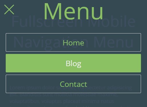
A mobile friendly responsive navigation menu with an animated hamburger toggle that uses CSS3 transitions for menu transition effects and a bit of jQuery script to toggle CSS classes.
How to use it:
1. Create a hamburger toggle for the mobile navigation.
<div id="toggle"><span></span></div>
2. Create the html for the mobile navigation.
<div id="menu"><span id="title">Menu</span>
  <ul>
    <li><a href="#"><span>Home</span></a></li>
    <li><a href="#"><span>Blog</span></a></li>
    <li><a href="#"><span>Contact</span></a></li>
  </ul>
</div>
3. Style & animate the hamburger toggle using CSS & CCS3 transforms.
#toggle {
  position: fixed;
  z-index: 3;
  width: 2.85714em;
  height: 2.85714em;
  top: 0;
  left: 0;
  margin: 15px 0 0 15px;
  cursor: pointer;
}

#toggle span {
  display: block;
  position: absolute;
  width: 100%;
  height: 0.2em;
  margin: 1.25em 0 0 0;
  background: #eee;
  -webkit-transition: 350ms ease all;
  -moz-transition: 350ms ease all;
  transition: 350ms ease all;
}

#toggle span:before,
#toggle span:after {
  content: " ";
  position: absolute;
  width: 100%;
  height: 0.2em;
  background: #eee;
  -webkit-transition: 350ms ease all;
  -moz-transition: 350ms ease all;
  transition: 350ms ease all;
}

#toggle span:before { margin: -1em 0 0 0; }

#toggle span:after { margin: 1em 0 0 0; }

#toggle.open span { background-color: transparent; }

#toggle.open span:before,
#toggle.open span:after {
  margin: 0;
  background: #8BC163;
}

#toggle.open span:before {
  -webkit-transform: rotate(135deg);
  -moz-transform: rotate(135deg);
  transform: rotate(135deg);
}

#toggle.open span:after {
  -webkit-transform: rotate(-135deg);
  -moz-transform: rotate(-135deg);
  transform: rotate(-135deg);
}
4. Style the mobile navigation.
#menu {
  visibility: hidden;
  opacity: 0;
  position: fixed;
  z-index: 2;
  width: 100%;
  height: 100%;
  top: 0;
  left: 0;
  text-align: center;
  background: rgba(44,62,80,0.9);
  -webkit-transform: scale(1.5);
  -moz-transform: scale(1.5);
  transform: scale(1.5);
  -webkit-transition: 350ms ease all;
  -moz-transition: 350ms ease all;
  transition: 350ms ease all;
}

#menu.opened {
  visibility: visible;
  opacity: 1;
  -webkit-transform: scale(1);
  -moz-transform: scale(1);
  transform: scale(1);
  -webkit-transition: 350ms ease all;
  -moz-transition: 350ms ease all;
  transition: 350ms ease all;
}

#menu span#title {
  display: block;
  line-height: 1em;
  margin: 0 0 0.5em 0;
  font-size: 5em;
  color: #8BC163;
}

#menu ul {
  list-style: none;
  margin: 0 auto;
}

#menu ul li {
  display: block;
  width: 90%;
  height: 65px;
  margin: 0 auto 0.5em auto;
}

#menu ul li:after {
  content: " ";
  position: absolute;
  width: 0%;
  height: 65px;
  margin: -65px 0 0 5%;
  left: 0;
  background: #8BC163;
  border-radius: 0.25em;
  -webkit-transition: 350ms ease all;
  -moz-transition: 350ms ease all;
  transition: 350ms ease all;
}

#menu ul li:hover:after { width: 90%; }

#menu ul li a {
  position: relative;
  z-index: 4;
  display: block;
  width: 100%;
  height: 65px;
  line-height: 65px;
  margin: 0 auto;
  color: #8BC163;
  text-decoration: none;
  border: 1px solid #ddd;
  border-radius: 0.2em;
  -webkit-transition: 350ms ease all;
  -moz-transition: 350ms ease all;
  transition: 350ms ease all;
}

#menu ul li a:hover {
  color: #eee;
  border-color: #8BC163;
}

#menu ul li a span { font-size: 1.66667em; }

#menu ul li a i {
  position: absolute;
  padding: 0 1.25em 0 0;
  font-size: 2em;
}
5. Include the jQuery JavaScript library on the web page.
<script src="//code.jquery.com/jquery-2.1.4.min.js"></script>
6. The JavaScript to toggle CSS classes.
$("#toggle").click(function() {
  $(this).toggleClass("open");
  $("#menu").toggleClass("opened");
});
This awesome jQuery plugin is developed by 3lv3n_snip3r. For more Advanced Usages, please check the demo page or visit the official website.