Fullscreen Responsive Overlay Menu Framework with jQuery
| File Size: | 406 KB |
|---|---|
| Views Total: | 6031 |
| Last Update: | |
| Publish Date: | |
| Official Website: | Go to website |
| License: | MIT |
This is a lightweight, cross-platform, responsive overlay menu framework that helps you create a nice, fullscreen navigation menu with CSS3 and jQuery powered animations.
Basic usage:
1. Include the required Ionicons icon font in the head section of the document.
<link rel="stylesheet" href="/path/to/ionicons.min.css">
2. Create a multi-column overlay menu as follow.
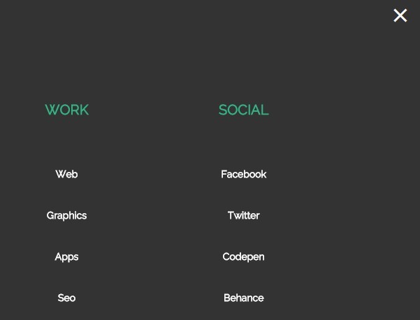
<div class="overlay">
  <div class="menu">
    <ul>
      <li><a href="#">About</a>
        <ul>
          <li><a href="#">About Company</a></li>
          <li><a href="#">Designers</a></li>
          <li><a href="#">Developers</a></li>
        </ul>
      </li>
      <li><a href="#">Services</a>
        <ul>
          <li><a href="#">Web design</a></li>
          <li><a href="#">Development</a></li>
          <li><a href="#">Apps</a></li>
          <li><a href="#">Graphic Design</a></li>
          <li><a href="#">Seo</a></li>
        </ul>
      </li>
      <li><a href="#">Work</a>
        <ul>
          <li><a href="#">Web</a></li>
          <li><a href="#">Graphics</a></li>
          <li><a href="#">Apps</a></li>
          <li><a href="#">Seo</a></li>
        </ul>
      </li>
      <li><a href="#">Social</a>
        <ul>
          <li><a href="#">Facebook</a></li>
          <li><a href="#">Twitter</a></li>
          <li><a href="#">Codepen</a></li>
          <li><a href="#">Behance</a></li>
          <li><a href="#">Dribbble</a></li>
        </ul>
      </li>
    </ul>
  </div>
</div>
3. Create a hamburger button to toggle the overlay menu.
<div class="menu-btn">
  <a class="btn-open" href="javascript:void(0)"></a>
</div>
4. Style the hamburger button.
.menu-btn {
  position: absolute;
  top: 6px;
  right: 20px;
  z-index: 999;
  display: inline;
  font-size: 32px;
}

.menu-btn a {
  display: inline-block;
  text-decoration: none;/* safari hack */
}

.btn-open:after {
  color: #333;
  content: "\f394";
  font-family: "Ionicons";
  -webkit-transition: all .2s linear 0s;
  -moz-transition: all .2s linear 0s;
  -o-transition: all .2s linear 0s;
  transition-property: all .2s linear 0s;
}

.btn-open:hover:after { color: #34B484; }

.btn-close:after {
  color: #fff;
  content: "\f2d7";
  font-family: "Ionicons";
  -webkit-transition: all .2s linear 0s;
  -moz-transition: all .2s linear 0s;
  -o-transition: all .2s linear 0s;
  transition-property: all .2s linear 0s;
}

.btn-close:hover:after { color: #34B484; }

@media screen and (max-width: 768px) {

.menu-btn { right: 25px; }

}
5. Style the overlay menu.
.overlay {
  position: fixed;
  top: 0;
  z-index: 99;
  display: none;
  overflow: auto;
  width: 100%;
  height: 100%;
  background: #333;
}

.overlay .menu {
  margin: 10% auto;
  width: 80%;
}

.overlay .menu ul {
  margin: 0;
  padding: 0;
  width: 100%;
}

.overlay .menu ul li {
  float: left;
  padding: 20px 0;
  width: 25%;
  list-style: none;
  text-align: center;
  text-transform: uppercase;
}

.overlay .menu ul li a {
  color: #34B484;
  font-weight: bold;
  font-size: 20px;
}

.overlay .menu ul ul { margin-top: 50px; }

.overlay .menu ul ul li {
  position: relative;
  float: none;
  margin: 0;
  width: 100%;
  border: 0;
}

.overlay .menu ul ul li a {
  color: #fff;
  text-transform: capitalize;
  font-weight: bold;
  font-size: 14px;
}

.overlay .menu ul ul li a:hover { color: #34b484; }

@media screen and (max-width: 768px) {

.overlay .menu ul li {
  float: none;
  margin-bottom: 50px;
  width: 100%;
  border-bottom: 1px solid #575757;
}

.overlay .menu ul li:last-child { border: 0; }

.overlay .menu ul ul { margin-top: 20px; }

}
6. Include jQuery library and the responsive-overlay-menu.js script at the bottom of the webpage.
<script src="//code.jquery.com/jquery-2.1.4.min.js"></script>
<script src="js/responsive-overlay-menu.js"></script>
About Author:
Author: marioloncarek
Homepage: https://github.com/marioloncarek/responsive-overlay-menu
This awesome jQuery plugin is developed by marioloncarek. For more Advanced Usages, please check the demo page or visit the official website.