Lightweight jQuery Mobile Collapsible Menu - Mobile Navigation
| File Size: | 46.1KB |
|---|---|
| Views Total: | 8127 |
| Last Update: | |
| Publish Date: | |
| Official Website: | Go to website |
| License: | MIT |
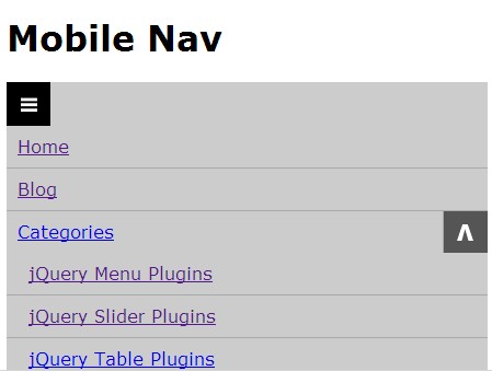
Mobile Navigation is a simple, responsive and mobile first jQuery menu plugin that converts a multi-level menu into a collapsible drop down navigation menu at mobile devices.
How to use it:
1. Include the basic CSS and theme CSS on your page.
<link rel="stylesheet" href="css/mnav.css" />
<link rel="stylesheet" href="css/mnav-theme.css" />
2. Create the html for a responsive navigation menu.
<nav id="demo">
<ul>
<li><a href="https://www.jqueryscript.net/">Home</a></li>
<li><a href="https://www.jqueryscript.net/blog/">Blog</a></li>
<li>
<a href="#">Categories</a>
<ul>
<li><a href="https://www.jqueryscript.net/menu/">jQuery Menu Plugins</a></li>
<li><a href="https://www.jqueryscript.net/slider/">jQuery Slider Plugins</a></li>
<li><a href="https://www.jqueryscript.net/table/">jQuery Table Plugins</a></li>
</li>
</ul>
</nav>
3. Include the jQuery library and jQuery Mobile Navigation on the page.
<script src="http://ajax.googleapis.com/ajax/libs/jquery/1.10.2/jquery.min.js"></script>
<script type="text/javascript" src="js/mnav.js"></script>
4. Call the plugin with options.
<script type="text/javascript">
$(function() {
$('#demo').Mnav({
theme:'mnav-theme'
mainMenuSpeed: 200, // How fast will the main menu slide down?
subMenuSpeed: 200, // How fast will the sub menu slide down?
delayCloseSpeed: 250, // How long to wait before the dropdown closes
mobileButtonPos: 'right', // Which side will the button be?
subMenuOpen: false, // Sub Menu open by default?
});
});
</script>
5. Change the styles via CSS or create a new theme to suit your needs.
This awesome jQuery plugin is developed by koralarts. For more Advanced Usages, please check the demo page or visit the official website.


