Minimal Sliding Mobile Menu With jQuery And CSS3
| File Size: | 2.59 KB |
|---|---|
| Views Total: | 8187 |
| Last Update: | |
| Publish Date: | |
| Official Website: | Go to website |
| License: | MIT |
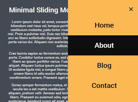
Just another jQuery & CSS implementation of the mobile-friendly sliding off-canvas navigation menu that uses CSS3 animations for the smooth slide in effect. jQuery is used only to toggle the CSS classes as you open / close the menu.
How to use it:
1. Create the mobile menu with a hamburger toggle button on the webpage.
<header>
  <div class="mobile-nav-button">
    <div class="mobile-nav-button__line"></div>
    <div class="mobile-nav-button__line"></div>
    <div class="mobile-nav-button__line"></div>
  </div>

  <nav class="mobile-menu">
    <ul>
      <li><a>Home</a></li>
      <li><a>About</a></li>
      <li><a>Blog</a></li>
      <li><a>Contact</a></li>
    </ul>
  </nav>
</header>
2. The primary CSS/CSS3 styles for the mobile menu.
.mobile-menu {
  display: block;
  max-width: 500px;
  width: 100%;
  right: -100%;
  height: 100vh;
  background: #fcb852;
  position: absolute;
  z-index: 9998;
  transition: 0.6s ease;
  top: 0;
  opacity: 0;
}

.mobile-menu ul {
  position: relative;
  top: 50%;
  transform: translateY(-50%);
  padding: 0;
}

.mobile-menu ul li { list-style: none; }

.mobile-menu ul li a {
  width: 100%;
  max-width: 1200px;
  margin: 0 auto;
  display: block;
  text-align: center;
  text-decoration: none;
  color: #0e0e0e;
  font-size: 3rem;
  font-weight: bold;
  overflow: hidden;
  position: relative;
}

.mobile-menu ul li a:after {
  content: '';
  background: #0e0e0e;
  width: 100%;
  height: 100%;
  position: absolute;
  right: -100%;
  top: 0;
  z-index: -1;
  transition: 0.4s ease;
}

.mobile-menu ul li a:hover { color: #fff; }

.mobile-menu ul li a:hover:after { right: 0; }

.mobile-menu img {
  position: absolute;
  width: 150px;
  display: block;
  left: 50%;
  top: 3rem;
  transform: translatex(-50%);
  padding: 0;
  text-align: center;
}

.mobile-menu--open {
  right: 0;
  opacity: 1;
}
3. Style and animate the hamburger toggle button.
.mobile-nav-button {
  width: 35px;
  position: absolute;
  margin: 2rem;
  right: 0;
  top: 0;
  z-index: 9999;
  cursor: pointer;
  width: 35px;
  height: 30px;
}

.mobile-nav-button .mobile-nav-button__line {
  width: 100%;
  height: 4px;
  background: #0e0e0e;
  position: relative;
  transition: 1s ease;
}

.mobile-nav-button .mobile-nav-button__line:nth-of-type(2) { margin: 0.5rem 0; }

.mobile-nav-button .mobile-nav-button__line--1 {
  transform: rotate(45deg);
  top: 13px;
  position: absolute;
}

.mobile-nav-button .mobile-nav-button__line--2 { display: none; }

.mobile-nav-button .mobile-nav-button__line--3 {
  transform: rotate(135deg);
  top: 13px;
  position: absolute;
}
4. Include the slim build of the latest jQuery library at the bottom of the webpage.
<script src="//code.jquery.com/jquery-3.1.1.slim.min.js"></script>
5. The main JavaScript (jQuery script) to toggle the CSS classes as you click on the hamburger toggle button.
$('.mobile-nav-button').on('click', function() {
  $( ".mobile-nav-button .mobile-nav-button__line:nth-of-type(1)" ).toggleClass( "mobile-nav-button__line--1");
  $( ".mobile-nav-button .mobile-nav-button__line:nth-of-type(2)" ).toggleClass( "mobile-nav-button__line--2");
  $( ".mobile-nav-button .mobile-nav-button__line:nth-of-type(3)" ).toggleClass( "mobile-nav-button__line--3");

  $('.mobile-menu').toggleClass('mobile-menu--open');
  return false;
});
This awesome jQuery plugin is developed by dbridgman. For more Advanced Usages, please check the demo page or visit the official website.