Mobile-first Fullscreen Navigation Plugin With jQuery - Snavvy
| File Size: | 6.27 KB |
|---|---|
| Views Total: | 4638 |
| Last Update: | |
| Publish Date: | |
| Official Website: | Go to website |
| License: | MIT |
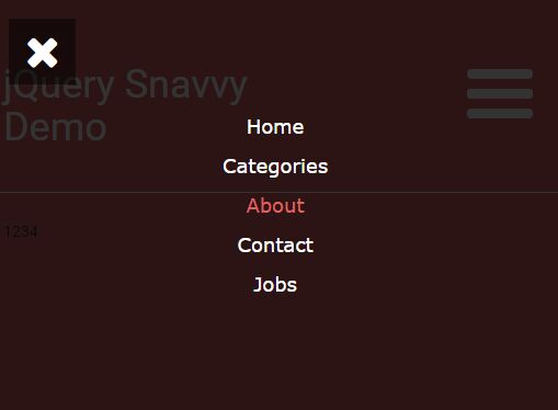
Snavvy is a lightweight and simple-to-use jQuery plugin for creating a mobile-friendly navigation that slides out a fullscreen, off-canvas menu covering the whole page when toggled.
How to use it:
1. To get started, you need to load jQuery library and the jQuery Snavvy plugin's JS & CSS files in the webpage.
<link href="snavvy.css" rel="stylesheet" type="text/css">
<script src="//code.jquery.com/jquery.min.js"></script>
<script src="snavvy.js"></script>
2. Create a menu toggle link and the insert it together with the menu items into your webpage. In this case, we're going to use Font Awesome 4 for the menu toggle icons.
<ul class = "fullmenu">
  <li>
    <a id="snavvy">
    <div id="nav-icon">
      <i class="fa fa-menu">
    </div>
    </a>
  </li>
  <div class="snavvy-links" id="snavvy-links">
    <ul class="links">
      <li> <a href=""> Home </a> </li>
      <li> <a href=""> About </a> </li>
      <li> <a href=""> Contact </a> </li>
    </ul>
  </div>
</ul>
3. Initialize the plugin and done.
$('#snavvy').snavvy({
  menuItems: '#snavvy-links'
});
4. All plugin settings with default values.
$('#snavvy').snavvy({

  // 100%
  width: 100,

  // left, right, top, bottom
  location: 'right',

  // parent container
  parent: 'body',

  // true or false
  close: 'true',

  // selector for menu items
  menuItems: null

});
Change log:
2016-08-25
- v1.0.2
This awesome jQuery plugin is developed by djstaff. For more Advanced Usages, please check the demo page or visit the official website.


