Mobile-first Pull-down Navigation with jQuery and CSS3
| File Size: | 2.33 KB |
|---|---|
| Views Total: | 2655 |
| Last Update: | |
| Publish Date: | |
| Official Website: | Go to website |
| License: | MIT |
A jQuery & CSS3 powered mobile-friendly navigation that slides out from the top of your webpage when toggled.
How to use it:
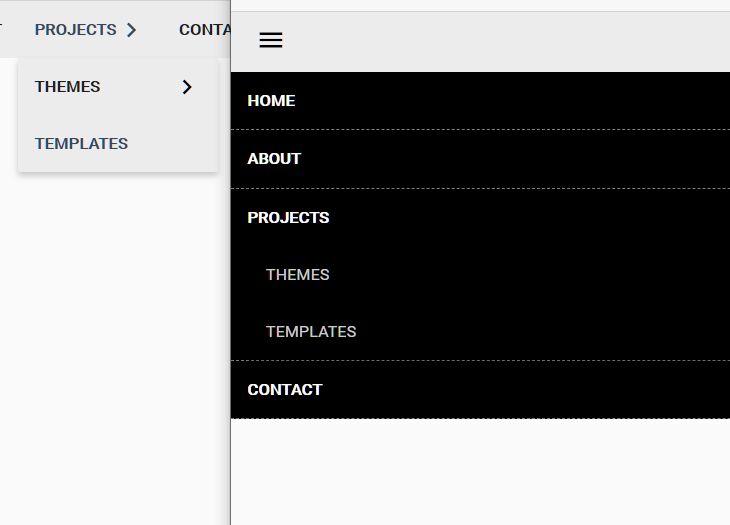
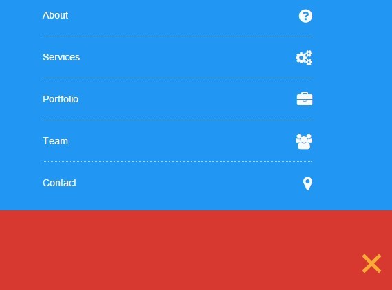
1. Create a top navigation using html unorder list.
<ul class="top-nav">
  <li><a href="#">Home</a></li>
  <li><a href="#about">About</a></li>
  <li><a href="#services">Services</a></li>
  <li><a href="#portfolio">Portfolio</a></li>
  <li><a href="#team">Team</a></li>
  <li><a href="#contact">Contact</a></li>
</ul>
2. Create a hamburger button to toggle the navigation menu.
<a id="nav-toggle" class="nav_slide_button" href="#"><span></span></a>
3. Primary CSS / CSS3 styles for the navigation menu.
nav ul {
  list-style: none;
  list-style-image: none;
}

nav {
  background-color: #fbaa35;
  margin-top: -1px;
}

nav ul {
  list-style: none;
  padding: 0;
}

nav ul li {
  color: #fafafa;
  display: block;
  border-bottom: 1px dotted rgba(255, 255, 255, 0.6);
  transition: all 0.5s ease;
  -moz-transition: all 0.5s ease;
  -webkit-transition: all 0.5s ease;
  -o-transition: all 0.5s ease;
  padding-left: 0;
  position: relative;
}

nav ul li:last-child { border: none; }

nav ul li a {
  color: #fafafa;
  display: block;
  padding: 20px;
  transition: all 0.5s ease;
  -moz-transition: all 0.5s ease;
  -webkit-transition: all 0.5s ease;
  -o-transition: all 0.5s ease;
  padding-left: 0;
  position: relative;
}

nav ul li a:hover,
nav ul li a:focus {
  text-decoration: none;
  color: #d73930;
}
4. Style the hamburger toggle.
#nav-toggle {
  position: absolute;
  right: 16px;
}

#nav-toggle {
  cursor: pointer;
  padding: 10px 35px 16px 0px;
}

#nav-toggle span,
#nav-toggle span:before,
#nav-toggle span:after {
  cursor: pointer;
  border-radius: 1px;
  -moz-border-radius: 1px;
  -webkit-border-radius: 1px;
  -o-border-radius: 1px;
  height: 5px;
  width: 35px;
  background: #fafafa;
  position: absolute;
  display: block;
  content: '';
}

#nav-toggle span:before { top: -10px; }

#nav-toggle span:after { bottom: -10px; }

#nav-toggle span,
#nav-toggle span:before,
#nav-toggle span:after {
  transition: all 500ms ease-in-out;
  -webkit-transition: all 500ms ease-in-out;
  -moz-transition: all 500ms ease-in-out;
  -o-transition: all 500ms ease-in-out;
}

#nav-toggle.active span { background-color: transparent; }

#nav-toggle.active span:before,
#nav-toggle.active span:after { top: 0; }

#nav-toggle.active span:before {
  transform: rotate(45deg);
  -webkit-transform: rotate(45deg);
  -ms-transform: rotate(45deg);
  background: #fbaa35;
}

#nav-toggle.active span:after {
  transform: translateY(-10px) rotate(-45deg);
  -webkit-transform: translateY(-10px) rotate(-45deg);
  -ms-transform: translateY(-10px) rotate(-45deg);
  top: 10px;
  background: #fbaa35;
}
5. The jQuery script to enable the navigation menu. Add the following JavaScript snippet after jQuery library.
(function ($) {

  $(document).ready(function (){

    $(window).load(function() {

      $('.nav_slide_button').click(function() {
        $('.pull').slideToggle();
      });

    });

    document.querySelector("#nav-toggle").addEventListener("click", function() {
      this.classList.toggle("active");
    });

  });

}(window.jQuery || window.$));
This awesome jQuery plugin is developed by iznogoud_cr. For more Advanced Usages, please check the demo page or visit the official website.