Multi-level Responsive Toggle Navigation Plugin For jQuery
| File Size: | 7.97 KB |
|---|---|
| Views Total: | 4187 |
| Last Update: | |
| Publish Date: | |
| Official Website: | Go to website |
| License: | MIT |
responsive-menu.js is a lite jQuery menu plugin for converting a normal multi-level navigation into a sliding toggle menu if the screen width is below 768px.
How to use it:
1. Include the jQuery library and jQuery responsive-menu.js script at the end of your web page.
<script src="http://ajax.googleapis.com/ajax/libs/jquery/1.11.0/jquery.min.js"></script>
<script src="js/responsive-menu.js"></script>
2. Include the responsive-menu.css in the head of the web page. You can modify or override the CSS file yourself by adding your own styles.
<link rel="stylesheet" href="css/responsive-menu.css" />
3. Create a multi-level navigation menu using nested unordered lists.
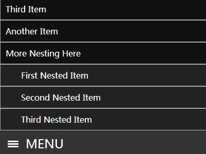
<div id="menu-container">
<ul class="menu">
<li><a href="#">First Item</a></li>
<li><a href="#">Second Item</a></li>
<li> <a href="#">Third Item</a>
<ul>
<li><a href="#">First Nested Item</a></li>
<li><a href="#">Second Nested Item</a></li>
<li><a href="#">Third Nested Item</a></li>
</ul>
</li>
<li><a href="#">Another Item</a></li>
<li> <a href="#">More Nesting Here</a>
<ul>
<li><a href="#">First Nested Item</a></li>
<li><a href="#">Second Nested Item</a></li>
<li><a href="#">Third Nested Item</a></li>
</ul>
</li>
</ul>
4. Create a toggle to trigger the responsive navigation that only appears in smaller screen devices.
<a href="#" class="trigger">Menu</a> </div>
5. Initialize the plugin by calling the function on document ready.
<script>
$(document).ready(function(){
$('#menu-container').responsiveMenu();
});
</script>
This awesome jQuery plugin is developed by SoupBowlWeb. For more Advanced Usages, please check the demo page or visit the official website.


