Collapsed Resonponsive Menu For Bootstrap - Greedy Menu
| File Size: | 3.18 KB |
|---|---|
| Views Total: | 5153 |
| Last Update: | |
| Publish Date: | |
| Official Website: | Go to website |
| License: | MIT |
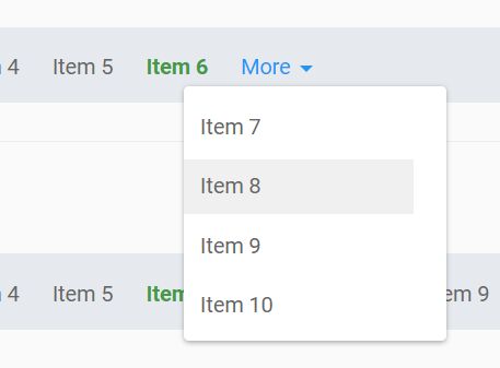
The Greedy Menu jQuery plugin makes use of Bootstrap's dropdown component to create a fully responsive navigation menu for your cross-platform, content-heavy web app.
The plugin automatically moves overflowing menu items into a 'More' dropdown menu depending on the screen size. Works both Bootstrap 3 and Bootstrap 4.
Basic usage:
1. Include jQuery library and Bootstrap 4 (or Bootstrap 3) framework on the web page.
<link rel="stylesheet" href="/path/to/bootstrap.min.css">
<script src="https://code.jquery.com/jquery-3.3.1.min.js"
        integrity="sha384-tsQFqpEReu7ZLhBV2VZlAu7zcOV+rXbYlF2cqB8txI/8aZajjp4Bqd+V6D5IgvKT"
        crossorigin="anonymous">
</script>
<script src="/path/to/bootstrap.min.js"></script>
2. Create a regular html list for the navigation menu.
<ul>
  <li>Item 1</li>
  <li>Item 2</li>
  <li>Item 3</li>
  <li>Item 4</li>
  <li>Item 5</li>
  ...
</ul>
3. Download and place the jQuery Greedy Menu plugin's script after jQuery. That's it.
<script src="greedy-menu.js"></script>
Changelog:
2020-08-07
- Update greedy-menu.js
This awesome jQuery plugin is developed by briantweed. For more Advanced Usages, please check the demo page or visit the official website.


