Responsive Sticky Side Menu Plugin For jQuery - Bamboo.js
| File Size: | 6.71 KB |
|---|---|
| Views Total: | 7952 |
| Last Update: | |
| Publish Date: | |
| Official Website: | Go to website |
| License: | MIT |
Bamboo.js is a tiny jQuery plugin helps you create a responsive, mobile-friendly, sticky toggle menu for your website.
Features:
- Transform a regular menu into an off-canvas side menu with a hamburger toggle.
- Click on the toggle icon to show/hide the side menu.
- Swipe to reveal the side menu on touch devices.
- Stick the hamburger toggle to the top of your webpage.
- Custom breakpoint to trigger the responsive side menu.
How to use it:
1. Include the required bamboo.css in the head section of the document.
<link rel="stylesheet" href="css/bamboo.css">
2. Create a list of items for the side menu.
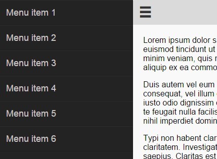
<nav id="main-nav" class="navigation overflow">
  <ul>
    <li><a href="#">Menu item 1</a></li>
    <li><a href="#">Menu item 2</a></li>
    <li><a href="#">Menu item 3</a></li>
    <li><a href="#">Menu item 4</a></li>
    <li><a href="#">Menu item 5</a></li>
    <li><a href="#">Menu item 6</a></li>
  </ul>
</nav>
3. Wrap your main content with the hamburger toggle into the '#container' as follow.
<div id="container">
<header class="primary"> <span class="open icon">☰</span>
<hgroup>
<h1>Page Title</h1>
</hgroup>
</header>
<section id="scroller" class="overflow">
<div id="content">
<!-- Content goes in here -->
</div>
</section>
</div>
4. Include jQuery library and the jQuery Bamboo.js at the end of the document.
<script src="//code.jquery.com/jquery-2.1.3.min.js"></script>
<script src="js/bamboo.0.1.js"></script>
5. Initialize the plugin.
var site = new Bamboo();
6. Available options.
menu: true,
swipeToOpen: true,
breakpoint: 768, // custom breakpoint
menuWidth: 265,
headerHeight: 50,
snapThreshold: null,
resize: function(){
  // function to call on page resize/orientation change
}
This awesome jQuery plugin is developed by andrewsg21. For more Advanced Usages, please check the demo page or visit the official website.


