Simple Clean Responsive Mobile Toggle Menu Plugin For jQuery
| File Size: | 25.2 KB |
|---|---|
| Views Total: | 27735 |
| Last Update: | |
| Publish Date: | |
| Official Website: | Go to website |
| License: | MIT |
A simple clean, alternative, responsive jQuery navigation plugin that converts a standard menu into a drop down toggle menu on mobile devices. Works with modern browsers that support CSS3 media queries.
How to use it:
1. Include the required menu.css file in the page and change the break point in the CSS3 media queries as per your needs.
<link rel="stylesheet" href="assets/css/menu.css" type="text/css"/>
2. Create a mobile toggle menu using normal <ul> <li> elements.
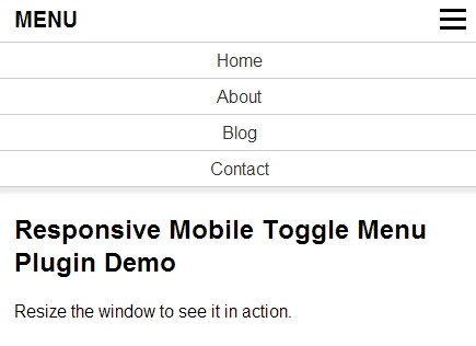
<nav class="mainMenu">
<label for="toggleMenu" class="menuTitle">MENU</label>
<input type="checkbox" id="toggleMenu" />
<ul class="menu">
<li><a href="#">Home</a></li>
<li><a href="#">About</a></li>
<li><a href="#">Blog</a></li>
<li><a href="#">Contact</a></li>
</ul>
</nav>
3. Include the jQuery javascript library at the end of the page.
<script src="http://ajax.googleapis.com/ajax/libs/jquery/1.11.0/jquery.min.js"></script>
4. The jQuery script.
function responsiveMenu() {
	$('.menuTitle').click(function () {
		$('.menu').slideToggle("slow");
		$('.menu').css({"max-height":"800px"});
	});
};

$(function() {
	$(".menu").css({"display":"none","transition":"none","max-height":"inherit"});
	$("#toggleMenu").remove();
	responsiveMenu();
});
Change logs:
2015-06-02
- fix bug in safari on select boxes
v2.2 (2015-01-28)
- update.
- add more demos.
v1.2 (2014-09-30)
- support for children
v1.2 (2014-08-23)
- Added function to force close the menu after clicking a menu link
v1.1 (2014-03-26)
- fixes
This awesome jQuery plugin is developed by daniellevautier. For more Advanced Usages, please check the demo page or visit the official website.


