Simple Mobile Push Menu With jQuery and TweenMax.js
| File Size: | 16.8 KB |
|---|---|
| Views Total: | 16355 |
| Last Update: | |
| Publish Date: | |
| Official Website: | Go to website |
| License: | MIT |
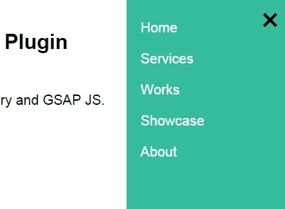
A simple mobile push menu that reveal an off-canvas side menu with a hamburger toggle button, build on top of jQuery and GSAP JS library.
How to use it:
1. Create a hamburger button to toggle the mobile menu.
<div class="hamburger">
  <div class="hamburger-inner">
    <div class="bar bar1 hide"></div>
    <div class="bar bar2 cross"></div>
    <div class="bar bar3 cross hidden"></div>
    <div class="bar bar4 hide"></div>
  </div>
</div>
2. Style & position the hamburger button on click.
.hamburger {
  position: fixed;
  top: 0;
  right: 0;
  float: right;
  margin: 10px;
  padding: 10px 10px 9px;
  cursor: pointer;
  z-index: 99999;
  display: block
}

.hamburger .hamburger-inner {
  position: relative;
  height: 21px;
  width: 25px;
  display: block;
  overflow: hidden;
  margin: 0;
  padding: 0
}

.hamburger .bar {
  width: 25px;
  height: 3px;
  background: #000;
  position: absolute;
  top: 0
}

.hamburger .bar.bar2,
.hamburger .bar.bar3 { top: 9px }

.hamburger .bar.bar4 { top: 18px }

.hamburger.open .bar1,
.hamburger.open .bar4 { display: none }

.hamburger.open .bar2,
.hamburger.open .bar3 { height: 4px }
3. Create a mobile push menu from an unordered Html list.
<div class="mobile-menu">
  <div class="mobile-menu-inner">
    <ul>
      <li>Home</li>
      <li>Services</li>
      <li>Works</li>
      <li>Showcase</li>
      <li>About</li>
    </ul>
  </div>
</div>
4. Style the mobile menu in the CSS.
.mobile-menu {
  position: fixed;
  top: 0;
  right: 0;
  opacity: 0;
  display: block;
  width: 240px;
  height: 100%;
  color: #fff;
  background-color: #34bc9d;
  z-index: -100;
  overflow-y: scroll;
  -webkit-overflow-scrolling: touch
}

.mobile-menu .mobile-menu-inner {
  width: 200px;
  padding: 20px 20px 60px
}

.mobile-menu ul {
  margin: 0 0 25px;
  padding: 0
}

.mobile-menu ul li {
  list-style: none;
  padding: 10px 0;
}
5. Load jQuery library, TweenMax.js and the jQuery JV Mobile Menu's script in the document.
<script src="//ajax.googleapis.com/ajax/libs/jquery/1.11.2/jquery.min.js"></script>
<script src="//cdnjs.cloudflare.com/ajax/libs/gsap/1.15.0/TimelineMax.min.js"></script>
<script src="js/jv-jquery-mobile-menu-min.js"></script>
6. Call the plugin on the body tag to enable the mobile push menu.
$('body').jvmobilemenu({

// selector to click outside menu to close
notMenuClick: $('.page'),

// speed to open and close menu
slideSpeed: 0.3,

// width of the mobile menu
menuWidth: 240

});
Change logs:
2015-09-24
- Fixes
2015-07-31
- v2.3
2015-02-14
- fixes.
2015-02-06
- fixes.
This awesome jQuery plugin is developed by juliusvaart. For more Advanced Usages, please check the demo page or visit the official website.