Slick Fullscreen Navigation Menu with CSS3 and jQuery
| File Size: | 3.97 KB |
|---|---|
| Views Total: | 3761 |
| Last Update: | |
| Publish Date: | |
| Official Website: | Go to website |
| License: | MIT |
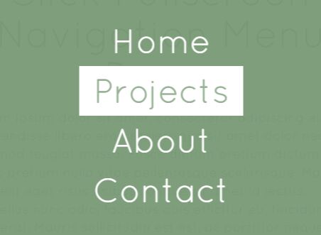
A CSS / CSS3 only fullscreen navigation menu with a pretty slick morphing animation, jQuery is used to toggle CSS classes as the users click on the hamburger menu toggler.
How to use it:
1. Create a menu toggle button on the webpage.
<button class="menu-toggle"></button>
2. Create a navigation menu for your website & web application.
<nav>
  <ul class="menu">
    <li>Home</li>
    <li>Blog</li>
    <li>About</li>
    <li>Contact</li>
  </ul>
</nav>
3. The CSS styles for the menu toggle button.
button {
  opacity: 0.6;
  background-color: transparent;
  position: fixed;
  z-index: 2;
  top: 24px;
  left: 24px;
  border: none;
  width: 36px;
  height: 30px;
  outline: none;
  -webkit-transition: opacity 0.2s ease-out;
  transition: opacity 0.2s ease-out;
}

button:before {
  content: "";
  position: absolute;
  top: 0;
  right: 0;
  bottom: 0;
  left: 0;
  margin: auto;
  right: auto;
  width: 100%;
  background: -webkit-linear-gradient(top, #98B296, #98B296 20%, transparent 20%, transparent 40%, #98B296 40%, #98B296 60%, transparent 60%, transparent 80%, #98B296 80%, #98B296 100%);
  background: linear-gradient(to bottom, #98B296, #98B296 20%, transparent 20%, transparent 40%, #98B296 40%, #98B296 60%, transparent 60%, transparent 80%, #98B296 80%, #98B296 100%);
  -webkit-transition: opacity 0.2s ease-out, width 0.2s 0.2s ease-out;
  transition: opacity 0.2s ease-out, width 0.2s 0.2s ease-out;
}

button:after {
  opacity: 0;
  content: '×';
  color: white;
  position: absolute;
  top: 16px;
  left: -4px;
  font-family: Arial, sans-serif;
  font-size: 76px;
  line-height: 0;
  -webkit-transition: opacity 0.4s ease-out;
  transition: opacity 0.4s ease-out;
}

button:active {
  -webkit-transform: translateY(2px);
  transform: translateY(2px);
}

button:hover { opacity: 1; }

.open button { opacity: 1; }

.open button:before {
  opacity: 0;
  width: 0;
}

.open button:after {
  opacity: 1;
  -webkit-transform: translate3d(0, 0, 0) rotate(360deg);
  transform: translate3d(0, 0, 0) rotate(360deg);
  -webkit-transition: opacity 0.4s 1s ease-out, -webkit-transform 0.4s 1s ease-out;
  transition: opacity 0.4s 1s ease-out, -webkit-transform 0.4s 1s ease-out;
  transition: transform 0.4s 1s ease-out, opacity 0.4s 1s ease-out;
  transition: transform 0.4s 1s ease-out, opacity 0.4s 1s ease-out, -webkit-transform 0.4s 1s ease-out;
}
4. The CSS styles for the navigation menu.
nav {
  z-index: 1;
  position: fixed;
  top: -100%;
  right: 0;
  bottom: 0;
  left: 0;
  width: 100%;
  height: 100%;
  -webkit-transform: translate3d(0, 0, 0);
  transform: translate3d(0, 0, 0);
  -webkit-backface-visibility: hidden;
  backface-visibility: hidden;
  overflow: hidden;
}

nav:before {
  content: '';
  position: absolute;
  top: 0;
  right: 0;
  bottom: 0;
  left: 0;
  margin: auto;
  background: rgba(123, 156, 121, 0.98);
  width: 100%;
  height: 0;
  padding-bottom: 100%;
  border-radius: 100%;
  -webkit-transform: scale(0.04), translateY(9999px);
  transform: scale(0.04), translateY(9999px);
  overflow: hidden;
}

.open nav { top: 0; }

.open nav:before {
  -webkit-animation: menu-animation 0.8s ease-out forwards;
  animation: menu-animation 0.8s ease-out forwards;
}

ul.menu {
  position: absolute;
  top: 50%;
  left: 50%;
  -webkit-backface-visibility: hidden;
  backface-visibility: hidden;
  -webkit-perspective: 1000;
  perspective: 1000;
  -webkit-transform: translate3d(-50%, -50%, 0);
  transform: translate3d(-50%, -50%, 0);
  color: white;
}

ul.menu li {
  opacity: 0;
  text-align: center;
  -webkit-transform: translate3d(0, 36px, 0);
  transform: translate3d(0, 36px, 0);
}

ul.menu li:before {
  content: '';
  position: absolute;
  top: 0;
  right: 0;
  bottom: 0;
  left: 0;
  margin: auto;
  left: auto;
  background-color: white;
  height: 100%;
  width: 0;
  overflow: hidden;
  -webkit-transition: width 0.14s ease-out;
  transition: width 0.14s ease-out;
}

ul.menu li:after {
  opacity: 0;
  content: attr(data-text);
  position: absolute;
  top: 0;
  right: 0;
  bottom: 0;
  left: 0;
  margin: auto;
  color: #98B296;
  overflow: hidden;
  -webkit-transform: translate(-24px, 6px);
  transform: translate(-24px, 6px);
  -webkit-transition: opacity 0.1s ease-out, -webkit-transform 0.1s ease-out;
  transition: opacity 0.1s ease-out, -webkit-transform 0.1s ease-out;
  transition: transform 0.1s ease-out, opacity 0.1s ease-out;
  transition: transform 0.1s ease-out, opacity 0.1s ease-out, -webkit-transform 0.1s ease-out;
}

ul.menu li:hover:before {
  left: 0;
  right: auto;
  width: 100%;
}

ul.menu li:hover:after {
  opacity: 1;
  padding: 0 20px;
  -webkit-transform: translate(0px, 6px);
  transform: translate(0px, 6px);
  -webkit-transition: opacity 0.2s 0.14s ease-out, -webkit-transform 0.2s 0.14s ease-out;
  transition: opacity 0.2s 0.14s ease-out, -webkit-transform 0.2s 0.14s ease-out;
  transition: transform 0.2s 0.14s ease-out, opacity 0.2s 0.14s ease-out;
  transition: transform 0.2s 0.14s ease-out, opacity 0.2s 0.14s ease-out, -webkit-transform 0.2s 0.14s ease-out;
}

.open ul.menu li {
  opacity: 1;
  -webkit-transform: translate3d(0, 0, 0);
  transform: translate3d(0, 0, 0);
  -webkit-transition: opacity 0.2s ease-out, -webkit-transform 0.2s ease-out;
  transition: opacity 0.2s ease-out, -webkit-transform 0.2s ease-out;
  transition: transform 0.2s ease-out, opacity 0.2s ease-out;
  transition: transform 0.2s ease-out, opacity 0.2s ease-out, -webkit-transform 0.2s ease-out;
}

.open ul.menu li:nth-child(1) {
  -webkit-transition-delay: 0.75s;
  transition-delay: 0.75s;
}

.open ul.menu li:nth-child(2) {
  -webkit-transition-delay: 0.85s;
  transition-delay: 0.85s;
}

.open ul.menu li:nth-child(3) {
  -webkit-transition-delay: 0.95s;
  transition-delay: 0.95s;
}

.open ul.menu li:nth-child(4) {
  -webkit-transition-delay: 1.05s;
  transition-delay: 1.05s;
}
5. Create the morphing animation in the CSS3 @keyframes.
@-webkit-keyframes
menu-animation {  0% {
 opacity: 0;
 -webkit-transform: scale(0.04) translateY(300%);
 transform: scale(0.04) translateY(300%);
}
 40% {
 -webkit-transform: scale(0.04) translateY(0);
 transform: scale(0.04) translateY(0);
 -webkit-transition: ease-out;
 transition: ease-out;
}
 40% {
 -webkit-transform: scale(0.04) translateY(0);
 transform: scale(0.04) translateY(0);
}
 60% {
 opacity: 1;
 -webkit-transform: scale(0.02) translateY(0px);
 transform: scale(0.02) translateY(0px);
}
 61% {
 -webkit-transform: scale(0.04);
 transform: scale(0.04);
}
 99.9% {
 height: 0;
 padding-bottom: 100%;
 border-radius: 100%;
}
 100% {
 -webkit-transform: scale(2);
 transform: scale(2);
 height: 100%;
 padding-bottom: 0;
 border-radius: 0;
}
}

@keyframes
menu-animation {  0% {
 opacity: 0;
 -webkit-transform: scale(0.04) translateY(300%);
 transform: scale(0.04) translateY(300%);
}
 40% {
 -webkit-transform: scale(0.04) translateY(0);
 transform: scale(0.04) translateY(0);
 -webkit-transition: ease-out;
 transition: ease-out;
}
 40% {
 -webkit-transform: scale(0.04) translateY(0);
 transform: scale(0.04) translateY(0);
}
 60% {
 opacity: 1;
 -webkit-transform: scale(0.02) translateY(0px);
 transform: scale(0.02) translateY(0px);
}
 61% {
 -webkit-transform: scale(0.04);
 transform: scale(0.04);
}
 99.9% {
 height: 0;
 padding-bottom: 100%;
 border-radius: 100%;
}
 100% {
 -webkit-transform: scale(2);
 transform: scale(2);
 height: 100%;
 padding-bottom: 0;
 border-radius: 0;
}
}
6. Use jQuery script to toggle the CSS class the the menu is toggled. Just put the following JS snippet after jQuery library and we're done.
<script src="//code.jquery.com/jquery-2.1.4.min.js"></script>
$('button').on('click', function(){
  $('body').toggleClass('open');
});
This awesome jQuery plugin is developed by hexagoncircle. For more Advanced Usages, please check the demo page or visit the official website.