jQuery/CSS3/SVG Based Expanding Hamburger Menu
| File Size: | 2.27 KB |
|---|---|
| Views Total: | 3053 |
| Last Update: | |
| Publish Date: | |
| Official Website: | Go to website |
| License: | MIT |
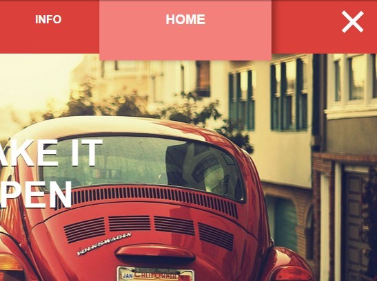
A cool navigation concept to create an animated hamburger menu that expands to a full-width top navigation with CSS3 powered transition effects. Built on top of jQuery, CSS/CSS3 and SVG.
How to use it:
1. The html structure for the expanding menu.
<div class="allMenu">
  <ul class="ul">
    <li class="lia"><a href="#" class="li">Home</a></li>
    <li class="lia"><a href="#" class="li">Info</a></li>
    <li class="lia"><a href="#" class="li">Portfolio</a></li>
    <li class="lia"><a href="#" class="li">The Team</a></li>
  </ul>
  <div class="Menu2"> <svg version="1.1" id="menulogo" xmlns="http://www.w3.org/2000/svg" xmlns:xlink="http://www.w3.org/1999/xlink" x="0px" y="0px"
   width="40px" height="36px" viewBox="0 0 40 36" enable-background="new 0 0 40 40" xml:space="preserve">
    <rect class="rect1" fill="#FFF" width="40" height="5.392"/>
    <rect class="rect2" x="0" y="12" fill="#FFF" width="40" height="5.393" />
    <rect class="rect3" x="0" y="24" fill="#FFF" width="40" height="5.393"/>
    </svg>
    <div class="Menu"> </div>
  </div>
</div>
2. The core CSS/CSS3 styles.
body {
  background: #7f7f7f;
  transition: all 4s;
  overflow-x: hidden;
  margin: 0 0 0 0;
}

.hover { transform: scale(50, 50); }

.rect1,
.rect2,
.rect3 {
  -webkit-transition: all 800ms cubic-bezier(0.980, 0.005, 0.000, 0.995);
  -moz-transition: all 800ms cubic-bezier(0.980, 0.005, 0.000, 0.995);
  -o-transition: all 800ms cubic-bezier(0.980, 0.005, 0.000, 0.995);
  transition: all 800ms cubic-bezier(0.980, 0.005, 0.000, 0.995); /* custom */
}

.Menu {
  background: #dc403b;
  width: 200px;
  -webkit-transition: all 800ms cubic-bezier(0.980, 0.005, 0.000, 0.995);
  -moz-transition: all 800ms cubic-bezier(0.980, 0.005, 0.000, 0.995);
  -o-transition: all 800ms cubic-bezier(0.980, 0.005, 0.000, 0.995);
  transition: all 800ms cubic-bezier(0.980, 0.005, 0.000, 0.995); /* custom */
  height: 200px;
  border-radius: 50%;
  z-index: 99;
  float: right;
  margin-right: -155px;
  margin-top: -100px;
}

.Menu2 {
  width: 100%;
  height: 100px;
  overflow: hidden;
  position: absolute;
}

#menulogo {
  margin-right: 25px;
  position: relative;
  z-index: 999;
  float: right;
  -webkit-transition: all 500ms cubic-bezier(0.000, 1, 0.985, 0.990); /* older webkit */
  -webkit-transition: all 500ms cubic-bezier(0.000, 1.650, 0.985, 0.990);
  -moz-transition: all 500ms cubic-bezier(0.000, 1.650, 0.985, 0.990);
  -o-transition: all 500ms cubic-bezier(0.000, 1.650, 0.985, 0.990);
  transition: all 500ms cubic-bezier(0.000, 1.650, 0.985, 0.990); /* custom */
  margin-top: 25px;
}

#menulogo:hover { -webkit-transform: scale(1.1, 1.1); }

#menulogo:hover { cursor: pointer; }

.allMenu {
  width: 100%;
  height: 100px;
  position: fixed;
}

ul {
  position: absolute;
  z-index: 9999;
  margin-top: -100px;
  -webkit-transition: all 800ms cubic-bezier(0.980, 0.005, 0.000, 0.995);
  -moz-transition: all 800ms cubic-bezier(0.980, 0.005, 0.000, 0.995);
  -o-transition: all 800ms cubic-bezier(0.980, 0.005, 0.000, 0.995);
  transition: all 800ms cubic-bezier(0.980, 0.005, 0.000, 0.995); /* custom */
  margin-left: auto;
  margin-right: auto;
  margin-right: 200px;
  width: 80%;
}

ul li {
  display: inline-block;
  float: right;
  -webkit-transition: all 400ms cubic-bezier(0.980, 0.005, 0.000, 0.995);
  -moz-transition: all 400ms cubic-bezier(0.980, 0.005, 0.000, 0.995);
  -o-transition: all 400ms cubic-bezier(0.980, 0.005, 0.000, 0.995);
  transition: all 400ms cubic-bezier(0.980, 0.005, 0.000, 0.995); /* custom */
  margin-left: -4px;
  padding-left: 80px;
  padding-right: 80px;
  height: 100px;
  line-height: 100px;
}

ul li:hover {
  background: #f4807c;
  transform: scale(1.2, 1.2);
  box-shadow: 5px 1px 10px rgba(0,0,0,0.3);
}

ul li a {
  font-family: 'Helvetica Neue', Arial, Helvetica, 'Nimbus Sans L', sans-serif;
  text-transform: uppercase;
  text-decoration: none;
  color: #FFF;
  font-weight: 700;
}

ul li a:hover { cursor: pointer; }
3. Create the cool transition effects using CSS3 keyframes.
@keyframes
fadein { from {
transform:scale(0, 0);
}

to { transform: scale(1, 1); }
}

/* Firefox < 16 */
@-moz-keyframes
fadein { from {
transform:scale(0, 0);
}

to { transform: scale(1, 1); }
}

/* Safari, Chrome and Opera > 12.1 */
@-webkit-keyframes
fadein { from {
transform:scale(0, 0);
}

to { transform: scale(1, 1); }
}

/* Internet Explorer */
@-ms-keyframes
fadein { from {
transform:scale(0, 0);
}

to { transform: scale(1, 1); }
}

/* Opera < 12.1 */
@-o-keyframes
fadein { from {
transform:scale(0, 0);
}
}

@keyframes
fadein2 { from {
transform:scale(1, 1);
}

to { transform: scale(0, 0); }
}

/* Firefox < 16 */
@-moz-keyframes
fadein2 { from {
transform:scale(1, 1);
}

to { transform: scale(0, 0); }
}

/* Safari, Chrome and Opera > 12.1 */
@-webkit-keyframes
fadein2 { from {
transform:scale(1, 1);
}

to { transform: scale(0, 0); }
}

/* Internet Explorer */
@-ms-keyframes
fadein2 { from {
transform:scale(1, 1);
}

to { transform: scale(0, 0); }
}

/* Opera < 12.1 */
@-o-keyframes
fadein2 { from {
transform:scale(1, 1);
}
}
4. Include the necessary jQuery library in the webpage.
<script src="//code.jquery.com/jquery-2.1.3.min.js"></script>
5. The core JavaScript to toggle CSS styles.
$(document).ready(function() {
  var $Menu = $('.Menu');
  $('#menulogo').click(function() {
    if($Menu.hasClass('hover')){
      $Menu.removeClass('hover');
      $('.rect1').css('opacity','1');
      $('.rect2').css('transform','rotate(0deg) translate(0px, 0px)');
      $('.rect3').css('transform','rotate(0deg) translate(0px, 0px)');
      $('#menulogo').css('margin-top','25px');
      $('.ul').css('margin-top','-100px');
    } else {
      $Menu.addClass('hover');
      $('.rect1').css('opacity','0');
      $('.rect2').css('transform','rotate(45deg) translate(6px, -15px)');
      $('.rect3').css('transform','rotate(-45deg) translate(-20px, 0px)');
      $('.ul').css('margin-top','0px');
      $('#menulogo').css('margin-top','35px');
    }
  });
});
This awesome jQuery plugin is developed by PixelatedOre. For more Advanced Usages, please check the demo page or visit the official website.