Mobile-friendly Multi-level Dropdown For Bootstrap
| File Size: | 2.61 KB |
|---|---|
| Views Total: | 7164 |
| Last Update: | |
| Publish Date: | |
| Official Website: | Go to website |
| License: | MIT |
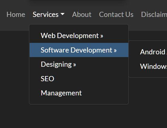
A tiny jQuery extension for Bootstrap framework that helps developers create multi-level dropdowns inside your navbar and converts them into an accordion on the mobile device for better readability.
How to use it:
1. Create a multi-level dropdown component from nested HTML lists in your navbar as follows.
<!-- Required -->
<link rel="stylesheet" href="/path/to/cdn/bootstrap.min.css" />
<script src="/path/to/cdn/jquery.slim.min.js"></script>
<script src="/path/to/cdn/bootstrap.min.js"></script>
<li class="nav-item dropdown">
<a class="nav-link dropdown-toggle" href="#" data-toggle="dropdown">Services</a>
<ul class="dropdown-menu">
<li><a class="dropdown-item" href="#"> Web Development » </a>
<ul class="submenu dropdown-menu">
<li><a class="dropdown-item" href="#"> Wordpress Website </a></li>
<li><a class="dropdown-item" href="#"> Website Design </a></li>
<li><a class="dropdown-item" href="#"> Open Source </a></li>
<li><a class="dropdown-item" href="#"> Custom CMS </a></li>
</ul>
</li>
<li><a class="dropdown-item" href="#"> Software Development » </a>
<ul class="submenu dropdown-menu">
<li><a class="dropdown-item" href="#"> Android App </a></li>
<li><a class="dropdown-item" href="#"> Windows Software </a></li>
</ul>
</li>
<li><a class="dropdown-item" href="#"> Designing » </a>
<ul class="submenu dropdown-menu">
<li><a class="dropdown-item" href="#"> Web Designing </a></li>
<li><a class="dropdown-item" href="#"> UI Design </a></li>
<li><a class="dropdown-item" href="#"> Wireframing </a></li>
</ul>
</li>
<li><a class="dropdown-item" href="#"> SEO </a></li>
<li><a class="dropdown-item" href="#"> Management </a>
</ul>
</li>
2. The jQuery script to prevent closing from click inside the dropdown.
$(document).on('click', '.dropdown-menu', function (e) {
  e.stopPropagation();
});
3. Convert the multi-level dropdown into an accordion when running on a small screen device (screen width < 992px in this example).
if ($(window).width() < 992) {
  $('.dropdown-menu a').click(function(e){
    if($(this).attr('href') == '#')
      e.preventDefault();
    if($(this).next('.submenu').length){
      $(this).next('.submenu').toggle();
    }
    $('.dropdown').on('hide.bs.dropdown', function () {
      $(this).find('.submenu').hide();
    })
  });
}
4. The necessary CSS styles for the Multi-level Dropdown.
@media (min-width: 992px){
  .dropdown-menu .dropdown-toggle:after {
    border-top: .3em solid transparent;
    border-right: 0;
    border-bottom: .3em solid transparent;
    border-left: .3em solid;
  }
  .dropdown-menu .dropdown-menu{
    margin-left:0; margin-right: 0;
  }
  .dropdown-menu li{
    position: relative;
  }
  .nav-item .submenu{
    display: none;
    position: absolute;
    left:100%; top:-7px;
  }
  .nav-item .submenu-left{
    right:100%; left:auto;
  }
  .dropdown-menu > li:hover{ background-color: #f1f1f1 }
  .dropdown-menu > li:hover > .submenu{
    display: block;
  }
}
This awesome jQuery plugin is developed by paradoxmr24. For more Advanced Usages, please check the demo page or visit the official website.


