Animated Step-by-step Tooltip Site Tour With jQuery - Chariot
| File Size: | 830 KB |
|---|---|
| Views Total: | 6355 |
| Last Update: | |
| Publish Date: | |
| Official Website: | Go to website |
| License: | MIT |
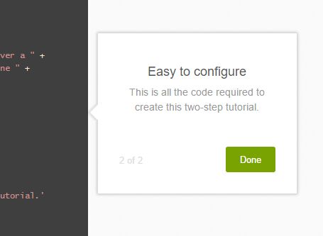
Chariot is a jQuery site guide/tour/wizard plugin for generating step-by-step tours that allow the users to walk through your website & web app using animated, easy-to-style, tooltip-like popup layers. By default, the site tour is displayed with a semi-transparent overlay that hides background content and highlights the selected element(s) for the current step of the tour. It also has the ability to animate the scrolling of the viewport until the next tooltip is centered if it is not completely within the client bounds.
Basic usage:
1. Add jQuery library together with the jQuery Chariot plugin's JS & CSS files to the html page.
<link href="release/chariot.css" rel="stylesheet">
<script src="//code.jquery.com/jquery.min.js"></script>
<script src="release/chariot.js"></script>
2. Create custom steps and specify the target element as follow:
chariot.startTutorial([
  {
    selectors: "h1",
    tooltip: {
      position: 'bottom',
      title: 'Step 1',
      text: "This is heading 1"
    },
  },
  {
    selectors: "span",
    tooltip: {
      position: 'right',
      title: 'Step 2',
      text: 'This is heading 2'
    }
  }
]);
3. Apply your own CSS styles to the tour popup.
.chariot-tooltip {
  background-color: #fff;
  padding: 30px;
  width: 320px;
  text-align: center;
  box-shadow: 0 0 5px 0 rgba(31, 28, 28, 0.3);
  border: 1px solid #ddd;
  color: #999;
}

.chariot-tooltip .chariot-tooltip-icon {
  width: 52px;
  height: 52px;
  margin: auto;
}

.chariot-tooltip .chariot-tooltip-icon img {
  width: 52px;
  height: 52px;
}

.chariot-tooltip .chariot-tooltip-header {
  font-size: 18px;
  line-height: 18px;
  font-weight: 500;
  color: #555;
  padding: 5px 0;
}

.chariot-tooltip .chariot-tooltip-content { padding: 5px 0; }

.chariot-tooltip .chariot-tooltip-content p {
  font-size: 14px;
  font-weight: 300;
  color: #999;
  padding-bottom: 15px;
}

.chariot-tooltip .chariot-btn-row { padding-top: 5px; }

.chariot-tooltip .chariot-btn-row .btn {
  font-size: 13px;
  font-weight: 400;
  color: #fff;
  background-color: #78A300;
  border-radius: 3px;
  height: 36px;
  padding: 0 20px;
  border: none;
}

.chariot-tooltip .chariot-btn-row .btn:hover { background-color: #78A300; }

.chariot-tooltip .chariot-btn-row .chariot-tooltip-subtext {
  float: left;
  color: #ddd;
  font-size: 13px;
  padding-top: 10px;
}

.chariot-tooltip-arrow { background: #fff; }

.chariot-tooltip-arrow-left {
  border-left: 1px solid #ddd;
  border-bottom: 1px solid #ddd;
  box-shadow: -2px 2px 2px 0 rgba(31, 28, 28, 0.1);
}

.chariot-tooltip-arrow-right {
  border-right: 1px solid #ddd;
  border-top: 1px solid #ddd;
  box-shadow: 2px -2px 2px 0 rgba(31, 28, 28, 0.1);
}

.chariot-tooltip-arrow-top {
  border-left: 1px solid #ddd;
  border-top: 1px solid #ddd;
  box-shadow: -2px -2px 4px 0 rgba(31, 28, 28, 0.1);
}

.chariot-tooltip-arrow-bottom {
  border-right: 1px solid #ddd;
  border-bottom: 1px solid #ddd;
  box-shadow: 2px 2px 4px 0 rgba(31, 28, 28, 0.1);
}
4. All possible settings to config the plugin.
chariot.startTutorial(

  //  An array of step configurations
  // Note that this property can be passed as the configuration if the optional params are not used.
  steps: [],

  // Sets the base z-index value
  zIndex: 20,

  // Setting to false will disable the overlay that normally appears over the page and behind the tooltips.
  shouldOverlay: true,

  // Overlay CSS color
  overlayColor: 'rgba(255,255,255,0.7)',

  // Callback that is called  once the tour has gone through all steps.
  onComplete: function(){},

  // Setting to true will use an implementation that does not rely on cloning highlighted elements.
  useTransparentOverlayStrategy: false,

  // Enables tooltip bouncing at the beginning and end of each step.
  animateTooltips: true,

  // If the next tooltip is not completely within the client bounds, this property animates the scrolling of the viewport until the next tooltip is centered.
  animateScrolling: true,

  // Specifies the duration of the scroll animation above, in milliseconds.
  scrollAnimationDuration: 500

);
This awesome jQuery plugin is developed by zendesk. For more Advanced Usages, please check the demo page or visit the official website.