Beautiful Modular Notification Library - Pnotify
| File Size: | 876 KB |
|---|---|
| Views Total: | 37515 |
| Last Update: | |
| Publish Date: | |
| Official Website: | Go to website |
| License: | MIT |
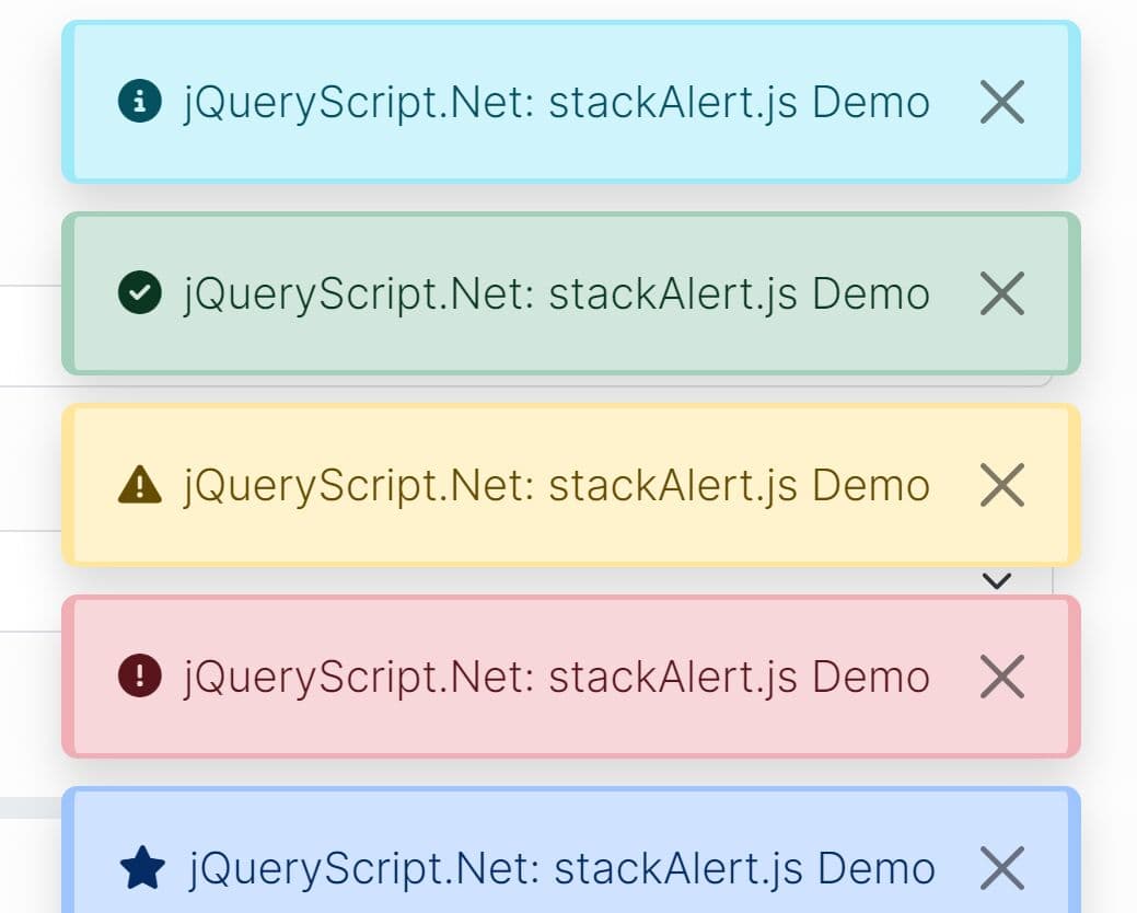
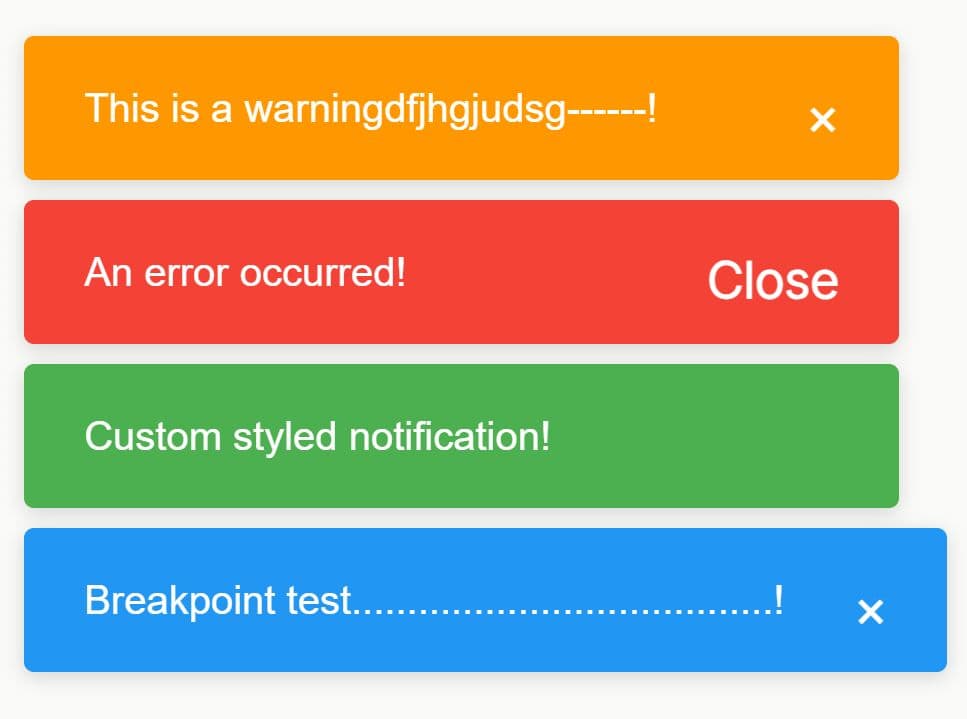
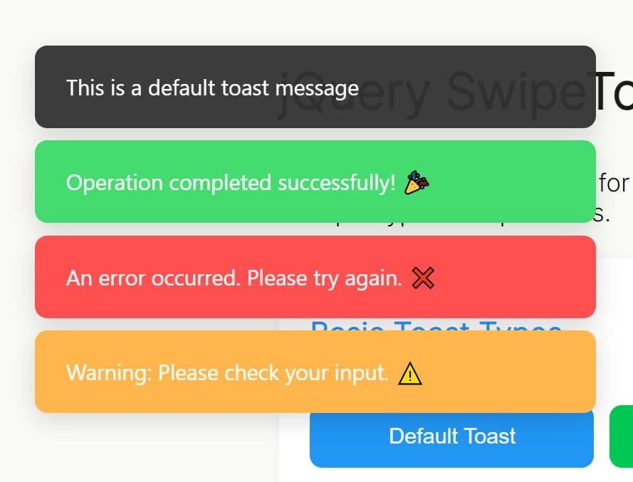
Pnotify is a customizable, modular, powerful notification JavaScript library that allows you to add beautiful and animated web, mobile, and desktop notifications on your web app.
More features:
- Works with jQuery, Angular, React and Vanilla JavaScript.
- Compatible with the latest Bootstrap framework.
- Custom icons.
- Awesome animations.
- Stackable notifications.
- 6 built-in themes to fit your design.
- Light & dark modes.
- Sticky notifications.
- Countdown timer.
See Also:
How to use it (v5.0+):
1. Install the Pnotify package with NPM.
# Required
npm install --save-dev @pnotify/core
# Optional
npm install --save-dev @pnotify/animate
npm install --save-dev @pnotify/bootstrap3
npm install --save-dev @pnotify/bootstrap4
npm install --save-dev @pnotify/confirm
npm install --save-dev @pnotify/countdown
npm install --save-dev @pnotify/desktop
npm install --save-dev @pnotify/font-awesome4
npm install --save-dev @pnotify/font-awesome5-fix
npm install --save-dev @pnotify/font-awesome5
npm install --save-dev @pnotify/glyphicon
npm install --save-dev @pnotify/mobile
# All In One
$ npm install pnotify --save
2. Import necessary modules & styles.
// default modules
import { alert, notice, info, success, error, defaultModules } from '@pnotify/core';

// default styles
import "@pnotify/core/dist/PNotify.css";

// default theme
import "@pnotify/core/dist/BrightTheme.css";
3. Create notifications as follows:
const myAlert = alert({
      text: "I'm an alert.",
      type: 'info'
});

// OR ...
const myNotice = notice({
      text: "I'm a notice."
});

const myInfo = info({
      text: "I'm an info message."
});

const mySuccess = success({
      text: "I'm a success message."
});

const myError = error({
      text: "I'm an error message."
});
4. Use Material Theme & Icons.
import '@pnotify/core/dist/Material.css';
import 'material-design-icons/iconfont/material-icons.css';

// Set theme
defaults.styling = 'material';
// Set icon
defaults.icons = 'material';
5. Use Bootstrap theme.
import '@pnotify/bootstrap4/dist/PNotifyBootstrap4.css';
// OR
import '@pnotify/bootstrap3/dist/PNotifyBootstrap3.css';

// Set default module
defaultModules.set(PNotifyBootstrap4, {});
// OR
defaultModules.set(PNotifyBootstrap3, {});
6. Use Font Awesome as default icons.
import * as PNotifyFontAwesome5Fix from '@pnotify/font-awesome5-fix';
import * as PNotifyFontAwesome5 from '@pnotify/font-awesome5';
// OR
import * as PNotifyFontAwesome4 from '@pnotify/font-awesome4';

// Set default module
defaultModules.set(PNotifyFontAwesome5Fix, {});
defaultModules.set(PNotifyFontAwesome5, {});
// OR
defaultModules.set(PNotifyFontAwesome4, {});
7. All possible options to customize the notification.
alert({

  // The notice's title.
  title: false,

  // Whether to trust the title or escape its contents. (Not allow HTML.)
  titleTrusted: false,

  // The notice's text.
  text: false,

  // Whether to trust the text or escape its contents. (Not allow HTML.)
  textTrusted: false,

  // Can be 'brighttheme', 'material', another string provided by a module, or a styling object
  styling: 'brighttheme',

  // Can be 'brighttheme', 'material', another string provided by a module, or an icon object.
  icons: 'brighttheme',

  // Light or dark version of the theme
  mode: 'no-preference',

  // Additional classes to be added to the notice. (For custom styling.)
  addClass: '',

  // Additional classes to be added to the notice, only when in modal.
  addModalClass: ''

  // Display the notice when it is created.
  autoOpen: true,

  // Width of the notice.
  width: '360px',

  // Minimum height of the notice. It will expand to fit content.
  minHeight: '16px',

  // Maximum height of the text container.
  // If the text goes beyond this height, scrollbars will appear. Use null to remove this restriction.
  maxTextHeight: '200px',

  // Type of the notice. 'notice', 'info', 'success', or 'error'.
  type: 'notice',

  // Set icon to true to use the default icon for the selected
  // style/type, false for no icon, or a string for your own icon class.
  icon: true,

  // The animation to use when displaying and hiding the notice. 'none'
  // and 'fade' are supported through CSS. Others are supported
  // through the Animate module and Animate.css.
  animation: 'fade',

  // Speed at which the notice animates in and out. 'slow', 'normal',
  // or 'fast'. Respectively, 400ms, 250ms, 100ms.
  animateSpeed: 'normal',

  // Display a drop shadow.
  shadow: true,

  // After a delay, remove the notice.
  hide: true,

  // Delay in milliseconds before the notice is removed.
  delay: 8000,

  // Reset the hide timer if the mouse moves over the notice.
  mouseReset: true,

  // Provide a button for the user to manually close the notice.
  closer: true,

  // Only show the closer button on hover.
  closerHover: true,

  // Provide a button for the user to manually stick the notice.
  sticker: true,

  // Only show the sticker button on hover.
  stickerHover: true,

  // The various displayed text, helps facilitating internationalization.
  labels: {close: 'Close', stick: 'Pin', unstick: 'Unpin'},

  // Remove the notice's elements from the DOM after it is removed.
  remove: true,

  // Whether to remove the notice from the global array when it is closed.
  destroy: true,

  // The stack on which the notices will be placed. Also controls the
  // direction the notices stack.
  stack: {
    dir1: 'down', // 'up', 'down', 'right', or 'left'
    dir2: 'left',
    firstpos1: 25,
    firstpos2: 25,
    spacing1: 36,
    spacing2: 36,
    maxOpen: 1,
    maxStrategy: 'wait',
    maxClosureCausesWait: true,
    modal: 'ish', // or true, false
    modalishFlash: true,
    push: 'bottom', // 'top' or 'bottom'
    overlayClose: true,
    overlayClosesPinned: false,
    context: window && document.body
  }

  // This is where options for modules should be defined.
  modules: {}

});
8. Import optional modules. All possible modules:
- Animate: Animates notifications using Animate.css
- Confirm: Confirmation dialog
- Desktop: Displays the notification even when the web page is not visible
- Mobile: Optmizes the notifications on mobile & tablet
- Countdown: Countdown timer
// Animate module
import * as PNotifyAnimate from '@pnotify/animate';
const myNotice = notice({
      text: "I'm a notice.",
      modules: new Map([
        ...defaultModules,
        [PNotifyAnimate, {
          inClass: null,
          outClass: null
        }]
      ])
});
// Animate module method
attention(aniClass, callback);

// Confirm Module
import * as PNotifyConfirm from '@pnotify/confirm';
const myNotice = notice({
  text: "I'm a notice.",
  modules: new Map([
    ...defaultModules,
    [PNotifyConfirm, {
      // Make a confirmation box.
      confirm: false,
      // Make a prompt.
      prompt: false,
      // Classes to add to the input element of the prompt.
      promptClass: '',
      // The value of the prompt.
      promptValue: '',
      // Whether the prompt should accept multiple lines of text.
      promptMultiLine: false,
      // For confirmation boxes, true means the first button or the button with promptTrigger will be focused, and null means focus will change only for modal notices. For prompts, true or null means focus the prompt. When false, focus will not change.
      focus: null,
      // Where to align the buttons. (flex-start, center, flex-end, space-around, space-between)
      align: 'flex-end',
      // The buttons to display, and their callbacks.
      buttons: [
        {
          text: 'Ok',
          primary: true,
          promptTrigger: true,
          click: (notice, value) => {
            notice.close();
            notice.fire('pnotify:confirm', {notice, value});
          }
        },
        {
          text: 'Cancel',
          click: (notice) => {
            notice.close();
            notice.fire('pnotify:cancel', {notice});
          }
        }
      ]
    }]
  ])
});
// event handler
myNotice.on('pnotify:confirm', () => {
  // User confirmed, continue here...
});
myNotice.on('pnotify:cancel', () => {
  // User canceled, continue here...
});

// Countdown Module
import * as PNotifyCountdown from '@pnotify/countdown';
const myNotice = notice({
  text: "I'm a notice.",
  modules: new Map([
    ...defaultModules,
    [PNotifyCountdown, {
      anchor: 'bottom', // 'top', 'bottom', 'left', or 'right'
      reverse: false
    }]
  ])
});

// Mobile Module
import * as PNotifyMobile from '@pnotify/mobile';
import '@pnotify/mobile/dist/PNotifyMobile.css';
const myNotice = notice({
  text: "I'm a notice.",
  modules: new Map([
    ...defaultModules,
    [PNotifyMobile, {
      swipeDismiss: true
    }]
  ])
});

// Desktop Module
import * as PNotifyDesktop from '@pnotify/desktop';
const myNotice = notice({
  text: "I'm a notice.",
  modules: new Map([
    ...defaultModules,
    [PNotifyDesktop, {
      fallback: true,
      icon: null, // The URL of the icon to display
      tag: null, // Using a tag lets you update an existing notice, or keep from duplicating notices between tabs.
      title: null,
      text: null,
      options: {}
    }]
  ])
});
9. API methods.
// open
myNotice.open(immediate)

// close
myNotice.close(immediate, timerHide, waitAfterward)

// return the state of the notice: 'waiting', 'opening', 'open', 'closing', or 'closed'.
notice.getState()

// update options
myNotice.update(options)

// add classes
myNotice.addModuleClass(element, ...classNames)

// remove classes
myNotice.removeModuleClass(element, ...classNames)

// test classes
myNotice.hasModuleClass(element, ...classNames)
10. Properties.
myNotice.refs.elem
myNotice.refs.container
myNotice.refs.content
myNotice.refs.titleContainer
myNotice.refs.textContainer
myNotice.refs.iconContainer
11. Event handlers.
- pnotify:init: on init
- pnotify:mount: when the notice has been mounted into the DOM
- pnotify:update: when the notice's state changes
- pnotify:beforeOpen: before open
- pnotify:afterOpen: after open
- pnotify:enterModal: when the notice enters a modal state
- pnotify:leaveModal: when the notice leaves a modal state.
- pnotify:beforeClose: before close
- pnotify:afterClose: after close
- pnotify:beforeDestroy: before destroy
- pnotify:afterDestroy: after destroy
// Invokes the callback whenever the notice dispatches the event.
// Callback receives an event argument with a detail prop.
// Returns a function that removes the handler when invoked.
myNotice.on(eventName, callback);

// Fires an event
notice.fire(eventName, detail);
Changelog:
v5.2.0 (2020-11-07)
- Stack swap and events.
- Notice open/close returns a promise now.
- Roboto font support for Material theme.
- New Paginate module to show pagination buttons and stack notice count.
- New Angeler theme, designed by Angela Murrell.
- Stacks can now be unpositioned, meaning notices flow in the normal flow.
2020-05-04
- Updated DOC to v5+
v5.1.2 (2020-04-30)
- Reduces file size of build files.
v5.1.1 (2020-04-28)
- Fixed for Font Awesome
- Reversed colors on countdown bar
v5.1.0 (2020-04-22)
- Added TypeScript types.
v5.0.1 (2020-04-19)
- Bugfix
v5.0.0 (2020-04-18)
- API updated.
- Added tons of features.
- Check out the Migration Guide.
- 5.0 Doc is coming soon
v4.0.0 (2019-04-29)
- Added focus control option in Confirm module.
- DOC updated.
This awesome jQuery plugin is developed by sciactive. For more Advanced Usages, please check the demo page or visit the official website.