Simple Growl Notification Plugin with jQuery - Notifyr
| File Size: | 104 KB |
|---|---|
| Views Total: | 1785 |
| Last Update: | |
| Publish Date: | |
| Official Website: | Go to website |
| License: | MIT |
Notifyr is a simple, customizable jQuery notification plugin used to pop-up growl-like notification messages on your website / web applications. Also can be implemented in AMD and CommonJS environments.
Basic usage:
1. Load jQuery library and the jQuery notifyr plugin in your document as usual.
<script src="//code.jquery.com/jquery-1.11.2.min.js"></script>
<script src="dist/jquery.notifyr.js"></script>
2. Open a notification and display alerts on event hooks.
$('#notifications').notifyr({
  title: 'Events',
  message: 'Notifications trigger events after they appear and after they are dismissed'
});

$('#notifications').on('notification-display-complete', function() {
  alert('Notification display complete');
  $('#notifications').off('notification-display-complete');
});

$('#notifications').on( 'notification-remove-complete', function() {
  alert('Notification remove complete');
  $('#notifications').off( 'notification-remove-complete');
});
3. Open a top-left notification with a custom button.
$('#notifications').notifyr({
  message: 'This is annoyingly on top of a link',
  location: 'top-left',
  title: 'A non standard close button',
  closeButtonHtml: '<button style="margin-bottom: 10px;">close</button>'
});
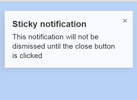
4. Open a "sticky" notification that will not autodismiss.
$('#notifications').notifyr({
  location: 'top-right',
  sticky: true,
  title: 'Sticky notification',
  message: 'This notification will not be dismissed until the close button is clicked'
});
5. The default styles for the notifications. You can change the CSS rules in any way you like.
#notifications {
  position: absolute;
  top: 0;
}

.notification {
  opacity: 0;
  position: fixed;
  z-index: 100;
  background-color: rgba(255, 255, 255, 0.9);
  border: 1px solid #bbb;
  box-shadow: -5px 5px 10px rgba(170, 170, 170, 0.25);
  width: calc(100% - 30px);
}

@media (min-width: 768px) and (max-width: 1023px) {

.notification { width: 250px; }

}

@media (min-width: 1024px) {

.notification { width: 300px; }

}

.notification-top-left {
  top: 1em;
  left: 1em;
}

.notification-top-right {
  top: 1em;
  right: 1em;
}

.notification-bottom-left {
  bottom: 1em;
  left: 1em;
}

.notification-bottom-right {
  bottom: 1em;
  right: 1em;
}

.notification-content {
  position: relative;
  padding: 15px 30px 15px 15px;
}

.notification-title {
  margin: 0 0 5px 0;
  font-size: 100%;
  font-weight: bold;
}

@media (min-width: 768px) and (max-width: 1023px) {

.notification-title { font-size: 105%; }

}

@media (min-width: 1024px) {

.notification-title { font-size: 110%; }

}

.notification-message { font-size: 80%; }

@media (min-width: 768px) and (max-width: 1023px) {

.notification-message { font-size: 90%; }

}

@media (min-width: 1024px) {

.notification-message { font-size: 100%; }

}

.notification-close {
  position: absolute;
  top: 0;
  right: 0;
  text-decoration: none;
  font-size: 130%;
  background-color: transparent;
  border: 0;
  padding: 10px;
  line-height: 1;
  color: #888;
}

.notification-close:focus { outline: 1px dotted; }

.notification-close:hover {
  color: #333;
  font-weight: bold;
}

@media (min-width: 768px) and (max-width: 1023px) {

.notification-close {
  font-size: 110%;
  padding: 8px;
  top: 2px;
  right: 2px;
}
}

@media (min-width: 1024px) {

.notification-close {
  font-size: 90%;
  padding: 5px;
  top: 5px;
  right: 5px;
}
}
6. Default options.
sticky: false, lifespan: 5000, location: 'top-right', animationSpeed: 250, offscreenPosition: '-5em', classes: [], closeButtonHtml: '<button class="notification-close">×</button>'
Change log:
2015-03-15
- plugin update.
This awesome jQuery plugin is developed by patientslikeme. For more Advanced Usages, please check the demo page or visit the official website.