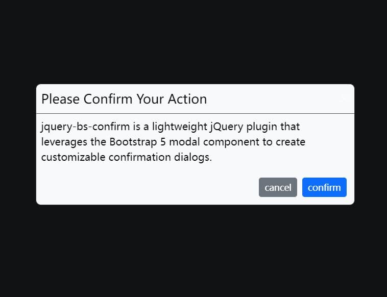
Versatile Modal-style Dialog Plugin With jQuery - allSIGE MessageBox
| File Size: | 1.12 MB |
|---|---|
| Views Total: | 1016 |
| Last Update: | |
| Publish Date: | |
| Official Website: | Go to website |
| License: | MIT |
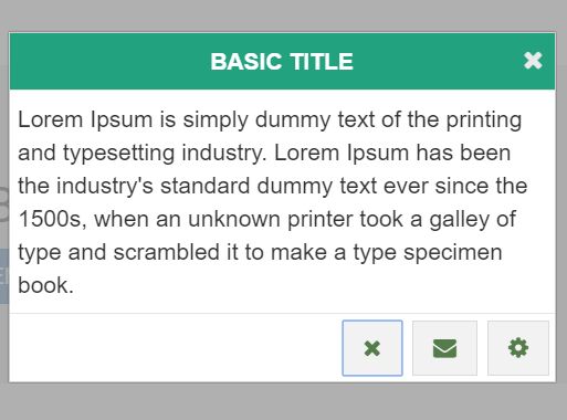
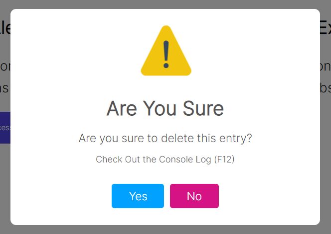
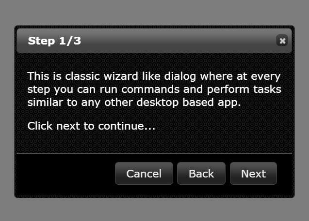
allSIGE MessageBox is a simple yet fully configurable jQuery plugin that allows you to create modal-style alert / error / info / success dialog boxes with lots of configuration options.
More Features:
- Custom types, sizes, icons, contents, buttons and many more.
- Custom CSS3 animations based on Animate.css.
- Modal-style fullscreen background overlay.
- Auto close with countdown timer.
- Callback functions.
How to use it:
1. The jQuery allSIGE MessageBox plugin should be included in the html page which has jQuery library installed.
<link href="allSIGE-dynamic-messageBox.css" rel="stylesheet">
<script src="//code.jquery.com/jquery.min.js"></script>
<script src="allSIGE-dynamic-messageBox.js"></script>
2. Include the Font Awesome 4 for custom dialog icons.
<link rel="stylesheet" href="font-awesome.min.css">
3. Include the Animate.css for custom CSS3 animations.
<link href="animate.css" rel="stylesheet">
4. The JavaScript to show a default dialog box.
$.allSIGEDynamicMessageBox({
  boxMessage: "Message here"
});
5. Customize the dialog box. Here's a list of default configuration options which can be passed as an object to the allSIGEDynamicMessageBox() method:
$.allSIGEDynamicMessageBox({

  // none, alert, error, info, success
  boxType: "none",

  //
  boxShortcuts: { enabled: true, closeKeyCode: 27, showShortcutLabel: true },

  // shows icons
  boxShowIcon: false,

  // shows header controls
  boxShowHeaderControls: true,

  // enable reload modal feature
  boxReloadModal: false,

  // custom icons
  // "error"   : { type: "ico", val: "fa fa-close" }
  boxTypeIcon: {
      "none"    : { type: "img", val: "none.png" },
      "success" : { type: "img", val: "success.png" },
      "error"   : { type: "img", val: "error.png" },
      "info"    : { type: "img", val: "info.png" },
      "alert"   : { type: "img", val: "alert.png" }
  },

  // xs, sm, md, lg, full or css metrics
  boxSize: "md",

  // custom title
  boxTitle: "allSIGE MessageBox",

  // custom message
  boxMessage: "",

  // custom action buttons
  /* boxButtons:
    [
      {
        label: "YES", class: "btn", return: "_yes", close: true,
        props: {
          element: "button",
          attribs: { }
        }
      },
      {
        label: "NO", class: "btn", return: "_no", close: false,
        iconClass: "glyphicons glyphicons-dog",
        props: { element: "a", attribs: {
                  href:"http://www.google.com"
                  target: "_blank"
                }
            }
      },
    ]
  */
  boxButtons: [],

  // custom header buttons
  /* boxHeaderButtons: {
      return: "clickHeader!", close: true, iconClass: "fa fa-close",
      props: {
        element: "li",
        attribs: { }
      }
    }
  */
  boxHeaderButtons: [],

  // default position of action buttons
  boxButtonDefaultPosition: 1,

  // alignment of buttons
  // center, left, right
  boxButtonAlign: "right",

  // auto close with a countdown timer
  boxAutoClose: { timeout: 0, message: "Closing in %s% seconds...", container: "message" },

  /* boxAlternateReturn: {
      selector: ".table > tbody > tr[data-row-id]",
      close: true
    }
  */
  boxAlternateReturn: {
      selector: "",
      close: true
  },

  boxFocusOnLoad: {
    selector: ""
  },

  dataParams: [],

  // style01, style02, another string..
  defaultStyle: "style01",

  // top offset
  topPosition: "100px",

  // close by clicking on the background overlay
  closeOnClickModal: true,

  //
  blockWhenOpen: false,

  // animations
  effects: { modalIn: "fadeIn", modalOut: "fadeOut", boxIn: "fadeInDown", boxOut: "fadeOutUp" },

  // callback functions
  onSuccess: function (result) { },
  onBeforeShow: function () { },
  onAfterShow: function () { },
  onBeforeClose: function () { },
  onAfterClose: function () { },

});
Change log:
2016-07-25
- Add new style: Facebook
2016-07-21
- Add new object feature in modal (version 3 beta)
2016-07-19
- Add new feature "boxFocusOnLoad"
2016-07-12
- added new feature blockWhenOpen
- fixed click shortcut bug
2016-07-09
- added new feature boxShortcuts
This awesome jQuery plugin is developed by ThiagoAugustoBorges. For more Advanced Usages, please check the demo page or visit the official website.