User-friendly Color Picker With Preset Colors - huebee.js
| File Size: | 52.7 KB |
|---|---|
| Views Total: | 2516 |
| Last Update: | |
| Publish Date: | |
| Official Website: | Go to website |
| License: | MIT |
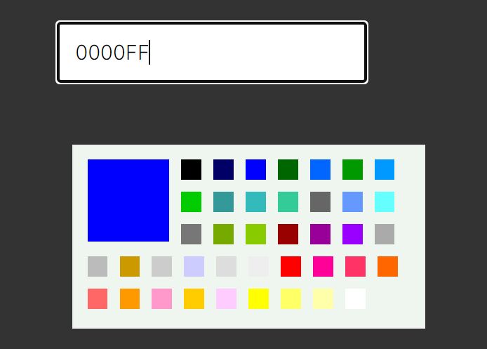
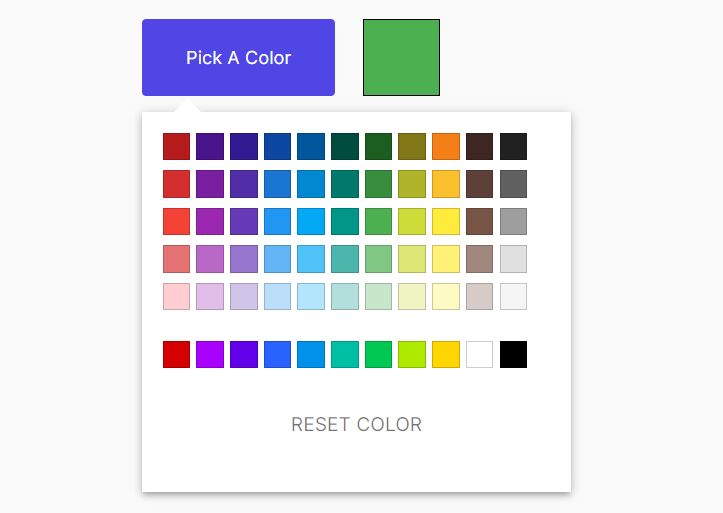
huebee.js is a highly-customizable, user-friendly color picker that allows the user to select a color from a predefined/restricted palette.
More Features:
- Works with both Vanilla JavaScript and jQuery.
- Supports color hues/shades/saturations.
- Supports shortHex, hex, hsl color formats.
- Allows to customize the colors displayed in the palette.
- onChange event handler.
How to use it:
1. Install & Download the plugin.
# Yarn
$ yarn add huebee

# NPM
$ npm install huebee --save
2. Import the huebee.js color picker. jQuery is optional.
<link href="/path/to/dist/huebee.min.css" rel="stylesheet" />
<script src="/path/to/cdn/jquery.slim.min.js"></script>
<script src="/path/to/dist/huebee.pkgd.min.js"></script>
3. Or from a CDN.
<link rel="stylesheet" href="https://unpkg.com/huebee@latest/dist/huebee.min.css" />
<script src="/path/to/cdn/jquery.slim.min.js"></script>
<script src="https://unpkg.com/huebee@latest/dist/huebee.pkgd.min.js"></script>
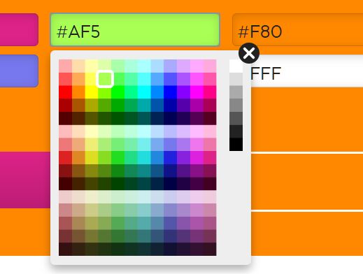
4. Attach the color picker to a trigger element. In this example, we're going to initialize the color picker via HTML data attributes:
<input class="color-picker" value="#F80" data-huebee />
<button class="color-picker" data-huebee>Select A Color</button>
5. Or initialize the plugin via JavaScript.
// Vanilla JavaScript
var colorPicker = new Huebee( '.color-picker', {
    // options
});

// jQuery
var elem = $('.color-picker')[0];
var colorPicker = new Huebee( elem, {
    // options
});

// multiple instance
$('.color-picker').each( function( i, elem ) {
  var colorPicker = new Huebee( elem, {
      // options
  });
});
6. Customize the preset palette (HEX/HSL and color names).
var colorPicker = new Huebee( '.color-picker', {
    customColors: [ YOUR COLOR CODE/NAME HERE ]
});
7. Full configuration options.
var colorPicker = new Huebee( '.color-picker', {

    // the number of hues
    hues: 12,

    // the first hue
    hue0: 0,

    // the number of shades
    shades: 5,

    // the number of sets of saturation
    saturations: 3,

    // or "hex", "hsl"
    notation: 'shortHex',

    // applies color to text
    setText: true,

    // applies color to background
    setBGColor: true,

    // shows the color picker on init
    staticOpen: false,

    // additional CSS class(es)
    className: ''

});
8. You can also pass the configurations via data attribute.
<input class="color-picker" data-huebee='{ "OPTION": "VALUE" }' />
9. Fire an event each time the color changes.
colorPicker.on('change', function(color) {
  // do something
});
10. Open/close the color picker manually.
colorPicker.open();
colorPicker.close();
11. Available props.
// returns the color
hueb.color

// returns the hue
hueb.hue

// returns the saturation
hueb.sat

// returns the luminance
hueb.lum

// determines if the color is light
hueb.isLight
Changelog:
v2.1.1 (01/16/2021)
- Fix
This awesome jQuery plugin is developed by metafizzy. For more Advanced Usages, please check the demo page or visit the official website.