jQuery & Vanilla JS Dark Mode Toggle Plugin for Bootstrap 5
| File Size: | 159 KB |
|---|---|
| Views Total: | 66 |
| Last Update: | |
| Publish Date: | |
| Official Website: | Go to website |
| License: | MIT |
The successor to bs-darkmode.
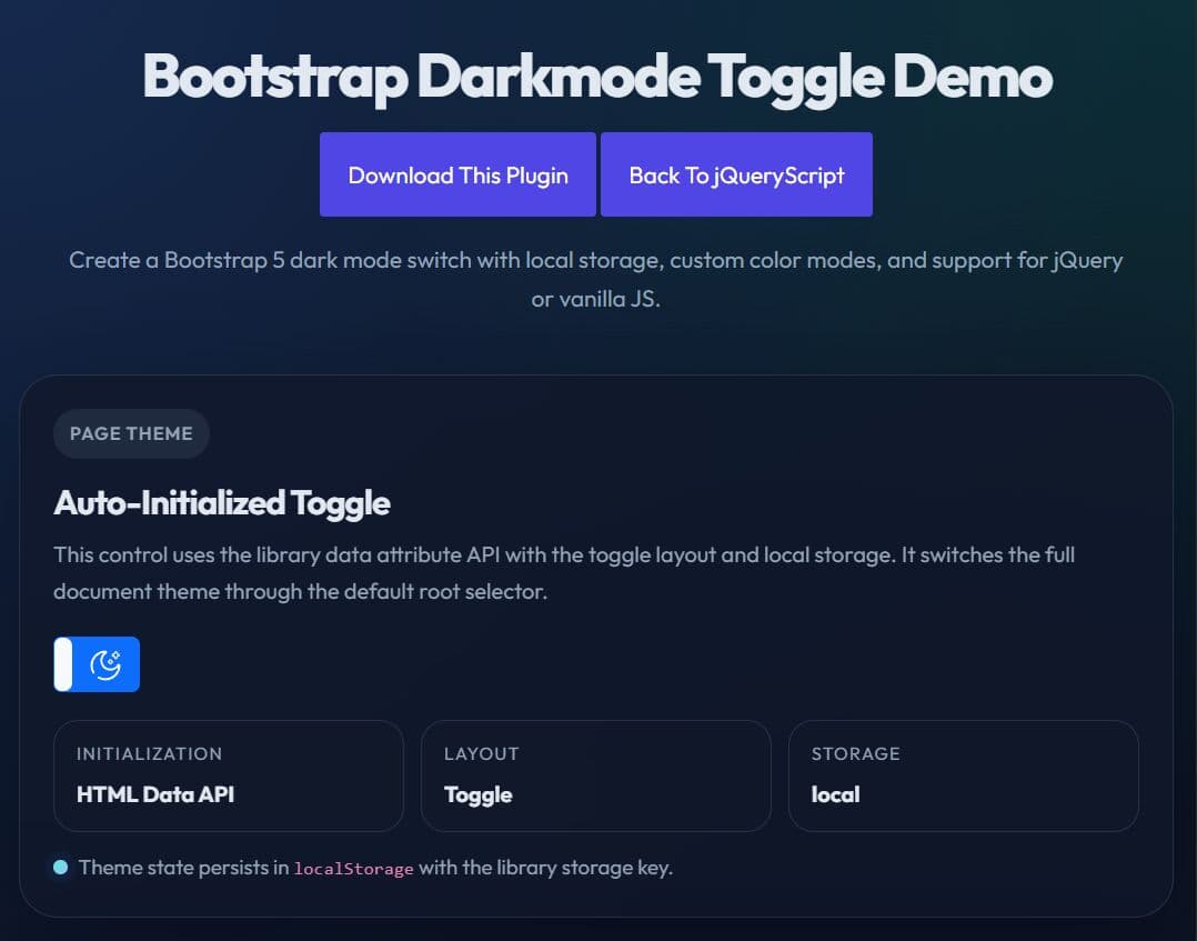
Bootstrap Darkmode Toggle is a jQuery & Vanilla JavaScript plugin that adds a light and dark mode switch to your Bootstrap 5 projects.
It supports automatic detection of the user’s preferred color scheme, optional persistence through local storage or cookies, custom labels, custom theme names, and two UI layouts.
Features:
- Lightweight and easy to use.
- Supports vanilla JavaScript and jQuery implementations.
- Reads system-level color scheme preferences.
- Saves user theme choices locally.
- Accepts custom labels for different states.
- Applies standard framework color classes for styling.
- Provides multiple layout options like buttons and toggles.
- Includes built-in icons for visual feedback.
How to use it:
1. Load the bs-darkmode-toggle plugin's files in your Bootstrap project.
<!-- Load the stylesheet -->
<link href="/css/bs-darkmode-toggle.min.css" rel="stylesheet">

<!-- Load the Vanilla JS version -->
<script src="/js/bs-darkmode-toggle.ecmas.min.js"></script>

<!-- Or load the jQuery version -->
<script src="/js/bs-darkmode-toggle.jquery.min.js"></script>
2. To create a basic dark mode toggle, just add the data-plugin="bs-darkmode-toggle" attribute to the target element and the plugin will do the rest.
<div data-plugin="bs-darkmode-toggle"></div>
3. You can also initialize the dark mode toggle via JavaScript.
<div id="theme-switch"></div>
// Vanilla JavaScript
const themeSwitch = document.getElementById('theme-switch');
themeSwitch.bsDarkmodeToggle({
  // options here
});

// jQuery
$('#themeSwitch').bsDarkmodeToggle({
  // options here
});
4. Start in dark mode with the data-state attribute. The plugin checks state in this order:
- Saved site preference.
- User system preference.
data-state.- JavaScript option.
- Light mode fallback.
<div data-plugin="bs-darkmode-toggle" data-state="dark"></div>
5. Apply dark or light mode to a custom root element:
<div id="preview-panel">
  <div
    data-plugin="bs-darkmode-toggle"
    data-root="#preview-panel"
  ></div>
</div>
6. Replace the default light and dark labels with custom text or HTML.
<div
  data-plugin="bs-darkmode-toggle"
  data-light-label="Day"
  data-dark-label="Night"
></div>
7. Change the switch style. The data-style value maps to Bootstrap color class names.
<!-- Use a success-colored switch -->
<div
  data-plugin="bs-darkmode-toggle"
  data-style="success"
></div>
8. Use custom color mode names:
<!-- Switch between two custom theme names -->
<div
  data-plugin="bs-darkmode-toggle"
  data-light-color-mode="blue"
  data-dark-color-mode="red"
></div>

<style>
  /* Define your custom "blue" mode */
  [data-bs-theme="blue"] {
    --bs-body-color: #adb5bd;
    --bs-body-color-rgb: 173, 181, 189;
    --bs-body-bg: rgb(166, 199, 247);
    --bs-body-bg-rgb: 166, 199, 247;
  }

  /* Define your custom "red" mode */
  [data-bs-theme="red"] {
    --bs-body-color: #adb5bd;
    --bs-body-color-rgb: 173, 181, 189;
    --bs-body-bg: rgb(226, 154, 161);
    --bs-body-bg-rgb: 226, 154, 161;
  }
</style>
9. Switch between toggle and button layouts:
<!-- Standard switch layout -->
<div data-plugin="bs-darkmode-toggle" data-layout="toggle"></div>

<!-- Button layout -->
<div data-plugin="bs-darkmode-toggle" data-layout="button"></div>
10. Save the user’s preference. Use local for browser storage, cookie or cache for cookie-based persistence depending on the build and docs you follow, or none to skip persistence.
<!-- Save the selected mode in browser storage -->
<div
  data-plugin="bs-darkmode-toggle"
  data-storage="local"
></div>
11. Use the built-in icons.
<!-- Sun icon -->
<i class="bs-darkmode-toggle sun"></i>

<!-- Moon icon -->
<i class="bs-darkmode-toggle moon"></i>

<!-- Light bulb on -->
<i class="bs-darkmode-toggle bulb-on"></i>

<!-- Light bulb off -->
<i class="bs-darkmode-toggle bulb-off"></i>
12. All configuration options.
state(boolean): Sets the default light or dark state in JavaScript. For data attributes, usedata-state="light"ordata-state="dark".root(string | html): Sets the CSS selector of the root element that receives the active color mode. The default value is":root".storage(string): Sets where the plugin stores user preference. Documented values includecache,local, andnone.lightLabel(string | html): Sets the label shown for the light mode state.darkLabel(string | html): Sets the label shown for the dark mode state.style(string): Sets the visual Bootstrap style for the control. Supported values includeprimary,secondary,success,danger,warning,info,light,dark, and outline variants such asoutline-primary.lightColorMode(string): Sets the theme name used for light mode. The default value is"light".darkColorMode(string): Sets the theme name used for dark mode. The default value is"dark".layout(string): Sets the UI layout. Supported values are"toggle"and"button".
$('#themeSwitch').bsDarkmodeToggle({
  state: true,
  root: ":root",
  storage: StorageType.NONE,
  lightLabel: "<i class=\"bs-darkmode-toggle sun\"></i>",
  darkLabel: "<i class=\"bs-darkmode-toggle moon\"></i>",
  lightColorMode: "light",
  darkColorMode: "dark",
  style: "outline-secondary",
  layout: Layout.TOGGLE
});
13. API methods.
// Initialize the plugin on the selected element
document.getElementById('theme-switch').bsDarkmodeToggle();

// Switch to light mode
document.getElementById('theme-switch').bsDarkmodeToggle('light');

// Switch to dark mode
document.getElementById('theme-switch').bsDarkmodeToggle('dark');

// Toggle between light and dark
document.getElementById('theme-switch').bsDarkmodeToggle('toggle');

// Change the storage mode at runtime
document.getElementById('theme-switch').bsDarkmodeToggle('set_storage', 'none');

// Switch to light mode and suppress the change event
document.getElementById('theme-switch').bsDarkmodeToggle('light', true);

// Switch to dark mode and suppress the change event
document.getElementById('theme-switch').bsDarkmodeToggle('dark', true);

// Toggle the current mode and suppress the change event
document.getElementById('theme-switch').bsDarkmodeToggle('toggle', true);
14. Fire an event when the active color mode changes.
document.getElementById('theme-switch').addEventListener('change', function (e) {
  console.log('Color mode changed.', e);
});
Alternatives:
Changelog:
v1.1.0 (2026-06-20)
- Added Dark Mode Debug Monitoring
- Added Configurable ARIA Labels for Accessibility
- Added Complete Instance Cleanup (destroy API)
- Added Cross-Instance Synchronization
- Added Custom darkmode:change Event
- Code refactored
- Bugfixed
This awesome jQuery plugin is developed by palcarazm. For more Advanced Usages, please check the demo page or visit the official website.