Modern Step Wizard Plugin for jQuery - Smart Wizard
| File Size: | 208 KB |
|---|---|
| Views Total: | 43100 |
| Last Update: | |
| Publish Date: | |
| Official Website: | Go to website |
| License: | MIT |
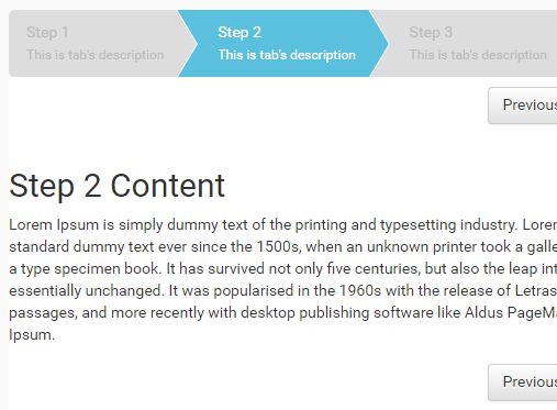
Smart Wizard is a jQuery step wizard plugin that converts a standard HTML list and tab panel structure into a fully functional, multi-step navigation interface.
It's ideal for jQuery-based web applications that need a production-ready component for registration forms, checkout flows, survey screens, or configuration sequences.
Features:
- TypeScript-rewritten: The v7 release is a complete TypeScript rewrite with built-in type declarations.
- Four built-in themes: Ships with
basic,arrows,glow, andpillsthemes. - Six transition effects:
default,fade,slideHorizontal,slideVertical,slideSwing, andcssmode transitions. - Dark, light, and auto modes: The
automode reads the system color scheme preference viamatchMedia. - Six step states: Individual steps can carry
completed,active,disabled,hidden,error, orwarningstates at runtime. - Keyboard navigation: Left and right arrow keys move between steps.
- Touch swipe navigation: Optional swipe support for mobile with a configurable pixel threshold.
- URL hash routing: Steps link to the URL hash with optional browser back and forward button support.
- Dynamic content loading: The
contentLoadercallback fetches step content asynchronously on demand. - Progress bar: A
--sw-progress-percentageCSS custom property drives the progress bar forward as the user advances. - Horizontal overflow scrolling: The step navigation scrolls horizontally with mouse wheel support when steps exceed the container width.
- RTL support: Full right-to-left layout support for localized applications.
- CSS animation library compatibility: The
csstransition mode integrates with Animate.css and any other keyframe-based library.
Use Cases:
- Multi-Step Registration Forms: Break long sign-up forms into digestible steps. Users can review and edit previous steps.
- E‑commerce Checkout: Guide customers through shipping, payment, and order confirmation. The progress bar keeps them informed.
- Survey or Questionnaire Wizards: Present questions one at a time. Use step states to indicate which sections are complete or have errors.
- Configuration Wizards: Help users set up complex software or hardware by walking them through options step by step.
See Also:
How To Use It:
1. Load the core stylesheet SmartWizard.css and a theme CSS of your choice in the webpage.
<!-- Core Stylesheet -->
<link href="./dist/css/smartwizard.min.css" rel="stylesheet" />
<!-- Optional SmartWizard themes -->
<link href="./dist/css/themes/arrows.min.css" rel="stylesheet">
<link href="./dist/css/themes/basic.min.css" rel="stylesheet">
<link href="./dist/css/themes/glow.min.css" rel="stylesheet">
<link href="./dist/css/themes/pills.min.css" rel="stylesheet">
2. The basic HTML structure for the smart wizard. The plugin requiers a wrapper div containing a <ul class="nav"> for the step anchors and a <div class="tab-content"> for the step panels. The href on each anchor must match the id of the corresponding panel. The progress bar is optional. Include it only when you want visible progress tracking.
<div id="registrationWizard">

  <!-- Step navigation anchors -->
  <ul class="nav">
    <li class="nav-item">
      <a class="nav-link" href="#account-info">
        <span class="badge">1</span>
        Account Info
      </a>
    </li>
    <li class="nav-item">
      <a class="nav-link" href="#personal-details">
        <span class="badge">2</span>
        Personal Details
      </a>
    </li>
    <li class="nav-item">
      <a class="nav-link" href="#preferences">
        <span class="badge">3</span>
        Preferences
      </a>
    </li>
    <li class="nav-item">
      <a class="nav-link" href="#confirmation">
        <span class="badge">4</span>
        Confirmation
      </a>
    </li>
  </ul>

  <!-- Step content panels — each id must match the anchor href -->
  <div class="tab-content">
    <div id="account-info" class="tab-pane" role="tabpanel" aria-labelledby="account-info">
      <h4>Account Information</h4>
      <p>Enter your username and email address.</p>
    </div>
    <div id="personal-details" class="tab-pane" role="tabpanel" aria-labelledby="personal-details">
      <h4>Personal Details</h4>
      <p>Enter your full name and date of birth.</p>
    </div>
    <div id="preferences" class="tab-pane" role="tabpanel" aria-labelledby="preferences">
      <h4>Preferences</h4>
      <p>Choose your notification and display settings.</p>
    </div>
    <div id="confirmation" class="tab-pane" role="tabpanel" aria-labelledby="confirmation">
      <h4>Confirmation</h4>
      <p>Review your details and submit your registration.</p>
    </div>
  </div>

  <!-- Optional progress bar — tracks step advancement -->
  <div class="progress">
    <div class="progress-bar" role="progressbar" style="width: 0%" aria-valuenow="0" aria-valuemin="0" aria-valuemax="100"></div>
  </div>

</div>
3. Load the latest jQuery library and the jQuery Smart Wizard plugin's script at the end of the webpage.
<script src="/path/to/cdn/jquery.min.js"></script>
<script src="./dist/js/jquery.smartWizard.min.js"></script>
4. Initialize the smart wizard with default options. That's it.
$(function() {
  // Minimal initialization — all options use defaults
  $('#registrationWizard').smartWizard();
});
5. All configuration options. Pass an options object to smartWizard() at initialization or call setOptions() at runtime.
initialStep(number): The zero-based index of the step to show on load. Default is0.theme(string): The visual theme. Acceptsbasic,arrows,glow, orpills. The matching theme CSS file must be included separately.displayMode(string): The color scheme. Acceptsauto,dark,light, ornone.autoreads the OS-levelprefers-color-schemepreference.behavior.autoHeight(boolean): Resizes the content area to match the active step panel height. Default istrue.behavior.useUrlHash(boolean): Syncs the active step with the URL hash. Default isfalse.behavior.supportBrowserHistory(boolean): Activates browser back and forward button support. RequiresuseUrlHash: true. Default isfalse.navigation.enabled(boolean): Lets users click step anchors to navigate directly. Default istrue.navigation.alwaysClickable(boolean): Lets users click any step at any time, regardless of completion state. Default isfalse.navigation.completed.enabled(boolean): Marks each visited step as completed on departure. Default istrue.navigation.completed.completeAllPreviousSteps(boolean): Marks all prior steps as completed when navigating via URL hash. Default istrue.navigation.completed.clearOnBack(boolean): Removes the completed state from a step when the user navigates backward past it. Default isfalse.navigation.completed.clickable(boolean): Lets users click back to previously completed steps. Default istrue.transition.effect(string): The step change animation. Acceptsnone,fade,slideHorizontal,slideVertical,slideSwing, orcss. Default isdefault.transition.speed(number): Animation duration in milliseconds. Not applied wheneffectiscss. Default is400.transition.easing(string): jQuery easing function name. Requires the jQuery Easing plugin. Not applied wheneffectiscss.transition.css.prefix(string): CSS class prefix for CSS-mode animations (e.g.,animate__animatedfor Animate.css).transition.css.forward.show(string): CSS animation class applied to the incoming panel during forward navigation.transition.css.forward.hide(string): CSS animation class applied to the outgoing panel during forward navigation.transition.css.backward.show(string): CSS animation class applied to the incoming panel during backward navigation.transition.css.backward.hide(string): CSS animation class applied to the outgoing panel during backward navigation.toolbar.position(string): Controls toolbar placement. Acceptsnone,top,bottom, orboth. Default isbottom.toolbar.buttons.showNext(boolean): Shows or hides the Next button. Default istrue.toolbar.buttons.showPrevious(boolean): Shows or hides the Previous button. Default istrue.toolbar.extraElements(string | jQuery object): Additional HTML or jQuery elements appended to the toolbar alongside the navigation buttons.keyboardNavigation.enabled(boolean): Activates left and right arrow key navigation. Default istrue.keyboardNavigation.keys.left(array): Key codes that trigger backward navigation. Default is[37].keyboardNavigation.keys.right(array): Key codes that trigger forward navigation. Default is[39].swipeNavigation.enabled(boolean): Activates touch swipe navigation on mobile. Default isfalse.swipeNavigation.threshold(number): Minimum swipe distance in pixels to register a navigation gesture. Default is50.localization.buttons.next(string): Label text for the Next button. Default is'Next'.localization.buttons.previous(string): Label text for the Previous button. Default is'Previous'.stepStates.completed(array): Zero-based step indexes to pre-mark as completed on initialization.stepStates.disabled(array): Step indexes to disable on initialization.stepStates.hidden(array): Step indexes to hide on initialization.stepStates.error(array): Step indexes to pre-mark with an error state on initialization.stepStates.warning(array): Step indexes to pre-mark with a warning state on initialization.scrollToView(boolean): Scrolls the active step anchor into the viewport on each step change. Default isfalse.contentLoader(function | null): A callback for dynamic content loading. Receives(stepIndex, stepDirection, stepPosition, stepElement, callback). Callcallback(htmlContent)when the content is ready.
$('#registrationWizard').smartWizard({
  initialStep: 0, // Start on the first step
  theme: 'arrows', // Use the arrows theme (arrows.min.css must be included)
  displayMode: 'auto', // Follow the system dark/light preference

  behavior: {
    autoHeight: true, // Resize the content area to each step's height
    useUrlHash: true, // Sync active step with the URL hash
    supportBrowserHistory: true // Respond to browser back/forward navigation
  },

  navigation: {
    enabled: true,
    alwaysClickable: false, // Users must complete steps in order
    completed: {
      enabled: true,
      completeAllPreviousSteps: true,
      clearOnBack: false,
      clickable: true
    }
  },

  transition: {
    effect: 'fade', // Crossfade between step panels
    speed: 350 // 350ms fade duration
  },

  toolbar: {
    position: 'bottom',
    buttons: {
      showNext: true,
      showPrevious: true
    },
    // Append a custom Save Draft button to the toolbar
    extraElements: '<button class="btn" id="btn-save-draft">Save Draft</button>'
  },

  keyboardNavigation: {
    enabled: true,
    keys: {
      left: [37], // Left arrow key
      right: [39] // Right arrow key
    }
  },

  swipeNavigation: {
    enabled: true, // Activate swipe navigation on touch devices
    threshold: 60 // Require at least 60px of horizontal swipe
  },

  localization: {
    buttons: {
      next: 'Continue', // Custom Next button label
      previous: 'Go Back' // Custom Previous button label
    }
  },

  stepStates: {
    completed: [],
    disabled: [3], // Lock the confirmation step on load
    hidden: [],
    error: [],
    warning: []
  },

  scrollToView: false,

  // Load step content from an endpoint on demand
  contentLoader: function(stepIndex, stepDirection, stepPosition, stepElement, callback) {
    $.get('/api/steps/' + stepIndex, function(html) {
      callback(html); // Pass the fetched HTML to the wizard
    });
  }
});
6. Available event handlers.
// Fires once after the wizard completes its internal setup
$('#registrationWizard').on('initialized.sw', function(e) {
  console.log('Wizard initialized.');
});

// Fires after the initial step renders for the first time
$('#registrationWizard').on('loaded.sw', function(e) {
  console.log('First step is now visible.');
});

// Fires before the wizard leaves the current step
// Return false from the handler to block navigation (for validation)
$('#registrationWizard').on('leave.sw', function(e, args) {
  // args contains: stepIndex, nextStepIndex, stepElement, stepDirection, stepPosition
  var stepIsValid = validateCurrentStep(args.stepIndex);
  if (!stepIsValid) {
    alert('Please complete all required fields before continuing.');
    return false; // Blocks the step transition
  }
});

// Fires after a new step becomes visible
$('#registrationWizard').on('shown.sw', function(e, args) {
  // args contains: stepIndex, stepElement, stepDirection, stepPosition
  console.log('Now on step ' + args.stepIndex + ' (' + args.stepDirection + ')');
});
7. Available API methods to create your own wizard controls.
const wizard = $('#registrationWizard');

// Advance to the next available step
wizard.smartWizard('next');

// Go back to the previous available step
wizard.smartWizard('prev');

// Navigate directly to step index 2 (third step, zero-based)
wizard.smartWizard('goToStep', 2);

// Force navigation to step 2; marks all preceding steps as completed
wizard.smartWizard('goToStep', 2, true);

// Reset the wizard to its initial state and first step
wizard.smartWizard('reset');

// Update configuration at runtime — no page reload required
wizard.smartWizard('setOptions', { theme: 'pills', displayMode: 'dark' });

// Disable steps at indexes 1 and 2
wizard.smartWizard('setState', [1, 2], 'disable');

// Mark step 3 with an error state (turns it red in most themes)
wizard.smartWizard('setState', [3], 'error');

// Mark step 2 with a warning state
wizard.smartWizard('setState', [2], 'warning');

// Re-enable previously disabled steps
wizard.smartWizard('unsetState', [1, 2], 'disable');

// Show the loading spinner (useful when fetching async content)
wizard.smartWizard('loader', 'show');

// Hide the loading spinner
wizard.smartWizard('loader', 'hide');

// Manually recalculate and apply the content area height
wizard.smartWizard('adjustHeight');

// Retrieve the current step index and total step count
const info = wizard.smartWizard('getStepInfo');
// Returns: { currentStep: 1, totalSteps: 4 }
console.log('Step ' + info.currentStep + ' of ' + info.totalSteps);
Alternatives
FAQs:
Q: How do I validate a form step before the user moves forward?
A: Bind a handler to the leave.sw event and return false to block navigation. The plugin calls every leave.sw handler before attempting the transition. Run your validation logic against args.stepIndex or query the fields inside args.stepElement. A return false in any handler stops the move and keeps the user on the current step.
Q: Can Smart Wizard v7 work alongside Bootstrap 5 or Tailwind CSS?
A: Yes. The plugin applies its own scoped CSS classes and does not conflict with utility-first frameworks. The toolbar renders standard <button> elements you can style freely. Step panels are plain div elements, so you can put any Bootstrap grid row or Tailwind component inside them.
Q: The transition flickers on the first step change. How do I fix it?
A: This usually occurs when autoHeight calculates a zero-height panel before the content renders. Set behavior.autoHeight: true and call wizard.smartWizard('adjustHeight') manually after any dynamic content populates a panel. If the flicker persists on slideHorizontal or slideVertical transitions, check that the wizard wrapper has overflow: hidden in your stylesheet .
Q: How do I load step content from an API on demand?
A: Use the contentLoader option. Pass a function that receives (stepIndex, stepDirection, stepPosition, stepElement, callback). Inside the function, make your Ajax request and pass the returned HTML string to callback(html). Call wizard.smartWizard('loader', 'show') at the start of the request and wizard.smartWizard('loader', 'hide') inside the callback to display the built-in loading indicator during the fetch.
Q: Can I add a custom button to the toolbar?
A: Yes. Pass an HTML string or a jQuery object to toolbar.extraElements. The plugin appends it to the toolbar alongside the Next and Previous buttons. For example, toolbar.extraElements: '<button class="btn" id="btn-save">Save Progress</button>' adds a Save button. Bind its click handler separately with standard jQuery.
Changelog:
v7.0.2 (2026-06-13)
- CSS Corrections and a few updates
v7 (2026-03-05)
- Added: Complete rewrite in TypeScript with bundled type declarations (dist/types/)
- Added: displayMode option — auto (follows system preference) | dark | light | none
- Added: swipeNavigation option — swipe left/right on touch devices to navigate steps (enabled, threshold)
- Added: Horizontal mouse-wheel scroll on the nav bar when steps overflow
- Added: behavior.useUrlHash and behavior.supportBrowserHistory options replace old enableUrlHash / backButtonSupport
- Added: navigation.completed.clickable option — control whether completed steps are re-clickable
- Added: DATA_ATTRIBUTES constants for data-theme attribute management
- Added: contentLoader callback for dynamic step content loading
- Added: CSS animation support for transitions via transition.css (prefix, forward, backward class groups)
- Added: Nav scroll buttons shown automatically when nav content overflows
- Added: UMD, ESM, and CJS build outputs
- Added: scrollToView option — scroll the active step anchor into view on step change
- Changed: All options restructured with clearer namespacing
- Changed: Events renamed for consistency
- Changed: reset() no longer manipulates URL hash unless useUrlHash + supportBrowserHistory are both enabled
- Changed: transition.css animations require the element to be visible before class is applied (fixes animationend not firing)
- Changed: this.default(...) references inside transition handlers replaced with direct transitions.default(...) to prevent TypeError when handlers are invoked without object context
- Changed: Progressbar width uses .toFixed(2) for cleaner CSS values
- Changed: ANIMATIONEND / ANIMATIONCANCEL events are now namespaced (.sw)
- Fixed: this is undefined TypeError in CSS / fade / slide transition fallbacks
- Fixed: animationend event not firing on hidden elements (element now shown before animation class is applied)
- Fixed: Double-invocation of transition complete callback (guard flag added)
- Fixed: URL hash incorrectly always set; now only when both useUrlHash and supportBrowserHistory are true
- Removed: justified option (layout handled by CSS)
- Removed: cycleNavigation option
- Removed: STEPCHANGE and RESET events (use shown.sw and handle externally)
v6.0.6 (2022-10-03)
- Fixed: History back on step1 not working
v6.0.5 (2022-08-08)
- Fixed: unDoneOnBackNavigation not working
v6.0.4 (2022-07-31)
- Changed: Code optimizations
v6.0.3 (2022-07-31)
- Fixed: Navigation not properly maintained when navigate fast
v6.0.1 (2022-06-27)
- Added: Support for jQuery Slim version
- Added: Public function fixHeight.
- Added: Public function setState.
- Added: Public function unsetState.
- Added: Public function getStepInfo to get step index and total steps.
- Added: goToStep function with force parameter.
- Added: Built-in progressbar
- Added: New themes, Square and Round
- Added: Dots and Square these can have progressbar on navigation by adding nav-progress CSS Class.
- Added: Colors are changable dynamically using CSS variables.
- Added: Bootstrap 5 support
- Added: Num(badge) class support on all themes
- Added: RTL (Right-to-left language) support
- Added: initialized event
- Added: Move CSS class names to options
- Added: Transition animations can be extended
- Added: CSS Animations support on transition animations. Supports Animate.css
- Changed: JavaScript and CSS code is rewritten
- Changed: Imporoved all CSS themes
- Changed: Made most of the options can changed with setOptions function
- Changed: Rewritten option names and properties with minimal and meaningful names
- Changed: Improved transition animations
- Fixed: Reset doesn't clear the existing steps of the error state.
- Fixed: goToStep method fails to recognize the correct step
- Fixed: URL Navigation to check if step visited.
- Fixed: Fixed and also added fixHeight public function to refresh content height.
- Fixed: CSS Files are empty
- Fixed: stepNumber is incorrect on showStep event when no transition
- Fixed: showStep showing Null instead of index 0 on initializing
- Fixed: showStep's stepIndex contains previous index
- Fixed: Content not showing when used inside a Bootrap 4 modal
- Fixed: Other fixes
- Removed: this.options.toolbar.buttonPosition is removed
- Removed: cycleNavigation is removed
- Removed: Dark mode is removed. Added CSS variable support to change any colors. See example for dark colors.
v5.1.1 (2020-07-11)
- Added: Accessibility
- Added: Dark Mode support for all themes
- Added: New theme (Progress)
- Added: leaveStep event has new parameter => nextStepIndex
- Added: UMD (Universal Module Definition) support
- Fixed: Incorrect stepDirection on leaveStep event
v5.0.0 (2020-05-24)
- Complete rewrite of JavaScript and CSS
- CSS to SCSS
- Updated all build packages
- External Ajax content support via Promise
- New navigation animations added
- New themes added
- New public functions
- New content loading event
- Standalone CSS with Bootstrap compatibility
v4.4.1 (2020-02-16)
- Added goToStep and hiddenSteps methods
- Build system packages updated to latest available.
v4.3.1 (2018-03-12)
- Bootstrap 4 support, bug fixes and improvements
v4.2.2 (2017-03-27)
- Small fixes and multiple wizard example added
v4.2.1 (2017-03-27)
- Dots and Circles themes updated to new design and made responsive
v4.1.7 (2017-02-21)
- Dots and Circles themes updated to new design and made responsive
v4.1.5 (2017-02-01)
- JS & CSS update
v4.1.2 (2017-01-09)
- JS & CSS update
v4.1.1 (2016-12-08)
- many improvements and additions
2016-11-16
- Updated to version v4.0.5
This awesome jQuery plugin is developed by techlab. For more Advanced Usages, please check the demo page or visit the official website.

