Material Design UI Component Library Based On Bootstrap 5/4
| File Size: | 1.91 MB |
|---|---|
| Views Total: | 1437 |
| Last Update: | |
| Publish Date: | |
| Official Website: | Go to website |
| License: | MIT |
Material Style is a responsive, beautifully crafted, Material Design styled UI component library built using jQuery library, Bootstrap 4/5 framework, and Material Icons.
Components Included:
- Accordion
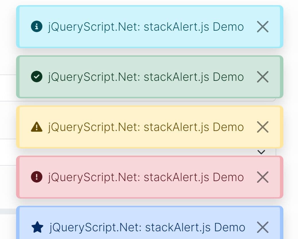
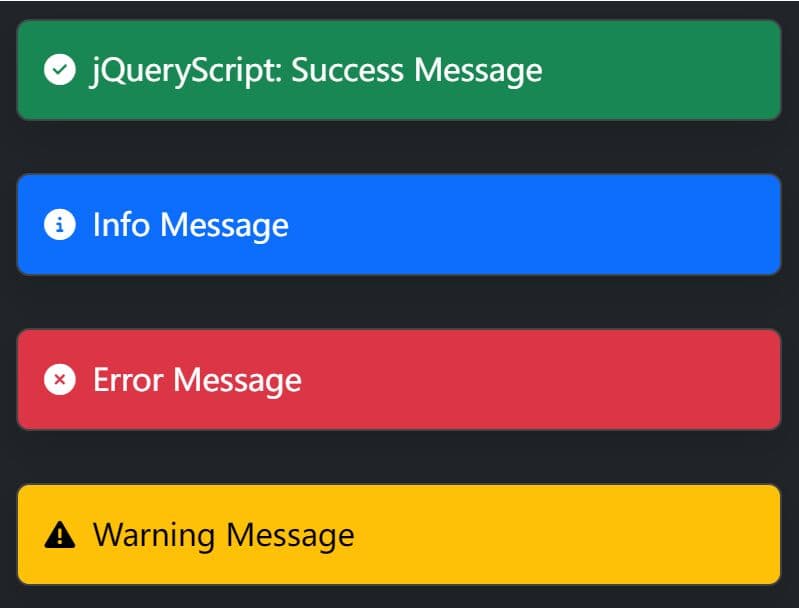
- Alerts
- Badges
- Breakcrumb
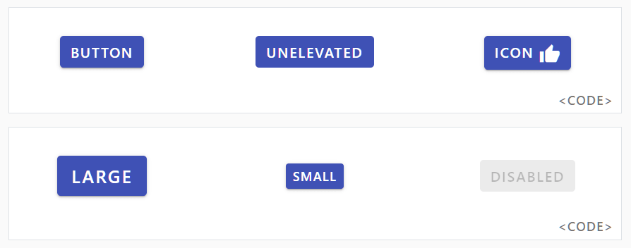
- Buttons
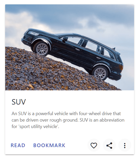
- Cards
- Carousel
- Close button
- Collapse
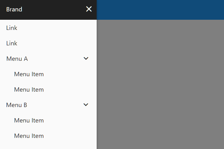
- Drawer
- Dropdowns
- Floating Action Button
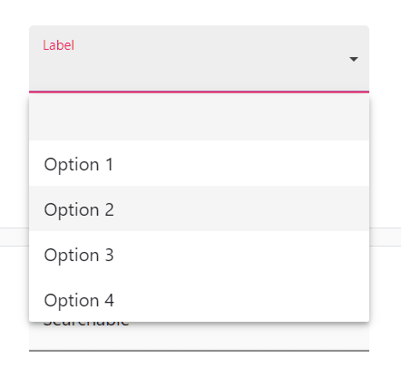
- Form Fields
- Lists
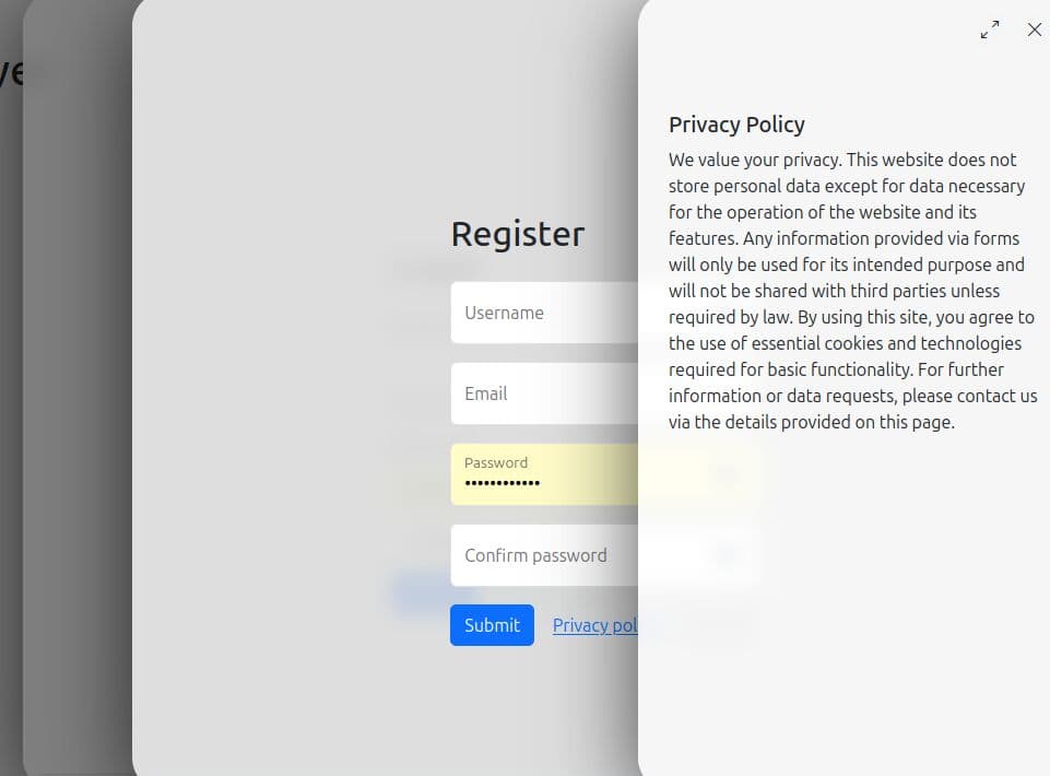
- Modal
- Navbar
- Pagination
- Placeholders
- Popovers
- Progress Bars
- Scrollspy
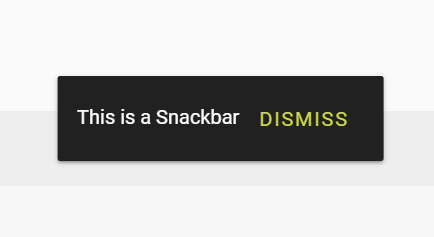
- Snackbars
- Spinners
- Tables
- Tabs
- Text Field
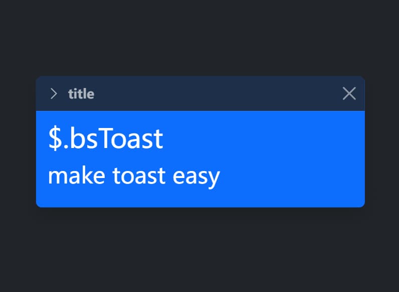
- Toasts
- Tooltips
How to use it:
1. Install the package with NPM.
# NPM
$ npm i @materialstyle/materialstyle --save
2. Import the Material Style into your project.
import '@materialstyle/materialstyle';
// or
import '@materialstyle/materialstyle/js/dist/util';
import '@materialstyle/materialstyle/js/dist/alert';
@import '@materialstyle/materialstyle/dist/css/materialstyle.min.css';
3. Or load the necessary JavaScript and CSS files into the document. Here is a starter template shows how to create a basic Material Style page.
<!doctype html>
<html lang="en">
<head>
  <!-- Required meta tags -->
  <meta charset="utf-8">
  <meta name="viewport" content="width=device-width, initial-scale=1, shrink-to-fit=no">
  <!-- Material Icons -->
  <link rel="stylesheet" href="https://fonts.googleapis.com/icon?family=Material+Icons">
  <!-- Material Style CSS -->
  <link rel="stylesheet" href="./dist/css/materialstyle.min.css">
  <title>Material Style</title>
</head>
<body>
  <!-- Navbar -->
  <nav class="navbar navbar-expand-sm bg-blue navbar-dark fixed-top auto-hide">
    <a class="navbar-brand" href="javascript:">
      Brand
    </a>
  </nav>
  <!-- Root -->
  <section class="m-root">
    <!-- Container -->
    <div class="m-container">
      YOUR CONTENT
    </div>
  </section>
  <!-- Footer -->
  <footer class="bg-dark text-white">
    Footer
  </footer>
  <!-- jQuery -->
  <script src="/path/to/cdn/jquery.min.js"></script>
  <!-- Popper JS -->
  <script src="/path/to/cdn/popper.min.js"></script>
  <!-- Material Style JS -->
  <script src="./dist/js/materialstyle.min.js"></script>
</body>
</html>
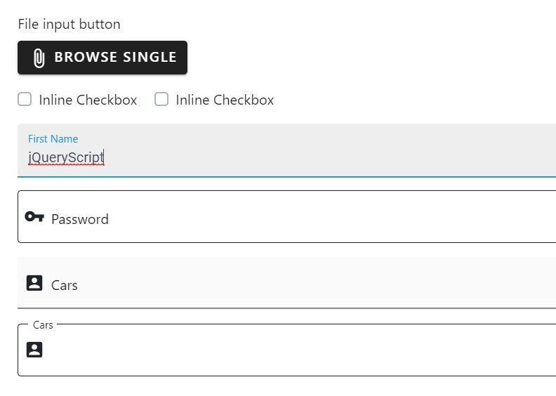
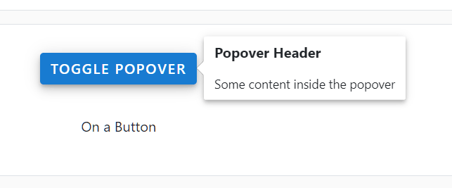
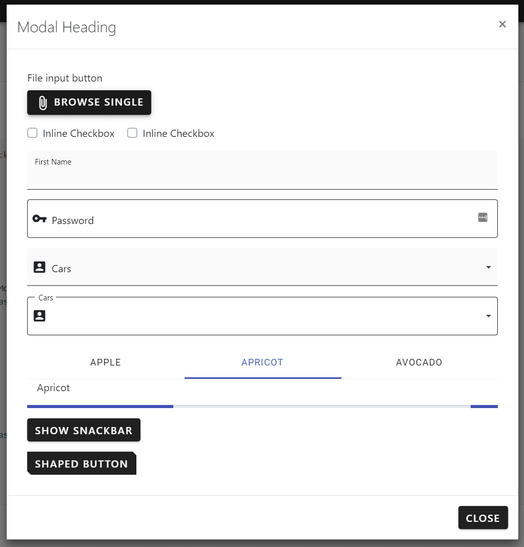
More Previews:
Changelog:
2023-09-28
- Updated for Bootstrap v5.3.2
2022-11-26
- Updated for Bootstrap v5.2.3
2022-09-09
- v3.0.0 stable
2022-09-07
- Updated Bootstrap 5 version
2022-07-25
- Added Bootstrap 5 version
This awesome jQuery plugin is developed by materialstyle. For more Advanced Usages, please check the demo page or visit the official website.