Customizable Round/Radial Range Slider Plugin With jQuery - Circle-Slider
| File Size: | 133 KB |
|---|---|
| Views Total: | 7241 |
| Last Update: | |
| Publish Date: | |
| Official Website: | Go to website |
| License: | MIT |
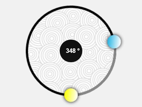
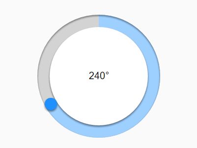
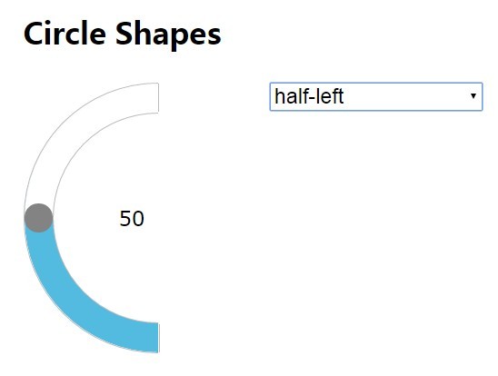
A simple, flexible, highly customizable jQuery circular slider plugin for rendering round/radial/ellipse range sliders using HTML5 canvas element and data attributes.
Key features:
- Supports any shapes you prefer.
- Touch events supported.
- Custom background, wheel, strip, handle and arrow.
- Supports mouse wheel events.
- Tons of configuration options.
See also:
- Minimal Circular Range Slider with jQuery and jQuery UI
- jQuery Plugin For 360 Degree Circular Range Selector
- Cool jQuery Plugin For Circular Carousel Slider - Tiny Circleslider
- jQuery Plugin For Multi-purpose Circular Slider Controls
Basic usage:
1. Just load the JavaScript file circle-slider.min.js after jQuery library and we're ready to go.
<script src="//code.jquery.com/jquery-3.2.0.min.js"></script>
<script src="circle-slider.min.js"></script>
2. Create a placeholder element for the circular slider.
<div class="circle-slider"
     data-type="circle-slider">
</div>
3. That's it. The plugin will automatically rendera default circular slider inside the container with the data-type="circle-slider" attribute. You're also allowed to manually initialize the plugin in the javascript as follow:
$('#slider-container').circleSlider();
4. The fastest way to customize the circular slider is to pass the following options via inline data-OPTIONNAME attributes on the placeholder element.
- data-type: "circle-slider", "degrees", "degrees2"
- data-padding: padding between sliders
- data-mousewheel-step: mouse wheel step value
- data-effects: "rotate-handle", "rotate-bg", "random-bg-color", "random-handle-color"
- data-start: start point in case of partial shape angle in degrees
- data-end: end point in case of partial shape angle in degrees
- data-radius: main circle radius / ellipse first
- data-radius2: the second radius in case of ellipse
- data-bgcolor: background color
- data-bgcolor2: if data-bgcolor2 is defined -> gradient is used instead of background color
- data-bggradient: h, v, r, d1, d2
- data-bg-image: custom repeated background image
- data-image: not repeated background image
- data-bgshadow: if true shadow is added
- data-bgshadow-color: shadow color
- data-bgshadow-blur: shadow blur
- data-bgshadow-x: shadow x offset
- data-bgshadow-y: shadow y offset
- data-path-width: strip width
- data-range: If true, range between 2 handles appears
- data-path-bgcolor: strip color
- data-path-bgcolor2: if data-path-bgcolor2 is defined -> gradient is used instead of background color
- data-path-gradient: h, v, r, d1, d2
- data-path-bgcolor-active: the color of the selected strip part
- data-path-bgcolor-active2: if data-path-bgcolor-active2 is defined -> gradient is used instead of background color
- data-path-bgcolor-active-gradient: h, v, r, d1, d2
- data-path-bg-image: path to the repeated background image of the strip
- data-path-bg-image-active: path to the repeated background image of the selected part of the strip
- data-path-image: path to the not repeated background image
- data-angle: the initial position of the first handle
- data-angle2: the initial position of the second handle (if exists)
- data-handle-radius: the radius of the handles; the default value equals to the strip width
- data-handle-color: handle color
- data-handle-color2: if data-handle-color2 is defined -> gradient is used instead of background
- data-handle-gradient: h, v, r, d1, d2
- data-handle2-color: second handle color (if exists)
- data-handle2-color2: if data-handle2-color2 is defined -> gradient is used instead of background color for the second handle
- data-handle2-gradient: h, v, r, d1, d2
- data-handle-bg-image: path to the background image of the first handle
- data-handle2-bg-image: path to the background image of the second handle (if exists)
- data-handle-shadow: if true shadow is added
- data-handle-shadow-color: shadow
- data-handle-shadow-blur: shadow blur
- data-handle-shadow-x: shadow x offset
- data-handle-shadow-y: shadow y offset
- data-arrow: if true arrow shape is added
- data-arrow-width: arrow shape width
- data-arrow-color: arrow shape color
- data-arrow-bg-image: arrow shape repeated background image
- data-arrow-image: arrow shape not repeated background image
<div
class="circle-slider"
data-type="circle-slider"
data-radius="100"
data-bgcolor="rgba(255, 255, 255, 0)"
data-path-width="5"
data-angle="0"
data-handle-radius="15"
data-handle-color="#24B4E3"
data-padding="25"
data-handle-shadow="true">
<!-- degrees placeholder -->
<div class="degrees-placeholder">
<span data-type="degrees"></span> °
</div>
</div>
Change log:
2017-04-15
- added touch events support
This awesome jQuery plugin is developed by htemplates. For more Advanced Usages, please check the demo page or visit the official website.