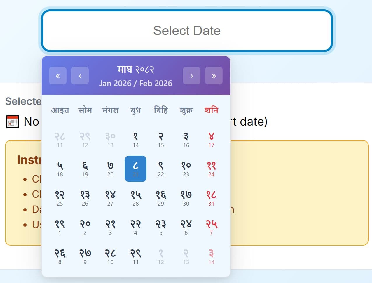
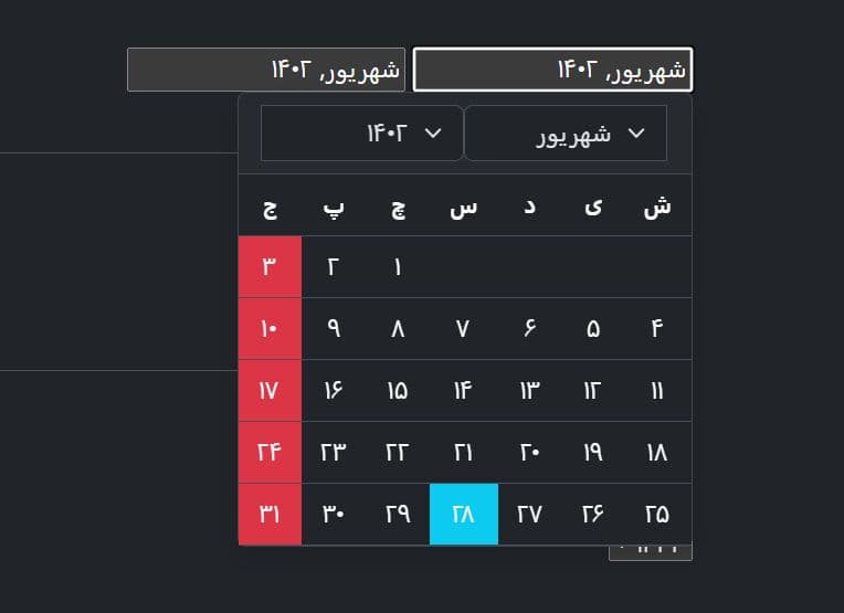
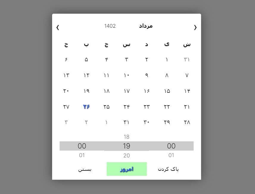
Hijri Date Picker With jQuery, Moment.js And Bootstrap
| File Size: | 372 KB |
|---|---|
| Views Total: | 30772 |
| Last Update: | |
| Publish Date: | |
| Official Website: | Go to website |
| License: | MIT |
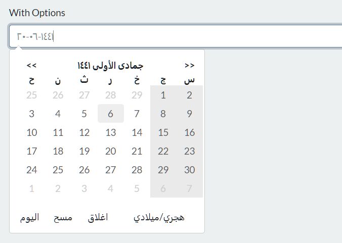
This is a Hijri date picker that allows the user to select a date from a Hijri calendar. Requires jQuery, Bootstrap, moment.js and moment-hijri.js.
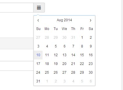
Heavily based on Eonasdan's Bootstrap Date/Time Picker.
See also:
- jQuery Datepicker Plugin For Persian Date - persianDatepicker
- Pretty persian Date Time Picker with jQuery and Bootstrap
- jQuery persian Date Picker Plugin - Pwt Datepicker
- Persian (Jalali) Calendar & Data Picker Plugin With jQuery - kamaDatepicker
How to use it:
1. Load the necessary jQuery, Bootstrap, and moment.js from CDN.
<link rel="stylesheet" href="bootstrap.min.css" />
<script src="jquery.slim.min.js"></script>
<script src="popper.min.js"></script>
<script src="bootstrap.min.js"></script>
<script src="moment.min.js"></script>
<!-- With locals <script src="moment-with-locales.min.js"></script> -->
<script src="moment-hijri.min.js"></script>
2. Load the Hijri Date Picker's JavaScript and CSS files.
<link href="css/bootstrap-datetimepicker.css" rel="stylesheet" />
<script src="js/bootstrap-hijri-datetimepicker.js"></script>
3. Initialize the plugin on an input field to create a basic Hijri Date Picker.
<input type="text" class="form-control hijri-date-input" />
$(".hijri-date-input").hijriDatePicker();
4. Possible options to customize the Hijri date picker. For more API, refer to the Bootstrap Date/Time Picker plugin.
$(".hijri-date-input").hijriDatePicker({

  // timezone
  timeZone: 'Etc/UTC',

  // Date format. See moment.js docs for valid formats.
  format: 'DD-MM-YYYY',
  hijriFormat: 'iYYYY-iMM-iDD',
  hijriDayViewHeaderFormat: 'iMMMM iYYYY',

  // Changes the heading of the datepicker when in "days" view.
  dayViewHeaderFormat: 'MMMM YYYY',

  // Allows for several input formats to be valid.
  extraFormats: false,

  // Number of minutes the up/down arrow's will move the minutes value in the time picker
  stepping: 1,

  // Prevents date/time selections before this date
  minDate: '1950-01-01',

  // Prevents date/time selections after this date
  maxDate: '2070-01-01',

  // On show, will set the picker to the current date/time
  useCurrent: true,

  // Using a Bootstraps collapse to switch between date/time pickers.
  collapse: true,

  // See moment.js for valid locales.
  locale: 'ar-SA',

  // Sets the picker default date/time.
  defaultDate: false,

  // Disables selection of dates in the array, e.g. holidays
  disabledDates: false,

  // Disables selection of dates NOT in the array, e.g. holidays
  enabledDates: false,

  // Change the default icons for the pickers functions.
  icons: {
    time: 'fa fa-clock text-primary',
    date: 'glyphicon glyphicon-calendar',
    up: 'fa fa-chevron-up text-primary',
    down: 'fa fa-chevron-down text-primary',
    previous: '<<',
    next: '>>',
    today: 'اليوم',
    clear: 'مسح',
    close: 'اغلاق'
  },

  // custom tooltip text
  tooltips: {
    today: 'Go to today',
    clear: 'Clear selection',
    close: 'Close the picker',
    selectMonth: 'Select Month',
    prevMonth: 'Previous Month',
    nextMonth: 'Next Month',
    selectYear: 'Select Year',
    prevYear: 'Previous Year',
    nextYear: 'Next Year',
    selectDecade: 'Select Decade',
    prevDecade: 'Previous Decade',
    nextDecade: 'Next Decade',
    prevCentury: 'Previous Century',
    nextCentury: 'Next Century',
    pickHour: 'Pick Hour',
    incrementHour: 'Increment Hour',
    decrementHour: 'Decrement Hour',
    pickMinute: 'Pick Minute',
    incrementMinute: 'Increment Minute',
    decrementMinute: 'Decrement Minute',
    pickSecond: 'Pick Second',
    incrementSecond: 'Increment Second',
    decrementSecond: 'Decrement Second',
    togglePeriod: 'Toggle Period',
    selectTime: 'Select Time'
  },

  // Defines if moment should use scrict date parsing when considering a date to be valid
  useStrict: false,

  // Shows the picker side by side when using the time and date together
  sideBySide: false,

  // Disables the section of days of the week, e.g. weekends.
  daysOfWeekDisabled: [],

  // Shows the week of the year to the left of first day of the week
  calendarWeeks: false,

  // The default view to display when the picker is shown
  // Accepts: 'years','months','days'
  viewMode: 'days',

  // Changes the placement of the icon toolbar
  toolbarPlacement: 'default',

  // Show the "Today" button in the icon toolbar
  showTodayButton: false,

  // Show the "Clear" button in the icon toolbar
  showClear: false,

  // Show the "Close" button in the icon toolbar
  showClose: false,

  // On picker show, places the widget at the identifier (string) or jQuery object if the element has css position: 'relative'
  widgetPositioning: {
    horizontal: 'auto',
    vertical: 'auto'
  },

  // On picker show, places the widget at the identifier (string) or jQuery object **if** the element has css `position: 'relative'`
  widgetParent: null,

  // Allow date picker show event to fire even when the associated input element has the `readonly="readonly"`property.
  ignoreReadonly: false,

  // Will cause the date picker to stay open after selecting a date if no time components are being used
  keepOpen: false,

  // If `false`, the textbox will not be given focus when the picker is shown.
  focusOnShow: true,

  // Will display the picker inline without the need of a input field. This will also hide borders and shadows.
  inline: false,

  // Will cause the date picker to **not** revert or overwrite invalid dates.
  keepInvalid: false,

  // CSS selector
  datepickerInput: '.datepickerinput',

  // shows switcher
  showSwitcher: true,

  // Debug mode
  debug: false,

  // If `true`, the picker will show on textbox focus and icon click when used in a button group.
  allowInputToggle: false,

  // Must be in 24 hour format. Will allow or disallow hour selections (much like `disabledTimeIntervals`) but will affect all days.
  disabledTimeIntervals: false,

  // Disable/enable hours
  disabledHours: false,
  enabledHours: false,

  // This will change the `viewDate` without changing or setting the selected date.
  viewDate: false,

  // Use hijri date
  hijri: false,

  // Enable/disable RTL mode
  isRTL: false

});
Changelog:
v1.0.1 (2020-03-04)
- Fix Data
- Fix destroy method
This awesome jQuery plugin is developed by balbarak. For more Advanced Usages, please check the demo page or visit the official website.