Customizable Adaptive jQuery Thumbnail Gallery Plugin
| File Size: | 50.2 MB |
|---|---|
| Views Total: | 6193 |
| Last Update: | |
| Publish Date: | |
| Official Website: | Go to website |
| License: | MIT |
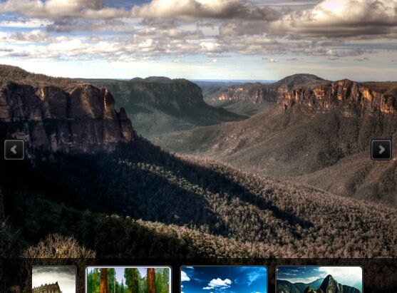
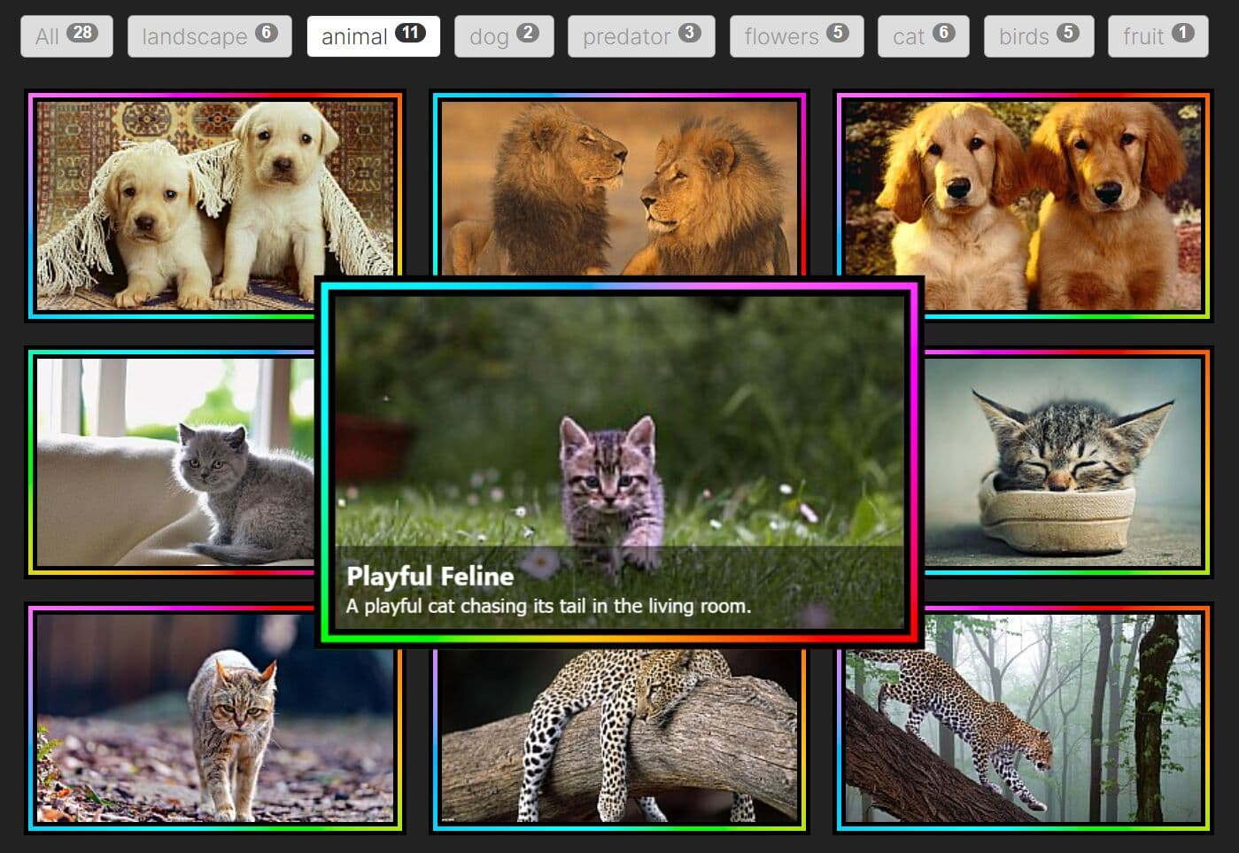
A simple, responsive and fully configuration jQuery thumbnail gallery plugin which allows you to navigate between gallery photos with thumbnails.
More features:
- Image data can be stored in a JSON or XML file.
- Fully responsive.
- Adaptive image sizes.
- Fullscreen mode.
- Thumbnail carousel.
- Tons of configuration options.
- Works on any devices: iPhone, iPad and Android smartphones
How to use it:
1. Download the plugin and add the following CSS and JS files in the head section of your website:
doptg/assets/gui/css/jquery.jscrollpane.css
doptg/assets/gui/css/jquery.dop.ThumbnailGallery.css
http://code.jquery.com/jquery-latest.js
doptg/assets/js/jquery.mousewheel.js
doptg/assets/js/jquery.jscrollpane.min.js
doptg/assets/js/jquery.dop.ThumbnailGallery.js
2. Call the function on the gallery container. You can add the following options to the plugin:
$('#galleryContainer').DOPThumbnailGallery({

  // gallery ID - necessary if you use more then one gallery on page
  'ID': 2,

  // JSON, XML, HTML
  'SettingsDataType': 'XML',

  // path to settings file
  'SettingsFilePath': 'settings.xml',

  // JSON, XML, HTML
  'ContentDataType': 'XML',

  // path to settings file
  'ContentFilePath': 'content.xml'

});
3. Customize the plugin. You have a JSON example in doptg/json/settings.json and a XML example in doptg/xml/settings.xml. For HTML, you need to add a list with class 'Settings':
<ul class=”Settings”></ul>
4. General Styles & Settings.
Width(value in pixels): Default value: 900. Set the width of the gallery.Height(value in pixels): Default value: 600. Set the height of the gallery.BgColor(color hex code): Default value: f1f1f1. Set gallery backgrund color.BgAlpha(value from 0 to 100): Default value: 100. Set gallery alpha.ImagesOrder(normal, random): Default value: normal. Set images order.ResponsiveEnabled(true, false): Default value: true. Enable responsive layout.
5. Thumbnails Styles & Settings.
ThumbnailsSpacing(value in pixels): Default value: 15. Sets the space between thumbnails.ThumbnailsPosition(top, right, bottom, left): Default value: bottom. Set the position of the thumbnails in the gallery.ThumbnailsOverImage(true, false): Default value: false. If the value is true the thumbnails will be displayed over the big image.ThumbnailsBgColor(color hex code): Default value: f1f1f1. Set the color for the thumbnails background.ThumbnailsBgAlpha(value from 0 to 100): Default value: 100. Set the transparency for the thumbnails background.ThumbnailsSpacing(value from 0 to 100): Default value: 100. Set the transparency for the thumbnails background.ThumbnailsPaddingTop(value in pixels): Default value: 0. Set the top padding for the thumbnails.ThumbnailsPaddingRight(value in pixels): Default value: 5. Set the right padding for the thumbnails.ThumbnailsPaddingBottom(value in pixels): Default value: 5. Set the bottom padding for the thumbnails.ThumbnailsPaddingLeft(value in pixels): Default value: 5. Set the left padding for the thumbnails.
6. Thumbnails Navigation Styles & Settings.
ThumbnailsSpacing(value in pixels): Default value: 15. Sets the space between thumbnails.ThumbnailsNavigation(mouse, arrows): Default value: mouse. Set the thumbnails navigation type.ThumbnailsNavigationPrev(path to image): Upload the image for thumbnails navigation's previous button.ThumbnailsNavigationPrevHover(path to image): Upload the image for thumbnails navigation's previous hover button.ThumbnailsNavigationNext(path to image): Upload the image for thumbnails navigation's next button.ThumbnailsNavigationNextHover(path to image): Upload the image for thumbnails navigation's next hover button.
7. Styles & Settings for a Thumbnail.
ThumbnailsSpacing(value in pixels): Default value: 15. Sets the space between thumbnails.ThumbnailLoader(path to image).Set the loader for the thumbnails.ThumbnailWidth(the size in pixels): Default valueThumbnailHeight(the size in pixels): Default value: 60. Set the height of a thumbnail.ThumbnailWidthMobile(the size in pixels): Default value: 60. Set the width of a thumbnail on mobile devices.ThumbnailHeightMobile(the size in pixels): Default value: 60. Set the height of a thumbnail on mobile devices.ThumbnailAlpha(value from 0 to 100): Default value: 50. Set the transparency of a thumbnail.ThumbnailAlphaHover(value from 0 to 100): Default value: 100. Set the transparency of a thumbnail when hover.ThumbnailAlphaSelected(value from 0 to 100): Default value: 100. Set the transparency of a thumbnail when selected.ThumbnailBgColor(color hex code): Default value: f1f1f1. Set the color of a thumbnail's background.ThumbnailBgColorHover(color hex code): Default value: 000000. Set the color of a thumbnail's background when hover.ThumbnailBgColorSelected(color hex code): Default value: 000000. Set the color of a thumbnail's background when selected.ThumbnailBorderSize(value in pixels): Default value: 2. Set the size of a thumbnail's border.ThumbnailBorderColor(color hex code): Default value: f1f1f1. Set the color of a thumbnail's border.ThumbnailBorderColorHover(color hex code): Default value: 000000. Set the color of a thumbnail's border when hover.ThumbnailBorderColorSelected(color hex code): Default value: 000000. Set the color of a thumbnail's border when selected.ThumbnailPaddingTop(value in pixels): Default value: 0. Set top padding value of a thumbnail.ThumbnailPaddingRight(value in pixels): Default value: 0. Set right padding value of a thumbnail.ThumbnailPaddingBottom(value in pixels): Default value: 0. Set bottom padding value of a thumbnail.ThumbnailPaddingLeft(value in pixels): Default value: 0. Set left padding value of a thumbnail.
8. Image Styles & Settings.
ImageLoader(path to image): Set the loader for the big image.ImageBgColor(color hex code): Default value: afafaf. Set the color for the image background.ImageBgAlpha(value from 0 to 100): Default value: 100. Set the transparency for the image background.ImageDisplayType(fit, full): Default value: fit. Set image display type. The fit value will display the all image. The full value will display the image on the all stage, padding and margin values will not be taken into consideration.ImageDisplayTime(time in miliseconds): Default value: 1000. Set image display duration.ImageMarginTop(value in pixels): Default value: 20. Set top margin value for the image.ImageMarginRight(value in pixels): Default value: 20. Set right margin value for the image.ImageMarginBottom(value in pixels): Default value: 20. Set bottom margin value for the image.ImageMarginLeft(value in pixels): Default value: 20. Set top left value for the image.ImagePaddingTop(value in pixels): Default value: 5. Set top padding value for the image.ImagePaddingRight(value in pixels): Default value: 5. Set right padding value for the image.ImagePaddingBottom(value in pixels): Default value: 5. Set bottom padding value for the image.ImagePaddingLeft(value in pixels): Default value: 5. Set left padding value for the image.
9. Navigation Styles & Settings.
ThumbnailsSpacing(value in pixels): Default value: 15. Sets the space between thumbnails.NavigationEnabled(true, false): Default value: true. Enable navigation buttons.NavigationOverImage(true, false): Default value: true. Show navigation buttons over or outside the image.NavigationPrev(path to image): Upload the image for navigation's previous button.NavigationPrevHover(path to image): Upload the image for navigation's previous hover button.NavigationNext(path to image): Upload the image for navigation's next button.NavigationNextHover(path to image): Upload the image for navigation's next hover button.NavigationLightbox(path to image): Upload the image for navigation's lightbox button.NavigationLightboxHover(path to image): Upload the image for navigation's lightbox hover button.NavigationTouchDeviceSwipeEnabled(true, false): Default value: true. Enable swipe navigation on touch devices.
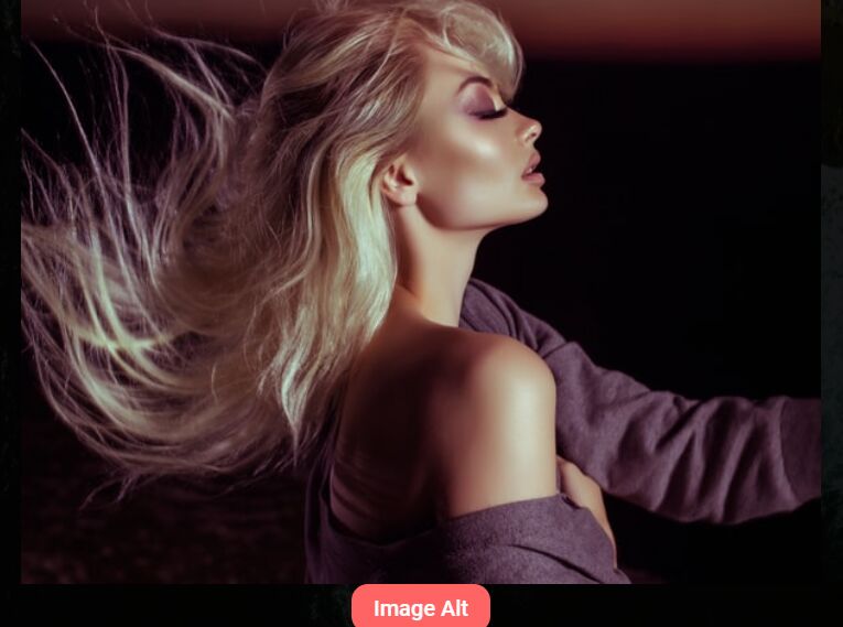
10. Image Caption Styles & Settings.
ThumbnailsSpacing(value in pixels): Default value: 15. Sets the space between thumbnails.CaptionWidth(value in pixels): Default value: 900. Set caption width.CaptionHeight(value in pixels): Default value: 75. Set caption height.CaptionTitleColor(color hex code): Default value: 000000. Set caption title color.CaptionTextColor(color hex code): Default value: 000000. Set caption text color.CaptionBgColor(color hex code): Default value: ffffff. Set caption background color.CaptionBgAlpha(value from 0 to 100): Default value: 50. Set caption alpha color.CaptionPosition(top, right, bottom, left, top-left, top-right, bottom-left, bottom-right): Default value: bottom. Set caption position.CaptionOverImage(true, false): Default value: true. Display caption over image, or not.CaptionScrollScrubColor(color hex code): Default value: 777777. Set scroll scrub color.CaptionScrollBgColor(color hex code): Default value: e0e0e0. Set scroll background color.CaptionMarginTop(value in pixels): Default value: 0. Set caption top margin.CaptionMarginRight(value in pixels): Default value: 0. Set caption right margin.CaptionMarginBottom(value in pixels): Default value: 0. Set caption bottom margin.CaptionMarginLeft(value in pixels): Default value: 0. Set caption left margin.CaptionPaddingTop(value in pixels): Default value: 10. Set caption top padding.CaptionPaddingRight(value in pixels): Default value: 10. Set caption right padding.CaptionPaddingBottom(value in pixels): Default value: 10. Set caption bottom padding.CaptionPaddingLeft(value in pixels): Default value: 10. Set caption left padding.
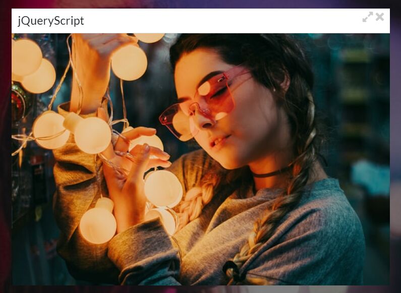
11. Lightbox Styles & Settings.
ThumbnailsSpacing(value in pixels): Default value: 15. Sets the space between thumbnails.LightboxEnabled(true, false): Default value: true. Enable the lightbox.LightboxWindowColor(color hex code): Default value: 000000. Set the color for the lightbox window.LightboxWindowAlpha(value from 0 to 100): Default value: 80. Set the transparency for the lightbox window.LightboxLoader(path to image): Set the loader for the lightbox image.LightboxBgColor(color hex code): Default value: 000000. Set the color for the lightbox background.LightboxBgAlpha(value from 0 to 100): Default value: 100. Set the transparency for the lightbox background.LightboxMarginTop(value in pixels): Default value: 70. Set top margin value for the lightbox.LightboxMarginRight(value in pixels): Default value: 70. Set right margin value for the lightbox.LightboxMarginBottom(value in pixels): Default value: 70. Set bottom margin value for the lightbox.LightboxMarginLeft(value in pixels): Default value: 70. Set top left value for the lightbox.LightboxPaddingTop(value in pixels): Default value: 10. Set top padding value for the lightbox.LightboxPaddingRight(value in pixels): Default value: 10. Set right padding value for the lightbox.LightboxPaddingBottom(value in pixels): Default value: 10. Set bottom padding value for the lightbox.LightboxPaddingLeft(value in pixels): Default value: 10. Set left padding value for the lightbox.
12. Lightbox Navigation Styles & Settings.
ThumbnailsSpacing(value in pixels): Default value: 15. Sets the space between thumbnails.LightboxNavigationPrev(path to image): Upload the image for lightbox navigation's previous button.LightboxNavigationPrevHover(path to image): Upload the image for lightbox navigation's previous hover button.LightboxNavigationNext(path to image): Upload the image for lightbox navigation's next button.LightboxNavigationNextHover(path to image): Upload the image for lightbox navigation's next hover button.LightboxNavigationClose(path to image): Upload the image for lightbox navigation's close button.LightboxNavigationCloseHover(path to image): Upload the image for lightbox navigation's close hover button.LightboxNavigationInfoBgColor(color hex code): Default value: 000000. Set the color for the lightbox info background.LightboxNavigationInfoTextColor(color hex code): Default value: dddddd. Set the color for the lightbox info text.LightboxNavigationTouchDeviceSwipeEnabled(true, false): Default value: true. Enable swipe lightbox navigation on touch devices.
13. Social Share Styles & Settings.
ThumbnailsSpacing(value in pixels): Default value: 15. Sets the space between thumbnails.SocialShareEnabled(true, false): Default value: true. Enable AddThis Social Share.SocialShare(path to image): Upload the image for social share button.SocialShareLightbox(path to image): Upload the image for lightbox social share button.
14. Tooltip Styles & Settings.
ThumbnailsSpacing(value in pixels): Default value: 15. Sets the space between thumbnails.TooltipEnabled(true, false): Default value: false. Enable the tooltip. The gallery item needs to have a title for tooltip to work.TooltipBgColor(color hex code): Default value: ffffff. Set tooltip background color.TooltipStrokeColor(color hex code): Default value: 000000. Set tooltip stroke color.TooltipTextColor(color hex code): Default value: 000000. Set tooltip text color.
15. Slideshow Settings.
ThumbnailsSpacing(value in pixels): Default value: 15. Sets the space between thumbnails.Slideshow"(true, false): Default value: false. Enable or disable the slideshow.SlideshowTime(time in miliseconds): Default: 5000. How much time an image stays until it passes to the next one.SlideshowAutostart(true, false): Default: true. Set it to true if you want the slideshow to start after imediatly after gallery is displayed.SlideshowLoop(true, false): Default: true. Set it to false if you want the slideshow to stop when it reaches the last image.SlideshowPlay(path to image): Upload the image for slideshow's play button.SlideshowPlayHover(path to image): Upload the image for slideshow's play hover button.SlideshowPause(path to image): Upload the image for slideshow's pause button.SlideshowPauseHover(path to image): Upload the image for slideshow's pause hover button.
16. Auto Hide Settings.
ThumbnailsSpacing(value in pixels): Default value: 15. Sets the space between thumbnails.AutoHide(true, false): Default: false. Hide the thumbnails and buttons and display them when you hover the gallery.AutoHideTimetime in miliseconds): Default: 2000. Set the time after which the thumbnails and buttons hide.
This awesome jQuery plugin is developed by dotonpaper. For more Advanced Usages, please check the demo page or visit the official website.