Lightweight jQuery Web Gallery with Thumbnail Slider - Logos Gallery
| File Size: | 0.99 MB |
|---|---|
| Views Total: | 17093 |
| Last Update: | |
| Publish Date: | |
| Official Website: | Go to website |
| License: | MIT |

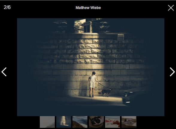
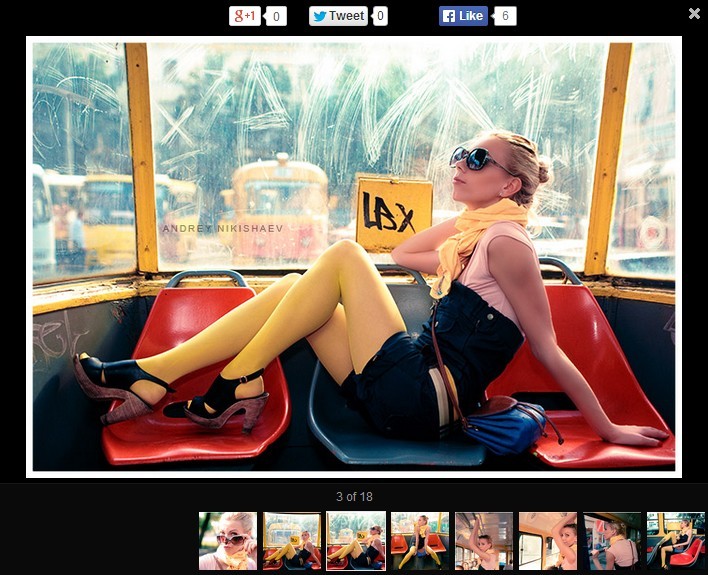
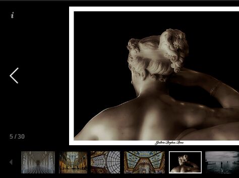
Logos Gallery is a lightweight jQuery & CSS3 based gallery/slideshow which allows you to infinitely navigate through a group of images by clicking on the thumbnails.
Features:
- Auto play/rotation with pause and resume controls.
- Fade transition effect.
- Carousel-like bottom thumbnail Slider.
- Auto play progress bar.
How to use it:
1. Create the Html structure for an image gallery as follows.
<section id="gallery-con">
  <section id="gallery-main">
    <img src="./images/content/001.jpg" />
  </section>
  <section id="gallery-hidden">
    <img src="./images/content/001.jpg" />
    <img src="./images/content/002.jpg" />
    <img src="./images/content/003.jpg" />
    ...
  </section>
  <section id="thumbnails">
    <div id="playtoggle" class="ui-button"><div class="icon icon-pause"></div></div>
    <div id="left-arrow" class="ui-button"><div class="icon icon-arrow-left"></div></div>
    <div id="thumbcon">
    </div>
    <div id="right-arrow" class="ui-button"><div class="icon icon-arrow-right"></div></div>
  </section>
  <section id="progressbar">
  </section>
</section>
2. Add the following CSS snippet in your document to style the image gallery.
#progressbar {
  width: 960px;
  height: 3px;
  margin-top: -3px;
  -moz-border-radius: 2px;
  -webkit-border-radius: 2px;
  -o-border-radius: 2px;
  -ms-border-radius: 2px;
  -khtml-border-radius: 2px;
  border-radius: 2px;
  background-image: -webkit-gradient(linear, 0% 50%, 100% 50%, color-stop(0%, rgba(130, 130, 130, 0.8)), color-stop(90%, rgba(215, 215, 235, 0.85)), color-stop(95%, rgba(225, 225, 255, 0.9)), color-stop(100%, #ffffff));
  background-image: -webkit-linear-gradient(left, rgba(130, 130, 130, 0.8) 0%, rgba(215, 215, 235, 0.85) 90%, rgba(225, 225, 255, 0.9) 95%, #ffffff 100%);
  background-image: -moz-linear-gradient(left, rgba(130, 130, 130, 0.8) 0%, rgba(215, 215, 235, 0.85) 90%, rgba(225, 225, 255, 0.9) 95%, #ffffff 100%);
  background-image: -o-linear-gradient(left, rgba(130, 130, 130, 0.8) 0%, rgba(215, 215, 235, 0.85) 90%, rgba(225, 225, 255, 0.9) 95%, #ffffff 100%);
  background-image: -ms-linear-gradient(left, rgba(130, 130, 130, 0.8) 0%, rgba(215, 215, 235, 0.85) 90%, rgba(225, 225, 255, 0.9) 95%, #ffffff 100%);
  background-image: linear-gradient(left, rgba(130, 130, 130, 0.8) 0%, rgba(215, 215, 235, 0.85) 90%, rgba(225, 225, 255, 0.9) 95%, #ffffff 100%);
  -moz-transition: all 0.7s ease;
  -webkit-transition: all 0.7s ease;
  -o-transition: all 0.7s ease;
  transition: all 0.7s ease;
}

#gallery-con {
  width: 960px;
  height: 550px;
  margin: 0 auto 0;
  padding: 0;
  border: 1px solid rgba(0, 0, 0, 0.5);
}

#gallery-con #gallery-main {
  margin: 0;
  padding: 0;
  position: absolute;
  z-index: -1;
}

#gallery-con #gallery-hidden {
  margin: 0;
  padding: 0;
  position: absolute;
  display: none;
  z-index: -1;
}

#gallery-con #thumbnails {
  width: 960px;
  height: 132px;
  background: rgba(130, 130, 130, 0.6);
  z-index: 10;
  margin-top: 418px;
  -moz-transition: all 0.5s ease;
  -webkit-transition: all 0.5s ease;
  -o-transition: all 0.5s ease;
  transition: all 0.5s ease;
  opacity: 0.6;
}

#gallery-con #thumbnails:hover {
  -moz-transition: all 0.5s ease;
  -webkit-transition: all 0.5s ease;
  -o-transition: all 0.5s ease;
  transition: all 0.5s ease;
  opacity: 1;
}

#gallery-con #thumbnails #thumbcon {
  width: 855px;
  height: 120px;
  display: inline-block;
  margin: 0;
  overflow: hidden;
  white-space: nowrap;
  float: left;
}

#gallery-con #thumbnails #thumbcon .thumb {
  width: 190px;
  height: auto;
  display: inline;
  margin: 12px 5px;
  opacity: 0.6;
  -moz-transition: all 0.5s ease;
  -webkit-transition: all 0.5s ease;
  -o-transition: all 0.5s ease;
  transition: all 0.5s ease;
  cursor: pointer;
}

#gallery-con #thumbnails #thumbcon .thumb:hover {
  -moz-transition: all 0.5s ease;
  -webkit-transition: all 0.5s ease;
  -o-transition: all 0.5s ease;
  transition: all 0.5s ease;
  opacity: 1;
  -moz-box-shadow: rgba(0, 0, 0, 0.6) 0px 0px 2px;
  -webkit-box-shadow: rgba(0, 0, 0, 0.6) 0px 0px 2px;
  -o-box-shadow: rgba(0, 0, 0, 0.6) 0px 0px 2px;
  box-shadow: rgba(0, 0, 0, 0.6) 0px 0px 2px;
}

#gallery-con #thumbnails #thumbcon .selected {
  -moz-transition: all 0.5s ease;
  -webkit-transition: all 0.5s ease;
  -o-transition: all 0.5s ease;
  transition: all 0.5s ease;
  opacity: 1;
  -moz-box-shadow: rgba(0, 0, 0, 0.6) 0px 0px 2px;
  -webkit-box-shadow: rgba(0, 0, 0, 0.6) 0px 0px 2px;
  -o-box-shadow: rgba(0, 0, 0, 0.6) 0px 0px 2px;
  box-shadow: rgba(0, 0, 0, 0.6) 0px 0px 2px;
}

#gallery-con #thumbnails .ui-button {
  width: 16px;
  height: 16px;
  background-image: -webkit-gradient(linear, 50% 0%, 50% 100%, color-stop(0%, rgba(170, 170, 170, 0.85)), color-stop(100%, rgba(215, 215, 215, 0.85)));
  background-image: -webkit-linear-gradient(top, rgba(170, 170, 170, 0.85) 0%, rgba(215, 215, 215, 0.85) 100%);
  background-image: -moz-linear-gradient(top, rgba(170, 170, 170, 0.85) 0%, rgba(215, 215, 215, 0.85) 100%);
  background-image: -o-linear-gradient(top, rgba(170, 170, 170, 0.85) 0%, rgba(215, 215, 215, 0.85) 100%);
  background-image: -ms-linear-gradient(top, rgba(170, 170, 170, 0.85) 0%, rgba(215, 215, 215, 0.85) 100%);
  background-image: linear-gradient(top, rgba(170, 170, 170, 0.85) 0%, rgba(215, 215, 215, 0.85) 100%);
  padding: 8px;
  -moz-border-radius: 3px;
  -webkit-border-radius: 3px;
  -o-border-radius: 3px;
  -ms-border-radius: 3px;
  -khtml-border-radius: 3px;
  border-radius: 3px;
  -moz-box-shadow: rgba(0, 0, 0, 0.7) 0px 0px 2px;
  -webkit-box-shadow: rgba(0, 0, 0, 0.7) 0px 0px 2px;
  -o-box-shadow: rgba(0, 0, 0, 0.7) 0px 0px 2px;
  box-shadow: rgba(0, 0, 0, 0.7) 0px 0px 2px;
  opacity: 0.60;
  -moz-transition: all 0.5s ease;
  -webkit-transition: all 0.5s ease;
  -o-transition: all 0.5s ease;
  transition: all 0.5s ease;
}

#gallery-con #thumbnails .ui-button:hover {
  -moz-transition: all 0.5s ease;
  -webkit-transition: all 0.5s ease;
  -o-transition: all 0.5s ease;
  transition: all 0.5s ease;
  opacity: 1;
  -moz-box-shadow: rgba(0, 0, 0, 0.7) 0px 0px 3px;
  -webkit-box-shadow: rgba(0, 0, 0, 0.7) 0px 0px 3px;
  -o-box-shadow: rgba(0, 0, 0, 0.7) 0px 0px 3px;
  box-shadow: rgba(0, 0, 0, 0.7) 0px 0px 3px;
}

#gallery-con #thumbnails #left-arrow {
  margin-top: 50px;
  margin-left: 10px;
  margin-right: 10px;
  display: inline-block;
  float: left;
}

#gallery-con #thumbnails #right-arrow {
  margin-top: 50px;
  margin-right: 10px;
  margin-left: 10px;
  display: inline-block;
  float: left;
}

#gallery-con #thumbnails #playtoggle {
  float: right;
  margin-top: -40px;
  margin-right: 10px;
}

#gallery-con #thumbnails .icon {
  display: inline-block;
  width: 32px;
  height: 32px;
  background-image: url(../images/sprites.png);
  background-repeat: no-repeat;
  cursor: pointer;
  z-index: 22;
  -moz-transition: all 0.5s ease;
  -webkit-transition: all 0.5s ease;
  -o-transition: all 0.5s ease;
  transition: all 0.5s ease;
}

#gallery-con #thumbnails .icon-play {
  background-position: 0 0;
  -moz-transition: all 0.5s ease;
  -webkit-transition: all 0.5s ease;
  -o-transition: all 0.5s ease;
  transition: all 0.5s ease;
}

#gallery-con #thumbnails .icon-pause {
  background-position: -32px 0;
  -moz-transition: all 0.5s ease;
  -webkit-transition: all 0.5s ease;
  -o-transition: all 0.5s ease;
  transition: all 0.5s ease;
}

#gallery-con #thumbnails .icon-arrow-right {
  background-position: -64px 0;
  -moz-transition: all 0.5s ease;
  -webkit-transition: all 0.5s ease;
  -o-transition: all 0.5s ease;
  transition: all 0.5s ease;
}

#gallery-con #thumbnails .icon-arrow-left {
  background-position: -96px 0;
  -moz-transition: all 0.5s ease;
  -webkit-transition: all 0.5s ease;
  -o-transition: all 0.5s ease;
  transition: all 0.5s ease;
}
3. Include the necessary jQuery library and the jQuery logos gallery plugin at the bottom of the document.
<script src="//ajax.googleapis.com/ajax/libs/jquery/1.11.1/jquery.min.js"></script>
<script defer src="js/gallery.js" ></script>
4. Setup the plugin at the beginning of the gallery.js.
var $transitionLength = 400;
var $timeBetweenTransitions = 4000;
This awesome jQuery plugin is developed by hellsan631. For more Advanced Usages, please check the demo page or visit the official website.