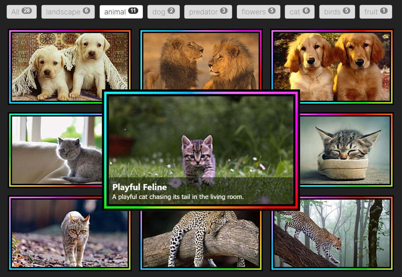
Expanding Gallery With Cool Hover Effect - Bold Gallery
| File Size: | 5.97 KB |
|---|---|
| Views Total: | 3585 |
| Last Update: | |
| Publish Date: | |
| Official Website: | Go to website |
| License: | MIT |

A modern expanding photo gallery with a cool hover effect that expands the image to the full size of the container element on click/tap.
Built using JavaScript (jQuery), Bootstrap, Font Awesome, CSS3 animations and CSS flexbox layout.
How to use it:
1. Load the necessary Bootstrap, Font Awesome, and jQuery JavaScript library in the document.
<link rel="stylesheet" href="https://use.fontawesome.com/releases/v5.4.2/css/all.css" integrity="sha384-/rXc/GQVaYpyDdyxK+ecHPVYJSN9bmVFBvjA/9eOB+pb3F2w2N6fc5qB9Ew5yIns" crossorigin="anonymous">
<link rel="stylesheet" href="https://stackpath.bootstrapcdn.com/bootstrap/4.1.3/css/bootstrap.min.css" integrity="sha384-MCw98/SFnGE8fJT3GXwEOngsV7Zt27NXFoaoApmYm81iuXoPkFOJwJ8ERdknLPMO" crossorigin="anonymous">
<script src="https://code.jquery.com/jquery-3.3.1.slim.min.js" integrity="sha384-q8i/X+965DzO0rT7abK41JStQIAqVgRVzpbzo5smXKp4YfRvH+8abtTE1Pi6jizo" crossorigin="anonymous"></script>
2. Insert images into the gallery following the HTML structure:
<div class="frame">
  <div class="container-fluid">
    <div class="row">
      <div class="backdrop"></div>
      <div class="col-4 pic pic-1">
        <img src="1.jpg" alt="">
        <div class="overlay"><i class="fas fa-plus"></i></div>
      </div>
      <div class="col-4 pic pic-2">
        <img src="2.jpg" alt="">
        <div class="overlay"><i class="fas fa-plus"></i></div>
      </div>
      <div class="col-4 pic pic-3">
        <img src="3.jpg" alt="">
        <div class="overlay"><i class="fas fa-plus"></i></div>
      </div>
      <div class="col-4 pic pic-4">
        <img src="4.jpg" alt="">
        <div class="overlay"><i class="fas fa-plus"></i></div>
      </div>
      <div class="col-4 pic pic-5">
        <img src="5.jpg" alt="">
        <div class="overlay"><i class="fas fa-plus"></i></div>
      </div>
      <div class="col-4 pic pic-6">
        <img src="6.jpg" alt="">
        <div class="overlay"><i class="fas fa-plus"></i></div>
      </div>
      <div class="col-4 pic pic-7">
        <img src="7.jpg" alt="">
        <div class="overlay"><i class="fas fa-plus"></i></div>
      </div>
      <div class="col-4 pic pic-8">
        <img src="8.jpg" alt="">
        <div class="overlay"><i class="fas fa-plus"></i></div>
      </div>
      <div class="col-4 pic pic-9">
        <img src="9.jpg" alt="">
        <div class="overlay"><i class="fas fa-plus"></i></div>
      </div>
    </div>
  </div>
</div>
3. The necessary CSS/CSS3 styles for the gallery.
.frame {
  position: absolute;
  top: 50%;
  left: 50%;
  width: 400px;
  height: 400px;
  margin-top: -200px;
  margin-left: -200px;
  border-radius: 2px;
  box-shadow: 0.5rem 0.5rem 2rem rgba(255, 30, 173, 0.5);
  overflow: hidden;
  background: #FF1EAD;
  color: #333;
  font-family: 'Open Sans', Helvetica, sans-serif;
  -webkit-font-smoothing: antialiased;
  -moz-osx-font-smoothing: grayscale;
  display: flex;
  flex-direction: row;
}

.frame .pic {
  padding: 1%;
}

.pic {
  -webkit-animation: 1s appear;
          animation: 1s appear;
}

@-webkit-keyframes appear {
  0% {
    opacity: 0;
  }
  100% {
    opacity: 1;
  }
}

@keyframes appear {
  0% {
    opacity: 0;
  }
  100% {
    opacity: 1;
  }
}
.pic-1 {
  -webkit-animation-delay: .2s;
          animation-delay: .2s;
  -webkit-transform-origin: -9% -9%;
          transform-origin: -9% -9%;
}

.pic-2 {
  -webkit-animation-delay: .3s;
          animation-delay: .3s;
  -webkit-transform-origin: 50% -9%;
          transform-origin: 50% -9%;
}

.pic-3 {
  -webkit-animation-delay: .4s;
          animation-delay: .4s;
  -webkit-transform-origin: 109% -9%;
          transform-origin: 109% -9%;
}

.pic-4 {
  -webkit-animation-delay: .5s;
          animation-delay: .5s;
  -webkit-transform-origin: -9% 50%;
          transform-origin: -9% 50%;
}

.pic-5 {
  -webkit-animation-delay: .6s;
          animation-delay: .6s;
}

.pic-6 {
  -webkit-animation-delay: .7s;
          animation-delay: .7s;
  -webkit-transform-origin: 109% 50%;
          transform-origin: 109% 50%;
}

.pic-7 {
  -webkit-animation-delay: .8s;
          animation-delay: .8s;
  -webkit-transform-origin: -9% 109%;
          transform-origin: -9% 109%;
}

.pic-8 {
  -webkit-animation-delay: .9s;
          animation-delay: .9s;
  -webkit-transform-origin: 50% 109%;
          transform-origin: 50% 109%;
}

.pic-9 {
  -webkit-animation-delay: 1s;
          animation-delay: 1s;
  -webkit-transform-origin: 109% 109%;
          transform-origin: 109% 109%;
}

.pic img {
  width: 100%;
  height: 100%;
  -webkit-filter: saturate(0) contrast(125%);
          filter: saturate(0) contrast(125%);
}

.overlay {
  position: absolute;
  top: 50%;
  left: 50%;
  width: 0;
  height: 0;
  background-color: rgba(255, 30, 173, 0.7);
  opacity: 0;
  z-index: 1000;
  display: flex;
  justify-content: center;
  align-items: center;
}
.overlay i {
  color: white;
  font-size: 200%;
  -webkit-animation: pulsing 1s infinite;
          animation: pulsing 1s infinite;
}

@-webkit-keyframes pulsing {
  50% {
    -webkit-transform: scale(1.1);
            transform: scale(1.1);
  }
}

@keyframes pulsing {
  50% {
    -webkit-transform: scale(1.1);
            transform: scale(1.1);
  }
}
.pic {
  overflow: hidden;
}
.pic:hover {
  cursor: pointer;
}
.pic:hover .overlay {
  left: 2%;
  top: 2%;
  width: 95%;
  height: 95%;
  opacity: 1;
  transition: .3s ease-out;
}

.active {
  transition: .5s ease-out;
  -webkit-transform: scale(2.7);
          transform: scale(2.7);
  z-index: 2000;
}
.active img {
  transition: .5s ease-in;
  box-shadow: 0 0 1rem 1rem white;
}
.active .overlay {
  display: none;
}

.backdrop {
  position: absolute;
  width: 100%;
  height: 100%;
  top: 0;
  left: 0;
}

.underlay {
  background-color: #FF1EAD;
  transition: .5s;
  z-index: 1;
}
4. Toggle the CSS classes using jQuery. Done.
$('.pic').click(function() {
  $(this).toggleClass('active');
  $('.backdrop').toggleClass('underlay');
});
This awesome jQuery plugin is developed by Artemis1. For more Advanced Usages, please check the demo page or visit the official website.