Customizable CSS3 Animated Modal Dialog Plugin For jQuery
| File Size: | 9.07 KB |
|---|---|
| Views Total: | 1187 |
| Last Update: | |
| Publish Date: | |
| Official Website: | Go to website |
| License: | MIT |
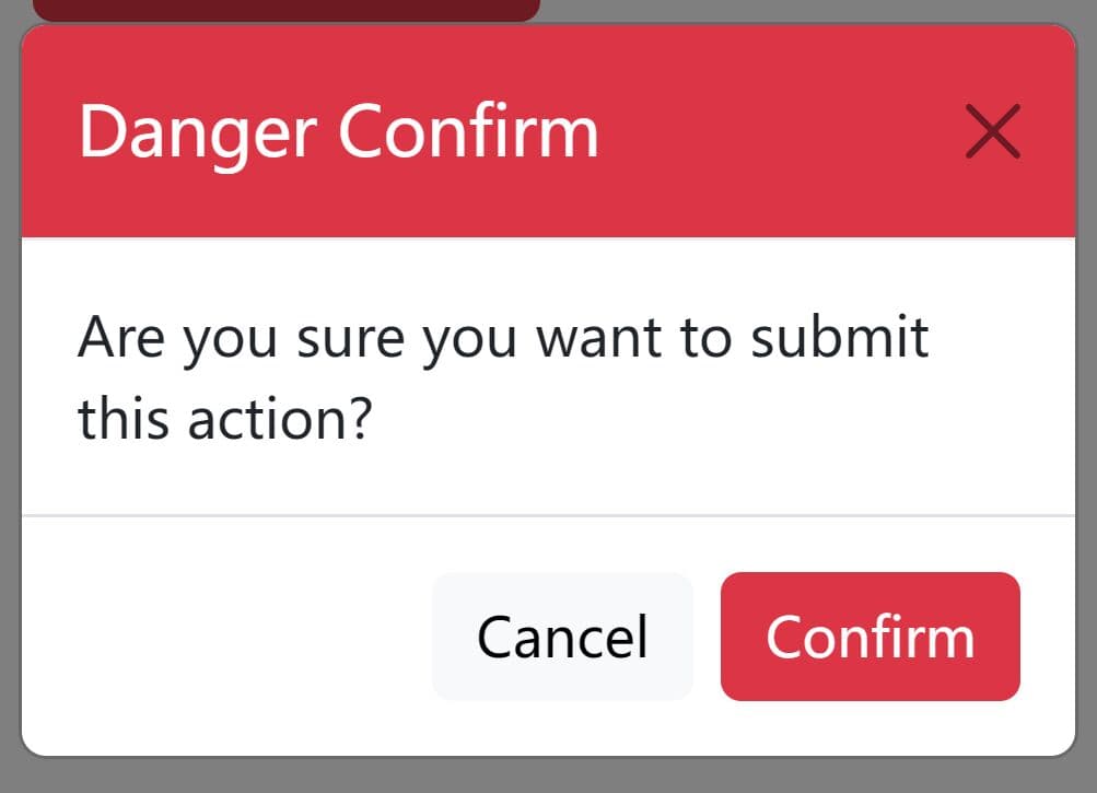
A minimal, clean, highly customizable jQuery modal dialog plugin which uses CSS3 for the awesome modal open/close animations.
Key features:
- Custom background overlay.
- Custom close icon.
- Supports any html content: text, images, etc.
- Custom header/body/footer styles.
- Custom confirm/cancel buttons.
- Shows/hides header and footer.
- Auto dismisses after a timeout.
- Event handlers. Ideal for confirmation dialog.
How to use it:
1. Load the core stylesheet and animation CSS in the header section of the webpage.
<link rel="stylesheet" href="css/modal-dialog.css">
<link rel="stylesheet" href="css/modal-dialog-animate.css">
2. Load jQuery library and the main JavaScript right before the closing body tag.
<script src="https://code.jquery.com/jquery-3.3.1.slim.min.js"
        integrity="sha384-q8i/X+965DzO0rT7abK41JStQIAqVgRVzpbzo5smXKp4YfRvH+8abtTE1Pi6jizo"
        crossorigin="anonymous"></script>
<script src="js/modal-dialog.js"></script>
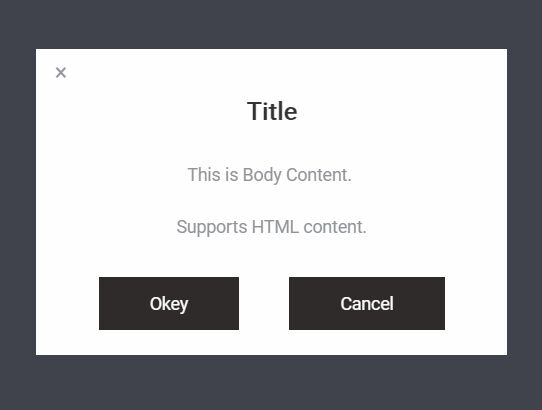
3. Create a basic dialog on the webpage.
new Dialog({
    title: 'Title',
    bodyContent: 'This is Body Content. <br/> Supports HTML content.'
});
4. Available options to customize the modal dialog.
new Dialog({
    dialogWidth: 'auto',
    dialogHeight: 'auto',
    dialogBorder: 'none',
    dialogPadding: '0px 200px',
    dialogBgColor: '#FFF',
    dialogClassName: undefined,
    dialogBorderRadius: 0,
    dialogAnimationIn: 'animated scaleFadeIn',
    dialogAnimationOut: 'animated scaleFadeOut'
});
5. Available options to customize the background overlay.
new Dialog({
    title: 'Title',
    bodyContent: 'This is Body Content. <br/> Supports HTML content.',
    mask: true,
    maskBgColor: 'rgba(43, 46, 56, .9)',
    maskClassName: undefined,
    maskAniamtionIn: 'animated fadeIn',
    maskAnimationOut: 'animated fadeOut',
    zIndex: 0
});
6. Available options to customize the header content.
new Dialog({
    title: 'Title',
    bodyContent: 'This is Body Content. <br/> Supports HTML content.',
    head: true,
    fontSize: 20,
    fontColor: '#333',
    fontWeight: 'bold',
    textAlign: 'center',
    headClassName: undefined,
    headPadding: '0 0 15px 0',
    headWidth: '100%',
    headHeight: '60px',
    headLineHeight: 0
});
7. Available options to customize the body content.
new Dialog({
    title: 'Title',
    bodyContent: 'This is Body Content. <br/> Supports HTML content.',
    body: true,
    bodyPadding: '15px 20px',
    bodyFontSize: 14,
    bodyLineHeight: 1.5,
    bodyTextColor: '#919498',
    bodyTextAlign: 'center',
    bodyClassName: undefined
});
8. Available options to customize the footer content and action buttons.
new Dialog({
    title: 'Title',
    bodyContent: 'This is Body Content. <br/> Supports HTML content.',
    footer: true,
    footerPadding: '15px 0 20px 0',
    buttonLineHeight: '43px',
    buttonFontSize: 14,
    buttonClassName: undefined,
    buttonMargin: 40,
    buttonPadding: '0 41px',
    confirm:  true, // shows confirm button
    cancel: true, // shows cancel button
    confirmText: 'Okey',
    cancelText: 'Cancel',
    footerClassName: undefined
});
9. Available options to customize the close icon.
new Dialog({
    title: 'Title',
    bodyContent: 'This is Body Content. <br/> Supports HTML content.',
    close: true,
    closePositionTop: 8,
    closePositionLeft: 15,
    closePositionRight: 0,
    closeFontSize: 18,
    closeClassName: undefined
});
10. Decide whether to uses CSS3 transitions.
new Dialog({
    title: 'Title',
    bodyContent: 'This is Body Content. <br/> Supports HTML content.',
    animation: true // default: true
});
11. Create a temporary modal dialog that auto dismiss after a timeout (5 seconds in this example).
const dialog =  Dialog({
    title: 'Title',
    bodyContent: 'This is Body Content. <br/> Supports HTML content.'
});

setTimeout(() => {
  dialog.out();
}, 5000);
12. Available event handlers.
new Dialog({
    event: {
      close:    function() {},
      cancel:   function() {},
      confirm:  function() {}
    }
});
Changelog:
2018-07-29
- Update modal-dialog.js
This awesome jQuery plugin is developed by rainydaycode. For more Advanced Usages, please check the demo page or visit the official website.