Multifunction Customizable Modal Plugin For jQuery - ssi-modal
| File Size: | 123 KB |
|---|---|
| Views Total: | 4238 |
| Last Update: | |
| Publish Date: | |
| Official Website: | Go to website |
| License: | MIT |
ssi-modal is a simple yet robust jQuery plugin that helps you create highly customizable modal / dialog / notification / gallery popup boxes with one JS call.
Key features:
- Easy to implement.
- Can be used as notification messages.
- Cool animations on modal open / close.
- Custom positions and sizes.
- Stackable modal windows.
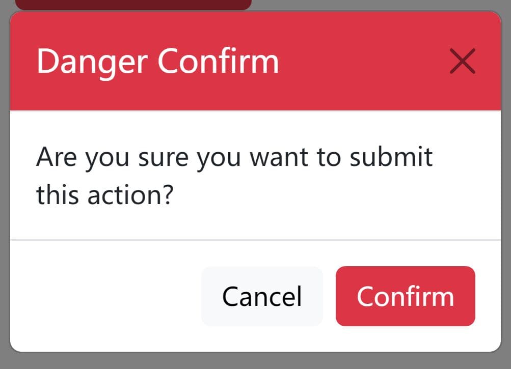
- Custom action buttons. Good for confirmation dialog boxes.
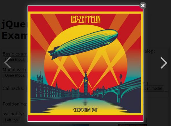
- Image and gallery lightbox supported.
How to use it:
1. All you have to do is to include jQuery library together with the jQuery ssi-modal plugin's files on the html page and we're ready to go.
<link href="ssi-modal.min.css" rel="stylesheet">
<script src="jquery.min.js"></script>
<script src="ssi-modal.min.js"></script>
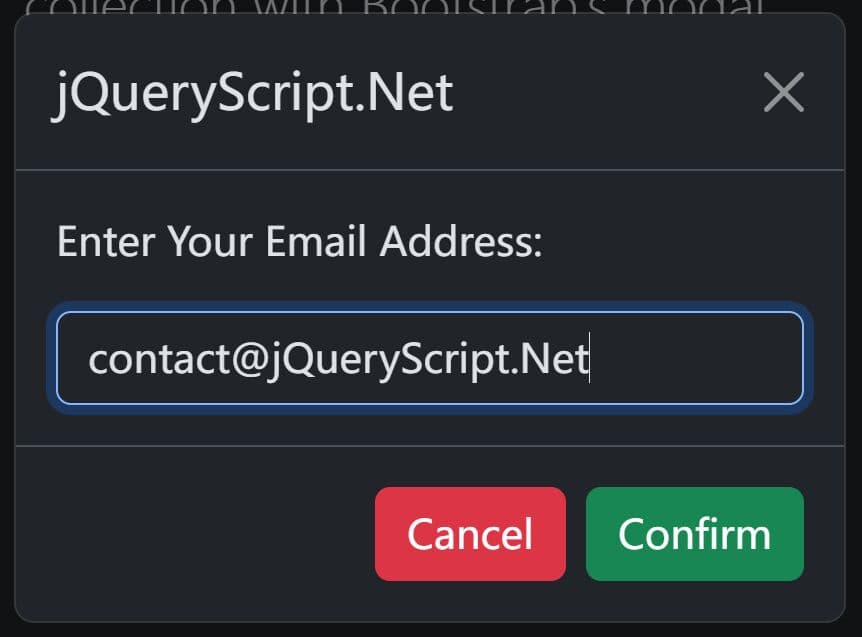
2. Create a basic modal window with custom content.
ssi_modal.show({
  content: 'Hello World!'
});
3. Create a confirm dialog with custom buttons.
ssi_modal.confirm({
  content: 'Are you sure?',
  okBtn: {
    className:'btn'
  },
  cancelBtn:{
    className:'btn'
  }
   },function (result) {
      if(result)
          // success
      else
          // error
  }
);
4. Create a notification message.
ssi_modal.notify('success', {
  content: 'Success'
});
5. Create a single image lightbox.
<a href="1.jpg" class="ssi-imgBox">Image Lightbox</a>
<a href="1.jpg" class="ssi-imgBox">
  <img src="1.jpg">
</a>
6. Create a gallery lightbox from a group of different medias.
<a data-ssi_imgGroup="group-1" href="1.jpg" class="ssi-imgBox">
  <img src="1.jpg"/>
</a>
<a data-ssi_imgGroup="group-1" href="2.jpg" class="ssi-imgBox">
  <img src="1.jpg"/>
</a>
<a data-ssi_imgGroup="group-1" href="3.jpg" class="ssi-imgBox">
  <img src="1.jpg"/>
</a>
ssi_modal.imgBox({
  title: true,
  animation: true,
  center: true,
  iframe: {className: 'idd'}
}, 'group-1');
7. All default options.
// The main content of the modal.
content: '',

// Enables/disables the scroll bar of the document when the modal is opened.
bodyScroll: false,

// Forces the modal to remove or not the content when it close.It not associated with stack modals
keepContent: false,

// Sets the position of the modals.
// 'right top'|'right bottom'|'left top'|'left bottom'|'center top'|'center bottom'
position: '',

// Enables disables the back drop. The shared option defines that the modal will open a back drop only if there is not anyone already in the dom.
// The byKindShared is similar to the shared but the already rendered backdrop must belong to the same kind of modals (normal modal,stack modal,imgBox modal) else will open new.
// boolean|'shared'|'byKindShared'
backdrop: true,

// Make the modal a part of stack.For example toast/notification messages. Requires position.
stack: false,

// Enables/Disables the ability to close the modal when you click in the main window.
onClickClose: false,

bodyElement: false,

// Defines a class to the modal outer element.
className: '',

// Defines a class to the backdrop element.
backdropClassName: '',

// Set the options and the state of a modal according to the preview
preview: {
    icon: false, // Generate an icon that allows the user to change display state
    hideIcons: false, // Enables/disables the ability to hide the modal after a certain time when the modal is in fullScreen state.
    state: 'normal' // full
},

// { time: 4, displayTime:false, resetOnHover:true }
closeAfter: false,

// Close the modal when you click outside.
outSideClose: true,

// Callback when the modal closes.
onClose: '',

// Callback when the modal opens.
onShow: '',

// Callback when the modal closes.
beforeClose: '',

// Callback when the modal opens.
beforeShow: '',

// Options for iframe.
iframe: {
  allowFullScreen: true,
  className: ''
},

// Element centering.Not associated with positioned modals
center: false,
closeIcon: true,

// Enables/disables the navigation of imgBox.
navigation: false,

// Defines the size of the modal.
sizeClass: 'medium',

// Enables/disables animations if you set a string all animation type will be set to that sting.
animation: false,

// Set the animations for the modal window.
// {show:'',hide:''}
modalAnimation: undefined,

// Set the animations for modal the back drop.
// {show:'',hide:''}
backdropAnimation: undefined,

animationSpeed: 300,

// The buttons of modal.
// [{className: 'btn btn-danger', enableAfter:3, id: '', label: 'Open', modalReverseAnimation:true backdropReverseAnimation:true
buttons: [],

closeAfter:{ clearTimeOut:true, keepContent:true, method: function(){ } } ]

// Register a new icon in the top of the modal( where the x button is).You can modify it only with css using content and background properties.
// [className:'',method:function(){}]
iconButtons: [],

// The title of the modal.
title: '',

// If modal height is bigger than the screen the height of modal will be fixed and will fit the screen also the content will be scrollable.
fixedHeight: false,

// The modal min-height will be the height of screen.
fitScreen: false
8. API methods.
// closes the very top modal
ssi_modal.close()

// closes the modal with class myModal
ssi_modal.close('.myModal')

// closes the normal and notify modals but not those with myModal class.
ssi_modal.closeAll(['normalModal','notify'],'myModal']);

// closes all the modals except those with myModal and mySecondModal classes.
ssi_modal.closeAll('',['myModal','mySecondModal']]);

// closes all the modals.
ssi_modal.closeAll();

// removes immediately all the modal elements from the DOM.
ssi_modal.removeAll();
Changelog:
2020-07-24
- v1.0.28: Fixed for jQuery 3+
This awesome jQuery plugin is developed by ssbeefeater. For more Advanced Usages, please check the demo page or visit the official website.