Accessible Modal Popup With jQuery And CSS3
| File Size: | 8.82 KB |
|---|---|
| Views Total: | 1392 |
| Last Update: | |
| Publish Date: | |
| Official Website: | Go to website |
| License: | MIT |
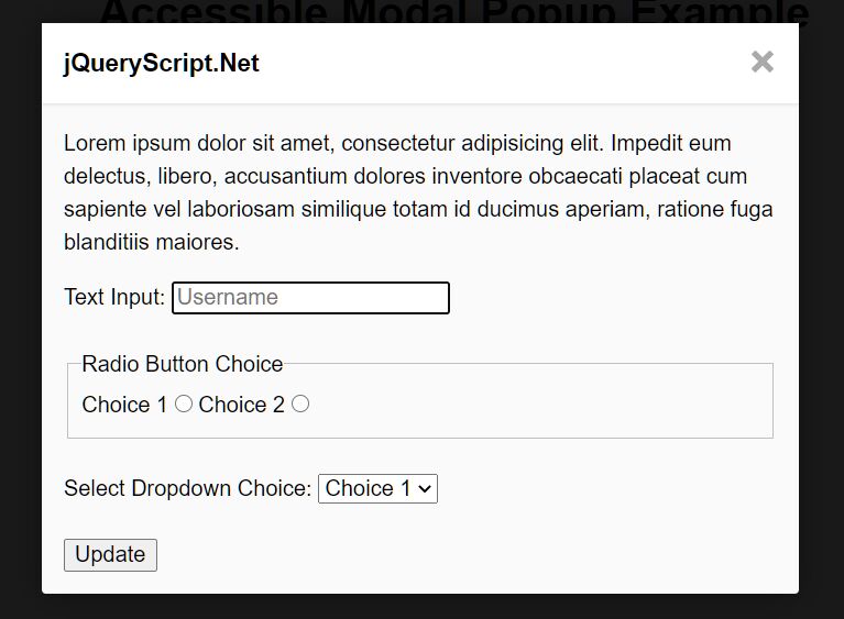
An accessible and minimal modal popup that uses CSS/CSS3 to toggle the visibility and utilizes jQuery to add/remove ARIA attributes based on the current open/close status.
How to use it:
1. Code the HTML for the modal popup.
<div class="modal" aria-hidden="true" role="dialog" aria-labelledby="modalTitle" aria-describedBy="modalDescription">
  <div class="modal-overlay modal-hide" tabindex="-1"></div>
  <div class="modal-container modal-hide">
    <div class="modal-wrapper modal-transition">
      <div id="modalDescription" class="modal-description vh">Beginning of dialog window.</div>
      <div class="modal-header">
        <button class="modal-close modal-hide">
          <svg class="icon-close icon" viewBox="0 0 32 32">
            <use xlink:href="#icon-close"></use>
          </svg>
        </button>
        <h2 id="modalTitle" class="modal-heading">This is a modal</h2>
      </div>
      <div class="modal-body">
        <div class="modal-content">
          Modal Content Here
        </div>
      </div>
    </div>
  </div>
</div>
2. Create an SVG based close button for the modal popup.
<svg display="none" version="1.1" xmlns="http://www.w3.org/2000/svg" xmlns:xlink="http://www.w3.org/1999/xlink" width="768" height="800" viewBox="0 0 768 800"><defs><g id="icon-close"><path class="path1" d="M31.708 25.708c-0-0-0-0-0-0l-9.708-9.708 9.708-9.708c0-0 0-0 0-0 0.105-0.105 0.18-0.227 0.229-0.357 0.133-0.356 0.057-0.771-0.229-1.057l-4.586-4.586c-0.286-0.286-0.702-0.361-1.057-0.229-0.13 0.048-0.252 0.124-0.357 0.228 0 0-0 0-0 0l-9.708 9.708-9.708-9.708c-0-0-0-0-0-0-0.105-0.104-0.227-0.18-0.357-0.228-0.356-0.133-0.771-0.057-1.057 0.229l-4.586 4.586c-0.286 0.286-0.361 0.702-0.229 1.057 0.049 0.13 0.124 0.252 0.229 0.357 0 0 0 0 0 0l9.708 9.708-9.708 9.708c-0 0-0 0-0 0-0.104 0.105-0.18 0.227-0.229 0.357-0.133 0.355-0.057 0.771 0.229 1.057l4.586 4.586c0.286 0.286 0.702 0.361 1.057 0.229 0.13-0.049 0.252-0.124 0.357-0.229 0-0 0-0 0-0l9.708-9.708 9.708 9.708c0 0 0 0 0 0 0.105 0.105 0.227 0.18 0.357 0.229 0.356 0.133 0.771 0.057 1.057-0.229l4.586-4.586c0.286-0.286 0.362-0.702 0.229-1.057-0.049-0.13-0.124-0.252-0.229-0.357z"></path></g></defs></svg>
3. Create a trigger button to toggle the modal popup when needed.
<button class="modal-show">Show modal</button>
4. The required CSS & CSS3 rules for the modal popup.
.modal {
  position: fixed;
  z-index: 10000;
  top: 0;
  left: 0;
  visibility: hidden;
  width: 100%;
  height: 100%;
}

.modal.is-visible {
  visibility: visible;
}

/* Prevent scrolling on <html> when `.modal` is visible */
.no-scroll {
  overflow: hidden;
}

/* Modal Overlay & Container */
.modal-overlay,
.modal-container {
  position: fixed;
  z-index: 9000;
  top: 0;
  left: 0;
  width: 100%;
  height: 100%;
  visibility: hidden;
  opacity: 0;
  transition: visibility 0s ease 0.3s, opacity 0.3s ease;
}

.modal-overlay {
  background: hsla(0, 0%, 0%, 0.5);
}

.modal.is-visible .modal-overlay,
.modal.is-visible .modal-container {
  opacity: 1;
  visibility: visible;
  transition-delay: 0s;
}

/* Allow scrolling on `.modal-container` in case `.modal-wrapper` is taller than the viewport */
.modal.is-visible .modal-container {
  overflow: auto;
  -webkit-overflow-scrolling: touch;
}

/* Modal Wrapper */
.modal-wrapper {
  position: absolute;
  z-index: 10000;
  top: 3em;
  left: 50%;
  width: 100%;
  max-width: 600px;
  margin-left: -50%;
  background-color: #fff;
  box-shadow: 0 0 1.5em hsla(0, 0%, 0%, 0.35);
}

/* Modal Transition */
.modal-transition {
  transition: visibility 0.3s 0.12s, opacity 0.3s 0.12s, transform 0.3s 0.12s;
  transform: translateY(-10%);
  opacity: 0;
}

.modal.is-visible .modal-transition {
  transform: translateY(0);
  opacity: 1;
}

.modal-header,
.modal-content {
  padding: 1em;
}

/* Modal Header */
.modal-header {
  position: relative;
  background-color: #fff;
  box-shadow: 0 1px 2px hsla(0, 0%, 0%, 0.06);
  border-bottom: 1px solid #e8e8e8;
}

/* Modal Heading */
.modal-heading {
  font-size: 1.125em;
  margin: 0;
  -webkit-font-smoothing: antialiased;
  -moz-osx-font-smoothing: grayscale;
}

/* Modal Close Button */
.modal-close {
  position: absolute;
  top: 0;
  right: 0;
  padding: 1.125em;
  color: #aaa;
  background: none;
  border: 0;
}

.modal-close:hover {
  color: #777;
}

/* Modal Content */
.modal-content > *:first-child {
  margin-top: 0;
}

.modal-content > *:last-child {
  margin-bottom: 0;
}

@media (min-width: 600px) {
  /* Modal Wrapper */
  .modal-wrapper {
    top: 6em;
    margin-left: -300px;
  }
}
5. Load the necessary jQuery JavaScript library (slim build for better performance) at the end of the document.
<script src="/path/to/cdn/jquery.slim.min.js"></script>
6. Cache the selectors
var html = $('html'),
    demo = $('.demo'),
    modal = $('.modal'),
    modalShow = $('.modal-show'),
    modalHide = $('.modal-hide'),
    modalWrapper = $('.modal-wrapper');
7. Show & hide the modal and toggle the CSS classes & ARIA attribute as follows:
// Modal Show
modalShow.on('click', function(e) {
  e.preventDefault();
  html.addClass('no-scroll');
  modal.addClass('is-visible');
  demo.attr('aria-hidden', 'true');
  modal.attr({
    'aria-hidden': 'false',
    'open': 'true',
    'tabindex': '0'
  });
});

// Modal Hide
modalHide.on('click', function(e) {
  e.preventDefault();
  html.removeClass('no-scroll');
  modal.removeClass('is-visible');
  demo.attr('aria-hidden', 'false');
  modal.attr('aria-hidden', 'true');
  modal.removeAttr('open tabindex');
});
8. Prevent the toggle event from bubbling.
modalWrapper.on('click', function(e) {
  e.stopPropagation();
});
This awesome jQuery plugin is developed by cbracco. For more Advanced Usages, please check the demo page or visit the official website.