Android Style Off-canvas Navigation For Bootstrap - offcanvas.js
| File Size: | 7.49 KB |
|---|---|
| Views Total: | 4015 |
| Last Update: | |
| Publish Date: | |
| Official Website: | Go to website |
| License: | MIT |
offcanvas.js is a lightweight jQuery plugin that extends the default Bootstrap navigation to create an Android style sliding off-canvas menu on small screens.
How to use it:
1. Load jQuery library and Twitter's Bootstrap 3 framework in the document.
<link rel="stylesheet" href="/path/to/bootstrap.min.css">
<script src="/path/to/jquery.min.js"></script>
<script src="/path/to/bootstrap.min.js"></script>
2. Load the jQuery offcanvas.js plugin's JS and CSS files in the document.
<link href="css/offcanvas.min.css" rel="stylesheet">
<script src="js/offcanvas.js"></script>
3. Load the OPTIONAL jQuery mobile library for touch events support.
<script src="/path/to/jquery.mobile.min.js"></script>
4. Create an overlay element that will cover the main content when the off-canvas menu opened.
<div class="overlay"></div>
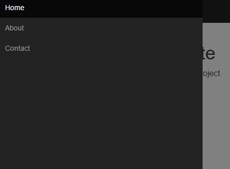
5. Create a Bootstrap navigation following the html structure like this:
<nav class="navbar navbar-inverse navbar-static-top">
  <div class="container">
    <div class="navbar-header">
      <button type="button" class="navbar-toggle collapsed pull-left" data-toggle="offcanvas" aria-controls="navbar">
        <span class="sr-only">Toggle navigation</span>
        <span class="icon-bar"></span>
        <span class="icon-bar"></span>
        <span class="icon-bar"></span>
      </button>
      <a class="navbar-brand" href="#">Project name</a>
    </div>
    <div id="navbar" class="collapse navbar-collapse sidebar-offcanvas">
      <ul class="nav navbar-nav">
        <li class="active"><a href="#">Home</a></li>
        <li><a href="#about">About</a></li>
        <li><a href="#contact">Contact</a></li>
      </ul>
    </div><!--/.nav-collapse -->
  </div>
</nav>
Change log:
v1.0.4 (2016-04-22)
- JS & CSS update
This awesome jQuery plugin is developed by eknows. For more Advanced Usages, please check the demo page or visit the official website.