Animated Drop Down Menus with jQuery and CSS3
| File Size: | 2.23 KB |
|---|---|
| Views Total: | 2055 |
| Last Update: | |
| Publish Date: | |
| Official Website: | Go to website |
| License: | MIT |
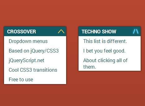
A collection of CSS3 animated dropdown menus with cool toggle icon transition effects, based on jQuery and CSS3 transforms & transitions.
How to use it:
1. Create a dropdown menu using dt, dd elements.
<section class="corssover">
  <dt>Crossover</dt>
  <dd>Dropdown menus</dd>
  <dd>Based on jQuery/CSS3</dd>
  <dd>jQueryScript.net</dd>
  <dd>Cool CSS3 transitions</dd>
  <dd>Free to use</dd>
</section>
2. The basic CSS to style the drop down menus.
section {
  -webkit-transition: all 0.3s ease-in-out;
  -moz-transition: all 0.3s ease-in-out;
  transition: all 0.3s ease-in-out;
  float: left;
  max-height: 30px;
  overflow: hidden;
  width: 200px;
  margin: 20px;
  box-shadow: 0 0 5px #000;
}

section.expanded { max-height: 200px; }

dt {
  text-transform: uppercase;
  font-weight: 700;
  color: #FFF;
  background: #105B63;
  padding: 5px 10px;
  position: relative;
  cursor: pointer;
}

dd {
  background: #FFF;
  color: #105B63;
  margin: 0;
  padding: 5px 15px;
}
3. Create a toggle icon with cross-over transition effects using CSS3 transforms.
.slide dt::after, .slide dt::before {
  -webkit-transition: all 0.4s linear;
  -moz-transition: all 0.4s linear;
  transition: all 0.4s linear;
  content: "";
  width: 2px;
  height: 15px;
  background: #FFD34E;
  position: absolute;
  right: 10px;
  top: 7.5px;
}
.slide dt::after, .slide dt::before {
  -webkit-transition: all 0.4s linear;
  -moz-transition: all 0.4s linear;
  transition: all 0.4s linear;
  content: "";
  width: 2px;
  height: 15px;
  background: #FFD34E;
  position: absolute;
  right: 10px;
  top: 7.5px;
}
.slide dt::after {
  -webkit-transform: rotate(45deg);
  -moz-transform: rotate(45deg);
  -ms-transform: rotate(45deg);
  -o-transform: rotate(45deg);
  transform: rotate(45deg);
}
.slide dt::before {
  -webkit-transform: translateX(-10px) rotate(-45deg);
  -moz-transform: translateX(-10px) rotate(-45deg);
  -ms-transform: translateX(-10px) rotate(-45deg);
  -o-transform: translateX(-10px) rotate(-45deg);
  transform: translateX(-10px) rotate(-45deg);
}
.slide dt.open::before {
  -webkit-transform: rotate(-760deg);
  -moz-transform: rotate(-760deg);
  -ms-transform: rotate(-760deg);
  -o-transform: rotate(-760deg);
  transform: rotate(-760deg);
}
.slide dt.open::after {
  -webkit-transform: translateX(-10px) rotate(760deg);
  -moz-transform: translateX(-10px) rotate(760deg);
  -ms-transform: translateX(-10px) rotate(760deg);
  -o-transform: translateX(-10px) rotate(760deg);
  transform: translateX(-10px) rotate(760deg);
}
4. Include the needed jQuery library at the bottom of the document.
<script src="http://code.jquery.com/jquery-2.1.1.min.js"></script>
5. A little jQuery script to toggle the CSS styles.
$('dt').on('click', function(){
  $(this).toggleClass('open');
  $(this).parent('section').toggleClass('expanded');
});
This awesome jQuery plugin is developed by jjmartucci. For more Advanced Usages, please check the demo page or visit the official website.