Animated Multi-Column Bottom Navigation with jQuery and CSS3 - rocker
| File Size: | 78.2 KB |
|---|---|
| Views Total: | 2139 |
| Last Update: | |
| Publish Date: | |
| Official Website: | Go to website |
| License: | MIT |
rocker is a jQuery plugin for creating a responsive, mobile-friendly multi-column navigation menu sliding from the bottom of the web page. The menu column will automatically expand with a CSS3 transition effect when hover over, similar to the accordion.
How to use it:
1. Include the required CSS file in the head section of the page.
<link rel="stylesheet" href="css/style.css">
2. Create a button to toggle the bottom navigation.
<span class="btn btn-menu"></span>
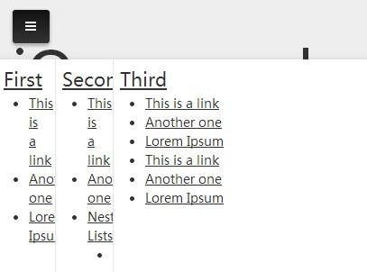
3. Create the Html for a bottom navigation using Html unordered lists.
<nav id="menu-container">
  <ul id="menu" class="js-rocker">
    <li>
      <h2><a href="#">First</a></h2>
      <ul>
        <li><a href="#">This is a link</a></li>
        <li><a href="#">Another one </a></li>
        <li><a href="#">Lorem Ipsum</a></li>
      </ul>
    </li>
    <li>
      <h2><a href="#">Second</a></h2>
      <ul>
        <li><a href="#">This is a link</a></li>
        <li><a href="#">Another one </a></li>
        <li><a href="#">Nested Lists</a>
          <ul>
            <li><a href="#">Some items</a></li>
            <li><a href="#">Some items</a></li>
          </ul>
        </li>
        <li><a href="#">Last link</a></li>
      </ul>
    </li>
    <li>
      <h2><a href="#">Third</a></h2>
      <ul>
        <li><a href="#">This is a link</a></li>
        <li><a href="#">Another one </a></li>
        <li><a href="#">Lorem Ipsum</a></li>
        <li><a href="#">This is a link</a></li>
        <li><a href="#">Another one </a></li>
        <li><a href="#">Lorem Ipsum</a></li>
      </ul>
    </li>
    <li> <img src="images/1200.jpg" alt="Kitten" /> </li>
    <li>
      <h2><a href="#">Fifth</a></h2>
      <ul>
        <li><a href="#">This is a link</a></li>
        <li><a href="#">Another one </a></li>
        <li><a href="#">Lorem Ipsum</a></li>
        <li><a href="#">This is a link</a></li>
        <li><a href="#">Another one </a></li>
        <li><a href="#">Lorem Ipsum</a></li>
        <li><a href="#">This is a link</a></li>
        <li><a href="#">Another one </a></li>
        <li><a href="#">Lorem Ipsum</a></li>
      </ul>
    </li>
    <li>
      <h2><a href="#">Sixth</a></h2>
      <ul>
        <li><a href="#">This is a link</a></li>
        <li><a href="#">Another one </a></li>
        <li><a href="#">Lorem Ipsum</a></li>
      </ul>
    </li>
  </ul>
</nav>
4. Include the jQuery javascript library and the jQuery rocker plugin at the end of the page.
<script src="http://ajax.googleapis.com/ajax/libs/jquery/1.11.1/jquery.min.js"></script>
<script src="js/jquery.rocker.js"></script>
5. Initialize the bottom navigation and set it to be toggled by clicking or touching the toggle button you just created.
var isMobile = navigator.userAgent.match(/(iPhone|iPod|iPad|Android|BlackBerry)/) ? true : false;

$(function() {

// Rudimentary mobile/desktop CSS class hook
$('html').addClass(isMobile ? 'is-mobile' : 'is-desktop');

// Initiate the rocker menu
$('#menu').on({
rockerShow: function(event, data) {
$('.btn-menu').addClass('active');
},
rockerHide: function(event, data) {
$('.btn-menu').removeClass('active');
}
}).rocker();

//$('#menu').rocker('show');

// Nav button actions
$('.btn-menu').on('click touchstart', function(e) {

e.preventDefault();
e.stopPropagation();

if (e.handled !== true) {
$('#menu').rocker('toggle');
e.handled = true;
} else {
return false;
}
});
$('#menu').on('click touchstart', function(e) {
e.stopPropagation();
});
$('body').on('click touchstart', function(e) {
$('#menu').rocker('hide');
});
});
This awesome jQuery plugin is developed by cvalleskey. For more Advanced Usages, please check the demo page or visit the official website.


