Animated Toggle Menu with jQuery and CSS / CSS3
| File Size: | 2.33 KB |
|---|---|
| Views Total: | 11866 |
| Last Update: | |
| Publish Date: | |
| Official Website: | Go to website |
| License: | MIT |

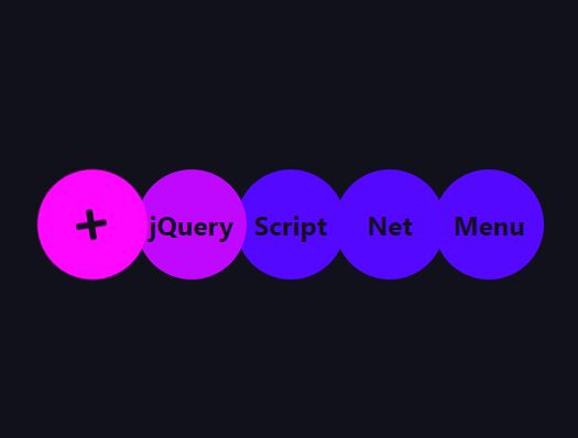
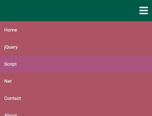
A beautiful site navigation system that utilizes jQuery and several CSS3 properties to create a sliding toggle menu with an animated navigation icon for modern web design.
How to use it:
1. Create a toggle menu from an html list as below.
<div class="toggle">
  <h1>Toggle Menu</h1>
  <ul class="toggle-menu">
    <li><a href="#">Home</a></li>
    <li><a href="#">About</a></li>
    <li><a href="#">Contact</a></li>
    <li><a href="#">Blog</li>
  </ul>
</div>
2. Create a link for the animated menu toggle button.
<a href="#" class="navicon"></a>
3. Style the toggle menu in the CSS.
.toggle {
  display: block;
  margin: 20px auto;
  width: 30%;
  background-color: rgba(255, 255, 255, 0.8);
  padding: 15px;
  display: block;
  opacity: 0;
  -webkit-transition: ease-in 0.5s all;
  transition: ease-in 0.5s all;
  -webkit-transform: translateY(-200%);
  -ms-transform: translateY(-200%);
  transform: translateY(-200%);
  min-width: 320px;
}

.toggle--active {
  display: block;
  opacity: 1;
  -webkit-transition: ease-in 0.5s all;
  transition: ease-in 0.5s all;
  -webkit-transform: translateY(0);
  -ms-transform: translateY(0);
  transform: translateY(0);
}

.toggle-menu { margin-bottom: 25px; }

.toggle-menu li {
  width: 25%;
  display: block;
  margin: 10px auto;
}

.toggle-menu li a {
  text-decoration: none;
  color: #000;
  display: block;
  text-align: center;
  font-size: 17px;
  text-transform: uppercase;
  border-bottom: 2px solid transparent;
  -webkit-transition: linear 0.5s all;
  transition: linear 0.5s all;
  font-weight: 500;
  padding: 5px 0;
}

.toggle-menu li a span { text-transform: lowercase; }

.toggle-menu li a:hover {
  color: #db5523;
  border-bottom: 2px solid #db5523;
  -webkit-transition: linear 0.5s all;
  transition: linear 0.5s all;
  -webkit-transform: scale(1.15);
  -ms-transform: scale(1.15);
  transform: scale(1.15);
  font-weight: 700;
}
4. Style the menu toggle button in the CSS.
.navicon {
  width: 100%;
  background: transparent;
  margin: 80px auto 40px;
  position: relative;
  height: 30px;
  width: 50px;
  display: block;
  z-index: 99;
  -webkit-transition: linear 0.5s all;
  transition: linear 0.5s all;
}

.navicon:before, .navicon:after {
  background: #fff;
  -webkit-backface-visibility: hidden;
  backface-visibility: hidden;
  content: "";
  height: 3px;
  left: 0;
  -webkit-transition: 0.8s ease;
  transition: 0.8s ease;
  width: 45px;
}

.navicon:before {
  box-shadow: #fff 0 14px 0 0;
  position: absolute;
  top: 0;
}

.navicon:after {
  position: absolute;
  top: 28px;
}

.navicon--active {
  margin-top: 20px;
  -webkit-transition: linear 0.5s all;
  transition: linear 0.5s all;
}

.navicon--active:before {
  box-shadow: transparent 0 0 0 0;
  top: 15px;
  -webkit-transform: rotate(225deg);
  -ms-transform: rotate(225deg);
  transform: rotate(225deg);
}

.navicon--active:after {
  top: 15px;
  -webkit-transform: rotate(315deg);
  -ms-transform: rotate(315deg);
  transform: rotate(315deg);
}
5. Put the latest version of jQuery JavaScript library at the bottom of the webpage.
<script src="//code.jquery.com/jquery-1.11.3.min.js"></script>
6. The jQuery script to toggle CSS classes as you open / close the toggle menu.
$('.navicon').on('click', function (e) {
  e.preventDefault();
  $(this).toggleClass('navicon--active');
  $('.toggle').toggleClass('toggle--active');
});
This awesome jQuery plugin is developed by Vladislav Kirbaba. For more Advanced Usages, please check the demo page or visit the official website.