Convenient Retractable Navigation With jQuery And CSS3 - gnmenu.js
| File Size: | 12.6 KB |
|---|---|
| Views Total: | 6543 |
| Last Update: | |
| Publish Date: | |
| Official Website: | Go to website |
| License: | MIT |
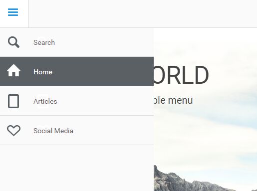
gnmenu.js is a jQuery plugin used to create a convenient slide-out sidebar navigation for both desktop and mobile webpages. Inspired by the Google Nexus website.
How it works:
- Make the menu 'half show' when you hover over the toggle button.
- If the menu is half show, show the whole menu when you click on the toggle button.
- Hide the menu by clicking/tapping on web page body.
How to use it:
1. Add the jQuery gnmenu.js script after the latest version of jQuery JavaScript library as follows:
<script src="//code.jquery.com/jquery-3.1.0.min.js"></script>
<script src="js/gnmenu.js"></script>
2. The html for the sidebar navigation.
<div id="sideNav">
  <ul>
    <li><a href="#" class="icon icon-home"><span>Home</span></a></li>
    <li><a href="#" class="icon icon-articles"><span>Articles</span></a></li>
    <li><a href="#" class="icon icon-social"><span>Social Media</span></a></li>
  </ul>
</div>
3. Create a toggle button for the sidebar navigation.
<nav>
  <ul>
    <li><a href="#" class="icon icon-menu" id="btn-menu">Menu</a></li>
  </ul>
</nav>
4. The core CSS/CSS3 styles for the sidebar navigation.
nav {
  font-family: 'Roboto', sans-serif;
  width: 100%;
  height: 59px;
  border-bottom: 1px solid #ddd;
  position: fixed;
  top: 0;
  left: 0;
  z-index: 20;
  background-color: #ffffff;
}

nav ul,  #sideNav ul,  #sideNav ul ul {
  margin: 0;
  padding: 0;
  list-style: none;
}

nav li {
  margin: 0;
  float: left;
  border-right: 1px solid #ddd;
  font-size: 18px;
}

nav a,  #sideNav a {
  color: #5b6064;
  text-decoration: none;
  display: block;
  padding: 10px 30px;
  height: 59px;
  -webkit-box-sizing: border-box;
  -moz-box-sizing: border-box;
  -o-box-sizing: border-box;
  line-height: 35px;
}

nav a:hover,  #sideNav a:hover {
  color: #ffffff;
  background-color: #5b6064;
}

#sideNav,  #sideNav.showHalfMenu,  #sideNav.showFullMenu,  #sideNav ul ul li,  #sideNav.showFullMenu ul ul li {
  -webkit-transition: 0.2s ease;
  -moz-transition: 0.2s ease;
  -ms-transition: 0.2s ease;
  transition: 0.2s ease;
}

#sideNav {
  position: fixed;
  left: -60px;
  top: 59px;
  width: 60px;
  height: 100%;
  /*    border-right:1px solid #ddd;             */
  background-color: #ffffff;
  overflow-y: auto;
}

#sideNav.showHalfMenu { left: 0; }

#sideNav.showFullMenu {
  left: 0;
  width: 311px;
}

#sideNav.showFullMenu ul ul li { height: 59px; }

#sideNav > ul {
  width: 100%;
  padding-bottom: 60px;
}

#sideNav ul li {
  width: 100%;
  margin: 0;
  font-weight: 300;
}

#sideNav ul li a {
  border-bottom: 1px solid #ddd;
  padding-left: 70px;
}

#sideNav ul li span {
  position: relative;
  top: 3px;
}

#sideNav ul ul li {
  overflow: hidden;
  height: 0;
}

#sideNav input.search {
  font-family: 'Roboto', sans-serif;
  border: 0;
  outline: 0;
  font-weight: 300;
  background: transparent;
  color: #5b6064;
}

input.search::-webkit-input-placeholder {
 color:#5b6064;
}

input.search:-moz-placeholder {
 color:#5b6064;
}

input.search::-moz-placeholder {
 color:#5b6064;
}

input.search:-ms-input-placeholder {
 color:#5b6064;
}

#sideNav li.searchForm:hover input.search:focus,  #sideNav li.searchForm:hover input.search::-webkit-input-placeholder {
 color:#fff;
}

#sideNav li.searchForm:hover input.search:-moz-placeholder {
 color:#fff;
}

#sideNav li.searchForm:hover input.search::-moz-placeholder {
 color:#fff;
}
5. Add icons to the navigation items.
.icon { background: transparent url('../img/icons.png') no-repeat 0 0; }

.icon-menu {
  text-indent: -99999em;
  background-position: 0 0;
}

.icon-menu:hover { background-position: -59px 0; }

.icon-menu.icon-menu-active {
  background-position: -120px 0;
  background-color: #fff;
}

.icon-search { background-position: 0 -60px; }

.icon-search:hover { background-position: -59px -60px; }

.icon-home { background-position: 0 -120px; }

.icon-home:hover { background-position: -58px -120px; }

.icon-articles { background-position: 0 -180px; }

.icon-articles:hover { background-position: -58px -180px; }

.icon-social { background-position: 0 -240px; }

.icon-social:hover { background-position: -58px -240px; }
6. Make the navigation fully responsive across the platform.
@media only screen and (min-width: 200px) and (max-width: 480px) {

nav a,  #sideNav a { padding: 10px 15px; }

nav a#btn-menu { padding: 10px 30px; }

#sideNav.showFullMenu,  #sideNav.showFullMenu li,  #sideNav.showFullMenu a { width: 100%; }

}
This awesome jQuery plugin is developed by ITteM. For more Advanced Usages, please check the demo page or visit the official website.


