Lightweight Responsive Sliding Menu Plugin with jQuery - F1-Nav
| File Size: | 15.2 KB |
|---|---|
| Views Total: | 4681 |
| Last Update: | |
| Publish Date: | |
| Official Website: | Go to website |
| License: | MIT |
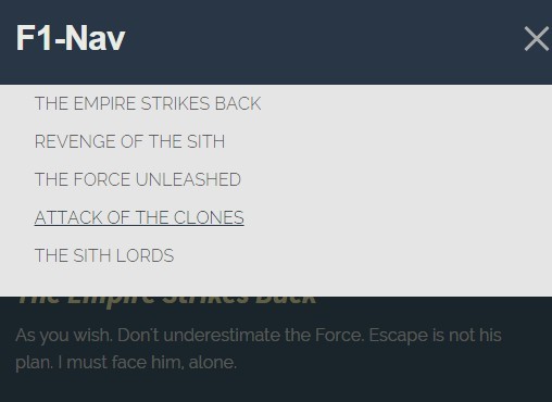
F1-Nav is a lightweight jQuery plugin that creates a responsive slide up/down navigation menu with a full page overlay. Click the toggle button or anywhere on the overlay to close the menu.
How to use it:
1. Create a link to toggle the navigation menu.
<a id="nav-toggle" class="mm_open"><span></span></a>
2. Make the toggle link it act like a hamburger button.
#nav-toggle {
  width: 30px;
  height: 40px;
  display: block;
  background: none;
  position: absolute;
  top: 2px;
  right: 0px;
  transition: all 0.3s ease
}

#nav-toggle span,
#nav-toggle span:before,
#nav-toggle span:after {
  cursor: pointer;
  border-radius: 1px;
  height: 3px;
  width: 30px;
  background: #ababab;
  position: absolute;
  top: 21px;
  right: 0px;
  display: block;
  content: ''
}

#nav-toggle span:before { top: -8px }

#nav-toggle span:after {
  bottom: -8px;
  top: 8px
}

#nav-toggle span,
#nav-toggle span:before,
#nav-toggle span:after { transition: all 500ms ease-in-out }

#nav-toggle.active span { background-color: transparent }

#nav-toggle.active span:before,
#nav-toggle.active span:after { top: 0 }

#nav-toggle.active span:before {
  transform: rotate(45deg);
  -webkit-transform: rotate(45deg)
}

#nav-toggle.active span:after {
  transform: rotate(-45deg);
  -webkit-transform: rotate(-45deg)
}

#nav-toggle:hover { opacity: 0.5 }
3. Create an Html list based panel for the navigation menu.
<div class="panel">
  <ul>
    <li class="nav-item"><a href="#">Link 1</a></li>
    <li class="nav-item"><a href="#">Link 2</a></li>
    <li class="nav-item"><a href="#">Link 3</a></li>
    <li class="nav-item"><a href="#">Link 4</a></li>
    <li class="nav-item"><a href="#">Link 5</a></li>
  </ul>
</div>
4. Style the navigation panel.
.panel {
  position: absolute;
  width: 100%;
  border: 0px;
  padding: 0;
  background: #e5e5e5;
  color: white;
  top: 80px;
  display: none;
  z-index: 9999;
  overflow: scroll;
  margin-bottom: 0;
  padding-bottom: 0;
  -ms-overflow-style: none
}
5. Style the fullscreen overlay.
.mask {
  background: rgba(0,0,0,0.62);
  height: 100%;
  width: 100%;
  z-index: 9998;
  position: fixed;
  top: 0;
  opacity: 0
}
6. Place jQuery library and the jQuery F1-Nav.js script at the bottom of the web page and done.
<script src="//ajax.googleapis.com/ajax/libs/jquery/1.11.2/jquery.min.js"></script>
<script src="f1-nav.js"></script>
7. Possible plugin options.
// These are the defaults.
subMenus: false,
mask: true,
itemClickClose: true,
panelPosition:  'absolute',
subMenuParentLink:  false
Change log:
v3.0.0 (2017-05-18)
- Fixes class being applied when submenu is open
v2.3.1 (2017-04-18)
- Hotfix to add class to correct LI instead of a per
- Makes the niftyNav an actual jQuery plugin.
v2.2.2 (2016-12-23)
- Fixes nifty nav toggle click area
v2.2.1 (2016-12-20)
- Makes clickable area larger, updates dev devDependencies
v2.2.0 (2016-05-13)
- JS & CSS update
v2.1.4 (2016-04-24)
- Adds .nifty-panel class to submenu parent links
v2.1.3 (2016-03-22)
- Adds subMenuParentLink option to block or allow the browser from letting the user navigate to the top level item
v1.6.2 (2016-01-29)
- update
v1.5 (2015-11-04)
- Adds sub menu toggles, as well as a complete overhaul of the file structure in preparation of bumping to 2.0.0 which will include a bower package for Nifty Nav. Note that most if not all of the class names have changed to avoid conflicts with Wordpress or other jQuery based plugins.
This awesome jQuery plugin is developed by factor1. For more Advanced Usages, please check the demo page or visit the official website.